Exercise: Soviet Remakes

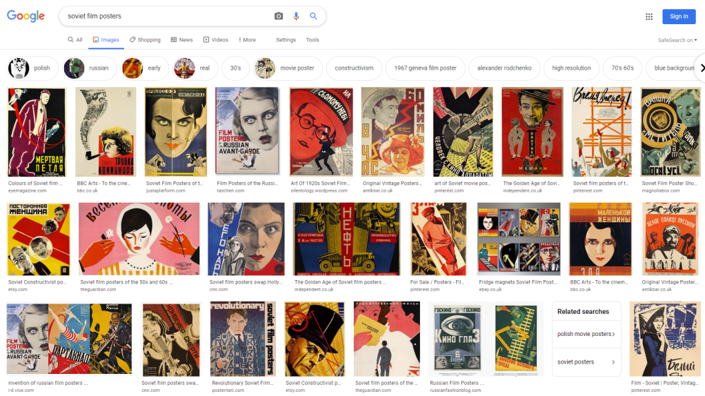
On initial look at soviet film posters the only real details i noticed was the use of a cut and paste collage look with the images and text. The font use is generally the same, a bold sans serif. The images however are quite striking! the large faces along with the harsh lines and circular shapes mixed together creating a strong dynamic visual.

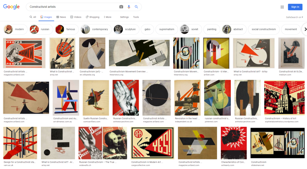
Constructivism was an artistic and architectural philosophy that originated in Russia beginning in 1913 by Vladimir Tatlin. This was a rejection of the idea of autonomous art. He wanted ‘to construct’ art. The movement was in favour of art as a practice for social purposes.

https://en.wikipedia.org/wiki/Constructivism_(art)

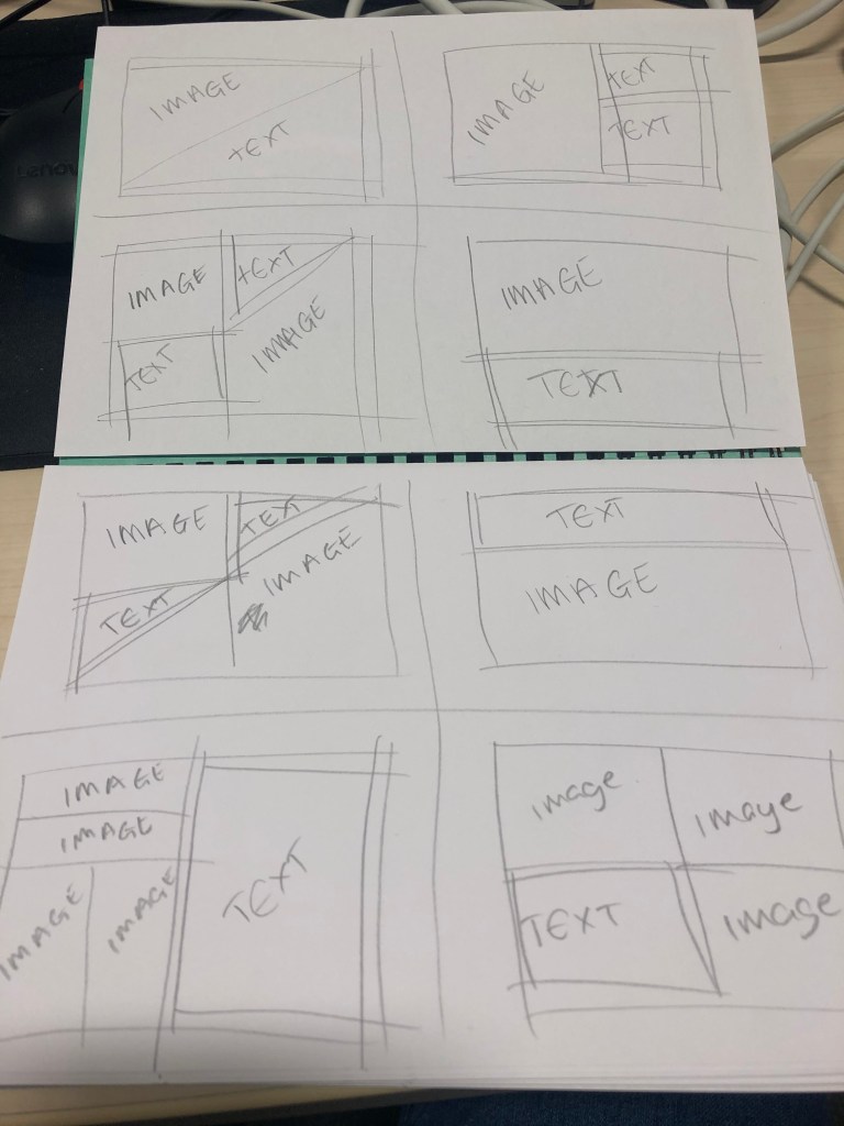
Jaws Film Poster – Sketchbook – develop adobe – final.

Image result for jaws poster
The Original Jaws Movie Poster 1975

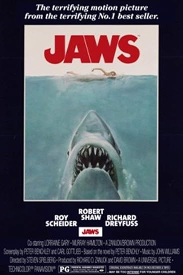
After choosing my classic Hollywood film, it was between Hitchcock’s psycho and Spielberg’s Jaws and i decided on jaws as i feel i could come up with more ideas with this movie. I started off with a few basic sketches of some ideas based on my research of soviet film posters and Constructivist artists.

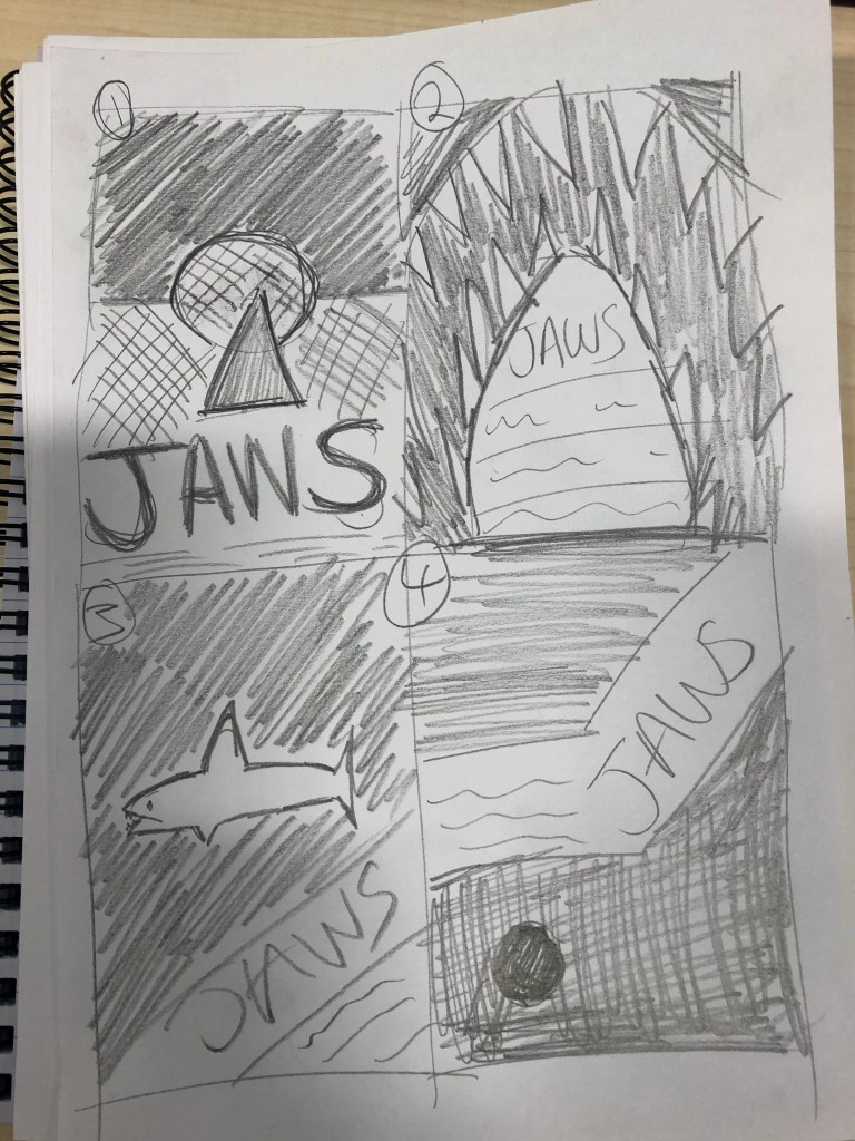
Using their style of bold shapes and cut and paste collage i then developed two of these in adobe illustrator before finalizing one to be my final piece.

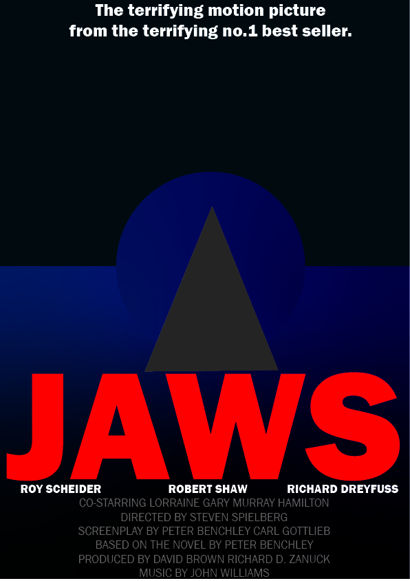
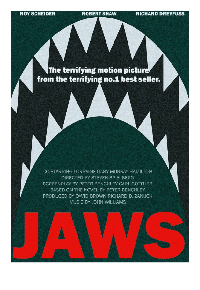
I have chosen the second of the two posters as my final i love the design how dynamic the shapes are but still conveys a strong visual of the film. I used a sponge effect to create an older, edgier look to the image. The fonts are basic but still nice and readable i used the same in both as i didn’t want to focus too much on the type but more on the design.

Exercise: A sense of place

This exercise is interesting as this is something that i use near enough everyday, as a young woman i am active on social media platforms such as facebook, instagram and snapchat and a feature on all of these platforms is adding text to images you have taken. From adding the location, time and even the weather! to tagging other people in the photograph who also have that form of social media. It’s a very modern from of communication to the outside world for example i have used a photo of me and one of my friends below to wish them a happy birthday placing the text onto an old photograph and tagging said individual see some examples below.

So instead of using photo editing software i will be using the Instagram story feature to add photo’s, text, filters, locations etc. to family images and seeing what i can come up with.

To do this exercise again would be different as obviously we are all a lot older and my dad is no longer with us, so like above i have tagged josh in my mum’s belly as that’s where he was! now i would have to tag my dad somewhere else some would say in heaven i would say otherwise. These were all taken at different locations as well one being a family home we no longer live in and another being a family wedding. Something’s you cannot simply recreate with photo’s especially as time changes things one day i will have family photo’s similar to this but not the same.

Exercise: Travel

I started this exercise of by doing a series of sketches of different types of layouts using large and small images along with large and small sections of text. I wanted to create something that can be used for all different types of travel from city breaks to luxurious holidays but still be dynamic with image use and have enough space for plenty of information.

I then chose four that worked well and recreated them in adobe illustrator adding lorem ipsum text into text areas and adding images taken from different travels of my own.

I think these all work really well the grid layout is dynamic and eye-catching along with having space for plenty of information and striking images. I’ve never used grids before so this was entirely new for me and something i will benefit from in future works.

Exercise: White Space

KEN GRIFFITHS – http://www.kengriffiths.co.uk/

In graphic design, “white space” refers to the space that surrounds the elements. You may find the term “negative space” here and there, indicating the exact same thing. However, this space is neither white nor negative. It’s simply the space in a design and it can have any color, texture or pattern.

https://blog.bannersnack.com/white-space-in-graphic-design/

There are two types of white space; Micro which refers to space between letters, paragraphs and icons. And Macro which is the space between text columns and graphics used.

white-space-in-billboards
white-space-in-design-google-ad

Apple and Google are examples of big cooperate brands using white space to convey luxury and high quality (see images above).

Many luxury brands make use of white space to create a neat and simple design, where the focus goes entirely on the product. Generally, we tend to associate heavy white space with luxury and premium quality. A balanced white space is seen as rather affordable and medium quality and little white space in a design (clutter) conveys cheapness.

https://blog.bannersnack.com/white-space-in-graphic-design/

After looking in the Bridgeman Education Library and VADS I loved the look of photographer Ken Griffith’s who is one of Britains most distinguished photographers so i have decided to use his work for my art catalogue. Researching other art catalogues they are generally of a square shape with the imagery being used on one side and text about the image or artist on the other. I want to create something simple and fitting with Griffiths style and i think i have achieved this with the below, simple yet effective.

Research: Structure 2

In graphic design, a grid is a structure (usually two-dimensional) made up of a series of intersecting straight (vertical, horizontal, and angular) or curved lines (grid lines) used to structure content.

By the mid-1970’s instruction of the typographic grid as a part of graphic design curricula had become standard in Europe, North America and much of Latin America. The graphic style of the grid was adopted as a look for corporate communication. In the early 1980’s, a reaction against the entrenchment of the grid, particularly its dogmatic use, and association with corporate culture, resulted in some designers rejecting its use in favor of more organic structure. The appearance of the Apple Macintosh computer, and the resulting transition away from type being set by typographers to designers setting type themselves resulted in a wave of experimentation, much of it contrary to the precepts of Tschichold and Müller-Brockmann. The typographic grid continues to be taught today, but more as a useful tool for some projects, not as a requirement or starting point for all page design.

https://en.wikipedia.org/wiki/Grid_(graphic_design)
Taken from Allen Hurlbeurt’s Grid: A Modular system for the design and production of newspapers, magazines and books.

While researching grids and how they are used in graphic design terms i came across this article which has so much information and images and even how to use grids effectively as a designer!

https://trydesignlab.com/blog/grids-ui-ux-graphic-design-quick-history-5-amazing-tips/#3

Exercise: Type Samples

With valentines day just around the corner i decided to base this exercise on 3 fonts that could be used on different types of valentines cards. One for a Heterosexual couple, one for a Homosexual couple and one between friends as everyone should celebrate who they love whether it’s a partner or not. So the three fonts i have chosen are all freely downloadable from dafont.com a very popular site where you can download all sorts of different typefaces.

  1. Lovely Valentine by Uloel Design
  2. Cupid de locke by Nymfont
  3. Chasing Hearts by Misti’s Fonts

Research: Type 2

https://www.fonts.com/browse/new-releases

I researched on fonts.com for the newest fonts released see below. I noticed how similar these fonts are to fonts i already have available for example Kamerik 105 Text is very similar to century gothic a font i use a lot. The Icons Dingbats font really intrigued me i’ve never noticed a font that has other companies icons on as i imagine getting the legal permission for this would prove challenging. Different font styles used will depend on the occasion the font is being displayed for, as an example i would use Rainmaker Script to make a document look handwritten script but still readable as i find alot of the fonts i already have aren’t this clear.

Another font from this list i really liked the look of was Straight Line as it looks very neat and tidy but still adds and individuality to it with the white spacing inside the letters see below.

Research: Type

These are the three fonts i have chosen to research – Century Gothic, Georgia and Tahoma.

  1. Century Gothic is a sans-serif typeface in the geometric style, released by Monotype Imaging in 1991. It is strongly influenced by the font Futura, but with a larger x-height. Its design also derives from two other typefaces that were designed to compete with Futura. It is an exclusively digital typeface that has never been manufactured as metal type. Like many geometric sans-serifs, Century Gothic’s design has a single-story “a” and “g”, and an “M” with slanting sides resembling an upturned “W”. Century Gothic has a high x-height (tall lower-case characters). Its origins (see below) come from a design intended for large-print uses such as headings and signs, and so it has a reasonably purely geometric design closely based on the circle and square, with less variation in stroke width than fonts designed for small sizes tend to show, and a relatively slender design in its default weight. – Information taken from https://en.wikipedia.org/wiki/Century_Gothic
  2. Georgia is a serif typeface designed in 1993 by Matthew Carter and hinted by Tom Rickner for the Microsoft Corporation. It was intended as a serif typeface that would appear elegant but legible printed small or on low-resolution screens. The typeface is inspired by Scotch Roman designs of the 19th century and was based on designs for a print typeface in the same style Carter was working on when contacted by Microsoft; this would be released under the name Miller the following year. The typeface’s name referred to a tabloid headline claiming “Alien heads found in Georgia. – Information taken from https://en.wikipedia.org/wiki/Georgia_(typeface)
  3. Tahoma is a humanist sans-serif typeface that Matthew Carter designed for Microsoft Corporation. Microsoft first distributed it, along with Carter’s Verdana, as a standard font in the initial release of Windows 95. While similar to Verdana, Tahoma has a narrower body, smaller counters, much tighter letter spacing, and a more complete Unicode character set. Carter first designed Tahoma as a bitmap font, then “carefully wrapped” TrueType outlines around those bitmaps. Carter based the bold weight on a double pixel width, rendering it closer to a heavy or black weight. In contrast with some other sans-serif typefaces, including Arial, the uppercase I” (eye) is distinguishable from lowercasel(ell), which is especially important in technical publications. Since 2010, Ascender Corporation has offered italic and small caps versions of Tahoma. Tahoma is often compared with Frutiger, another humanist sans-serif typeface. In an interview by Daniel Will-Harris, Carter acknowledged that Tahoma has some similarities with his earlier Bell Centennial typeface. The Tahoma typeface family was named after the Native American name for the stratovolcano Mount Rainier (Mount Tahoma), which is a prominent feature of the southern landscape around the Seattle metropolitan area. – Information taken from https://en.wikipedia.org/wiki/Tahoma_(typeface)

I’ve always loved using Century Gothic i find it such a clean, nice, easy font to use and will continue to do so now i know more about it. I would like to use Georgia instead of Times New Roman as i feel this is used practically everywhere for designers who want to use a serif style font. I never knew Tahoma was a Microsoft specific font i suppose I’ve never really thought of using it on my mac anyway so maybe when designing i can look at what works on both formats.

Exercise: Key Characters

Taking a few fonts that I have used before I’ve analysed the features of the fonts and what similarities and variations they have see below.

To celebrate the variation, diversity, similarities and differences between the different fonts and typefaces i came up with the idea of creating a wordsearch with some of the fonts i have looked at and used, the idea being that the player must find the font name in that specific font in the wordsearch.

Design a site like this with WordPress.com
Get started