A local wildlife park wants you to develop a logo that supports the idea of a popular and fun family-centered experience, but also helps to make people more aware of the conservation work they do. The trustees of the park have recently visited Toronto and London Zoos to see how they balance the need to attract visitors and funding with a commitment to educating people about animal welfare and habitat issues. Develop a logo that represents your chosen animal in an appealing way for a family audience, but which also maintains its image and integrity as a wild animal. Record your progress in your learning log.
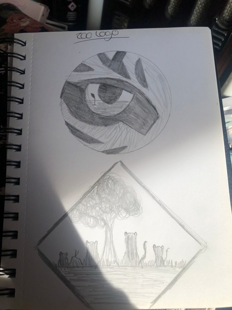
For this exercise i have decided to use a tiger as my animal of choice purely because it’s my favourite and as they’re now an endangered species i feel it’s important to get that imagery out there. So i started off doing a few rough sketches of ideas i had following the brief. I wanted to represent the tiger and the conservation more than the fun family-centered experience as i feel this could easily be covered in the wording or slogan. Please see below the sketches.
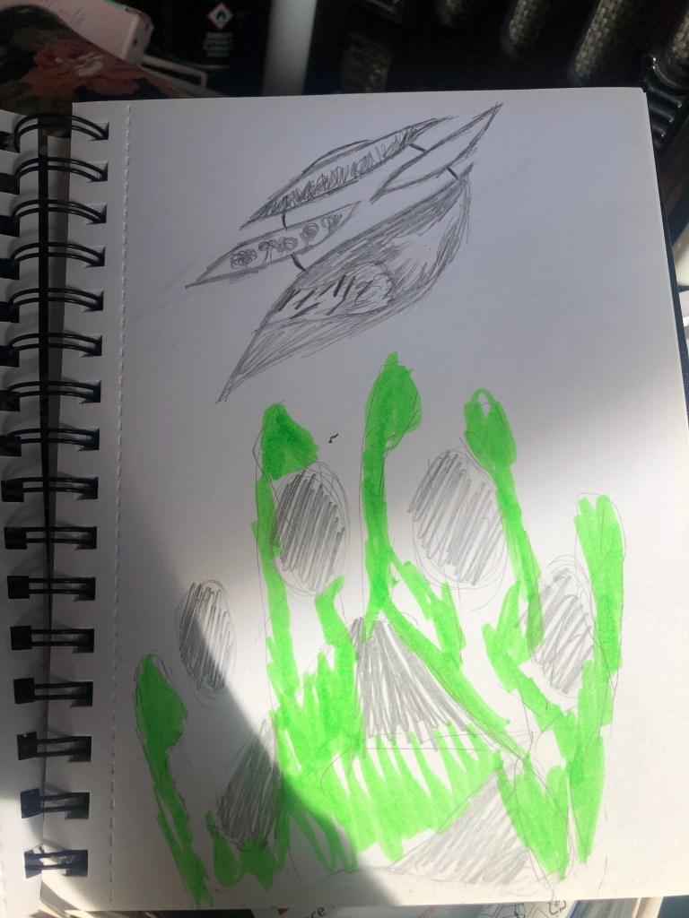
I then chose a few to develop on adobe illustrator. My strongest design, i believe, is the tiger eye with the imprint of a plant growing in a wasteland however this did change from being the hand and paw print design as it was something that sort of popped into my head as i was sketching the above circle/tiger stripes design. Please see below the finished versions in adobe illustrator.
I wasn’t keen on the hand and paw print design, it just didn’t have the same impact i wanted. The second family of tigers design does work quite well it appeals to my target audience of families and conveys the message of animals and conservation. I do however think the strongest is the tiger eye design, the look is striking and easy to recognize and see the detailing of the plant growing in the reflection of the tiger’s eye.
Logo’, like life and fine wines, develop over time. They adapt and change to the worlds current predicament like google changes its web page every day depending on what historically happened on said day. However important it is to adapt to the times it’s also important to keep a brand image. See below some examples of logo’s and how they have changed over the years.
See how simple the changes made to the google logo are. Moving the colour around to changing the font style from serif to a sans serif as this is more modern. Taken from – https://www.pnclogos.com/google-logos-throughout-history/Another example see how originally there was no colour usage to then adding colour in the 60’s. Also notice the wording as they created more of a well known brand not needing so many explanations e.g. famous bbq and hamburgers. To the famous M that we know today which needs no explanation. https://www.logaster.com/blog/25-famous-brands-logos/Most of the logos i have researched have only changes about 10 times over the last 100 years or so. However Pepsi have re branded their logo 16 times! Keeping the red colour throughout however i imagine the Pepsi-cola had some branding issues with coca-cola as the imagery font and colour are all near enough the same. So adding the blue in 1945 seemed like a good idea to establish themselves as a competitor to Coca-cola and then changing the font style to something more clear and readable while getting rid of the ‘cola’ wording differing from coca-cola. Taken from https://www.logaster.com/blog/25-famous-brands-logos/
I started by doing 3 different sketch designs in my sketchbook adding a slight hint of colour for each before developing as a vector graphic for each design.
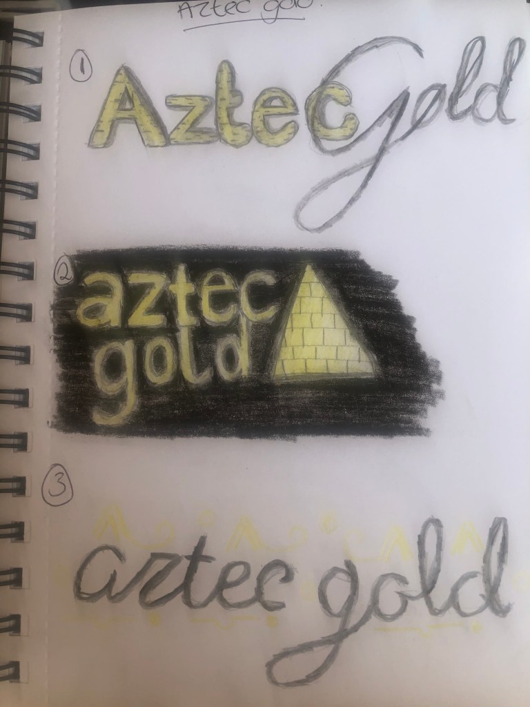
Aztec Gold
Looking at the name of the chocolate the obvious is to add a gold colouring and an aztec style building font but taking into consideration the description as ‘Exotic dark chocolate with buried fragments of honeycomb’ this makes the bar sound abit more classy and therefore more expensive to buy. I wanted to create a contrast of black and gold colours combined with aztec style font or added images with a classy style to it.
So the first design i used a standard sans serif style font for the word aztec and a more script style for the gold wording. Before then adding a block effect to the word Aztec creating a sense of depth to the logo. I also considered this as a type of brand for example if the company used the wording ‘aztec’ for another type of chocolate like white or milk etc. The second was more plain font with added imagery of a pyramid, thinking about how this could be packaged like in a pyramid style bar (Toblerone as an example) again adding the block effect to the pyramid alongside a black background and gold imagery and text. The third was more taken from googling aztec gold and the results were prominently the aztec gold coin featured in the popular film ‘pirates of the Caribbean’. So i used a script style font and added features from the coin, like hieroglyphics almost, this works really well around the text and could feature along the packaging of the bar.
Immediately associated this name with an already existing biscuit ‘Rich Tea’. So i need to make sure the design is different to this. I wanted to incorporate a classy, script or even older style font. High Tea is very much for upper class and the description for the biscuit even mentions ‘An altogether classier chocolate biscuit’ So i need to adhere to this.
The first design i wanted to incorporate a script classy font for High Tea and then a standard serif style for the Biscuits wording while also featuring a biscuit with melted chocolate on the front i think it looks quite nice and appealing especially if this was an actual photograph of the biscuit. The second i wanted a 1920’s sort of style to the logo/packaging featuring black and warm gold it certainly looks like an altogether classier logo the font is very simple yet elegant. The third i am less keen on i thought the idea of the text being on the biscuit as a sort of emblem style logo would work well but it doesn’t give off the elegant style im going for with this design.
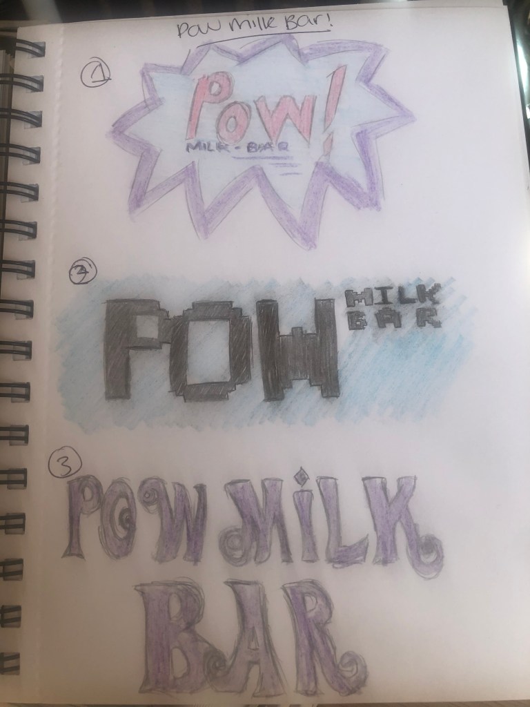
I associate the word ‘pow’ from this like the ‘bang’ ‘kapow’ that features in the old batman tv show with a loud pop art shape and colour. So i wanted to create styles like this and more like vintage and retro and described ‘Retro chocolate for big kids’.
Firstly i made a decision to use purple and blue colours as these are not often used to associate as retro but are associated with chocolate particularly the purple for ‘dairy milk’. The first design i stuck to the pop art style featuring the POW as the main word and then the milk bar text below. It looks very appealing and certainly retro. The second i thought more about the wording ‘retro’ as a few months ago i went to a retro gaming weekend with pacman machines from the 80’s so i incorporated a pacman/gaming style square font which works really well and again could be used for other types of confectionery as i have moved the milk bar text to the side of the POW text and featured a small colourful pop art in the corner as an emblem for the brand. Taking the ‘retro’ style font i wanted an even older style from the 60’s as sort of a more plain design as the font speaks for itself however it doesn’t connect as well as the other two with the pop art style.
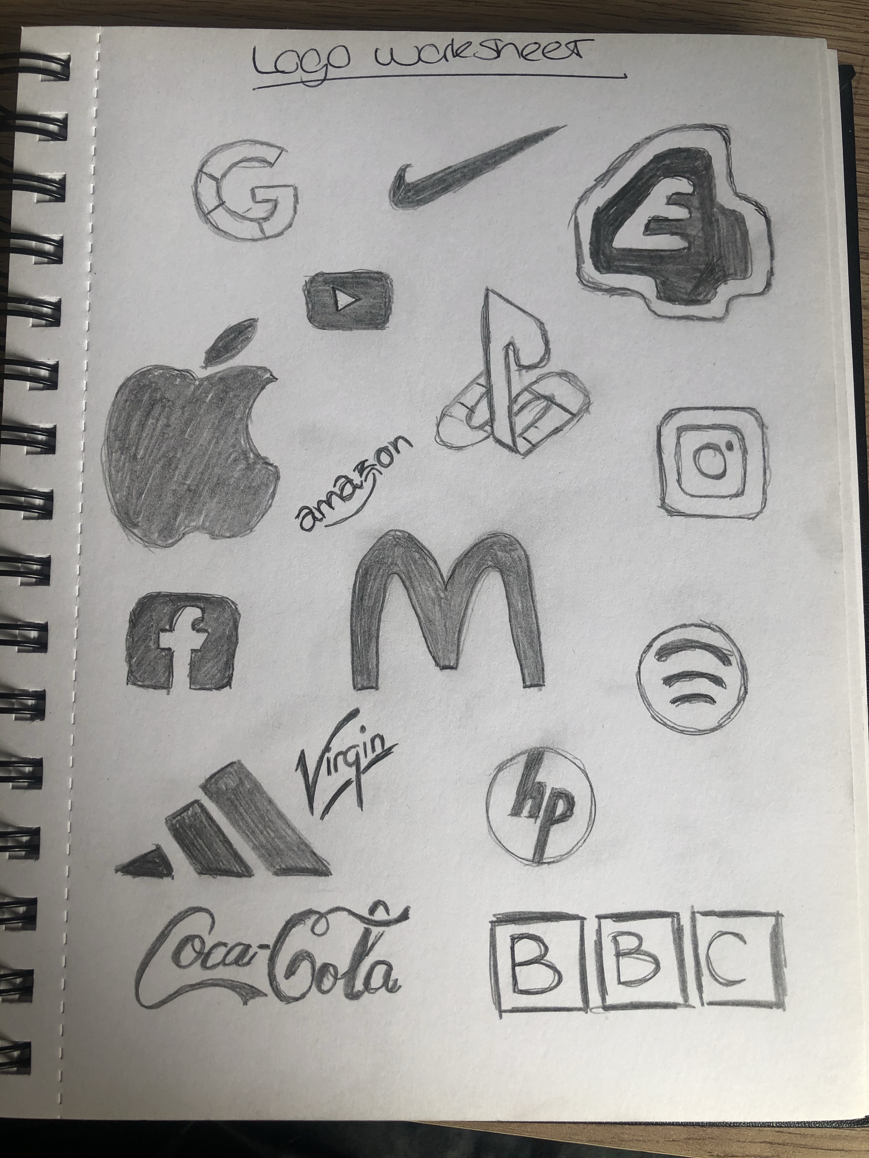
Starting in my sketchbook i drew as many logos as i could think of see below. The companies are quite varied from my social media emblems to food company logos and company names.
Using the varied designs i combined and used the different design aspects from each see below.
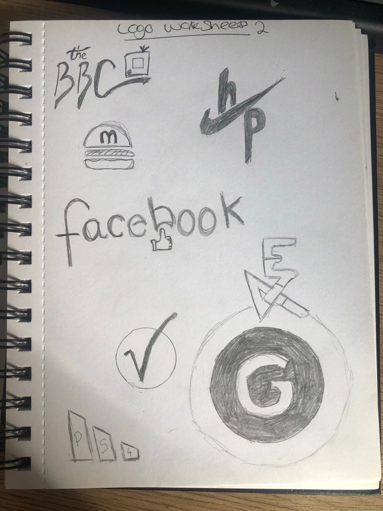
I’ve taken the font style from coca-cola and used a little TV type emblem like the Instagram logo for the top left BBC logo. The BBC has always used the same style of boxes and text since 1922. This works quite well keeping a sort of traditional style font with a modern twist.
Using the nikey tick and HP together is quite interesting, nike being a sporting company and HP computers. However as the symbol is just a tick it could mean anything, it certainly gives a positive look to HP. The same thing with the Adidas logo the three stripes could be used for anything so adding the PS4 text inside creates a little additional factor – i may add some original grey to this to make slightly more classical like the old console PS1 was grey.
I took the idea of the apple logo being an apple and mcdonalds being prominently a fast food burger institution i used the burger symbol and added a simple M to the forefront, i will develop this a bit further on illustrator to get the full effect, maybe add some colour?
For the Facebook logo i decided to use the same element from the amazon logo. The arrow pushes up into part of the text so i have used the ‘like’ symbol associated with Facebook to push into the text. This actually works really well i think still keeps the company essence of social media but adds in a bit of fun rather than it just being standard text.
I’ve used the circle emblem style with the virgin logo, using the V inside the circle making something simple and easy to associate with the company – especially if i had some red as this is their brand colour.
The E4 logo I’ve used the PlayStation style to join together both letters by adding some colour to this i think it could be quite an interesting look. Same could be said with the Google emblem the google logo is already very simple but adding a circular shape around like the 4 over the E just makes it slightly more striking but keeping a professional look.
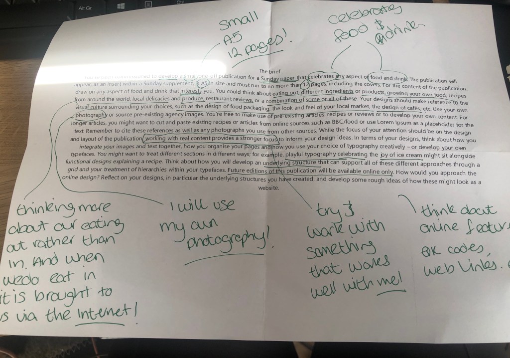
To start this assignment off i thought about food… and then i got hungry, after consuming a healthy snack! I thought about how we consume food now with technology advancing everyday more and more of us only get our food through online means, ordering a takeaway, selecting food from a retailer and having it delivered etc. And i thought when was the last time i went outside for food? Well i went for afternoon tea at the Grand Royal in Hyde Park for my mum’s birthday. (Even the tickets were purchased online!) Afternoon tea used to be for a certain elite members of society but now it’s becoming more and more common and trendy even. Themed afternoon tea’s and bottomless prosecco afternoon tea are just some of the variations. So having taken some images of afternoon tea and particularly enjoying it i decided this is what my publication on food and drink would feature, running perfectly with mother’s day right around the corner.
Research
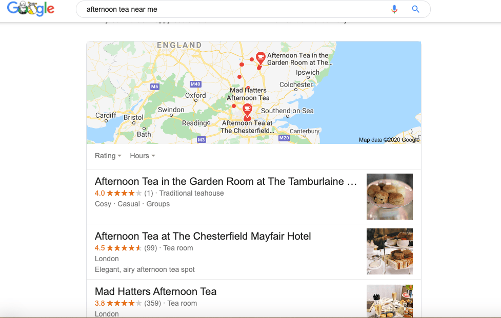
I started off by looking at afternoon tea available near me, and then looked at each website, what was available what does the imagery and type look like? what features have they included? i need to make sure that i am using similar effects to target the right audience.
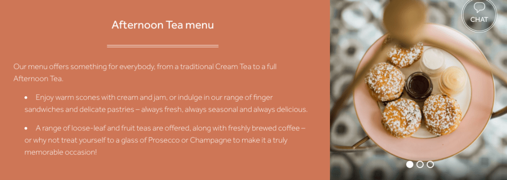
The images are crisp and clear focusing purely on the food, the text is clearly a sans font across a salmon colour background in white but still nice and easy to read. The use of language is very descriptive and minimal. Something i should bare in mind for my own!
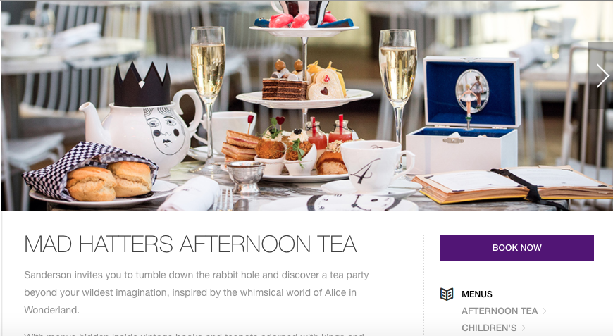
Considering the above is a ‘Mad Hatters’ afternoon tea the design on the website is not mad at all, not even a little bit creative, they have used a basic sans font with next to no colour or imagery. I want my design to be elegant but still have a ‘wow’ factor of colour.
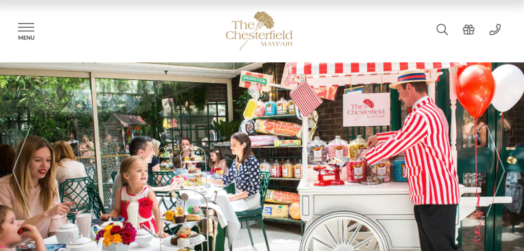
Love the use of bright red in this design, it’s so striking but still keeps a traditional aspect to it. Not so keen on the use of Serif and Sans serif fonts together, i feel it doesn’t keep a theme going well. I would understand this use if the font was not as visible in a paragraph or smaller font size but both are very readable, clear fonts.
Sketches
Now i have a rough idea i’ll use what i like from the above research to create my own front page design and other pages across the document with similar features.
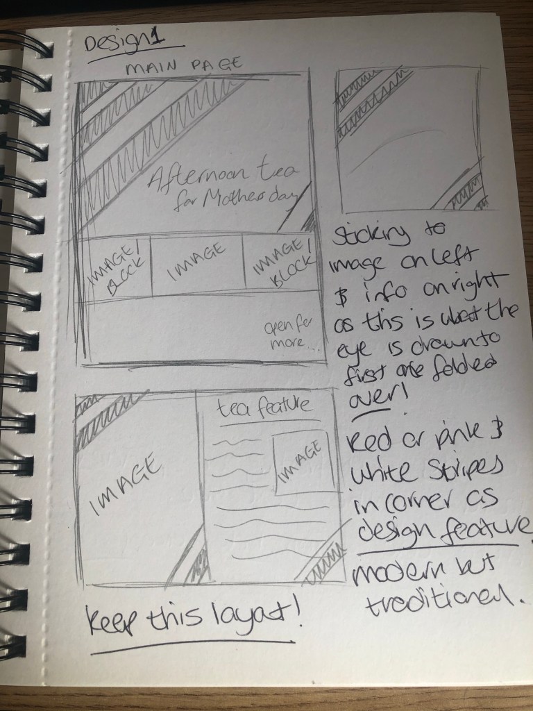
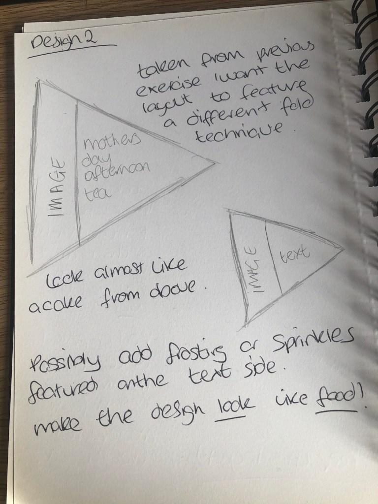
I did two designs in my sketch book, one keeping with a traditional style and page layout with text and images on separate sides along with design features in the corner of the document to continue through each page. Using a calligraphy style font for the title and a more readable sans serif style font. The second was more dynamic featuring an unusual page format in a triangle style to look like a slice of cake commonly featured at afternoon tea. To make the document look like food seemed a good way to attract attention and look appealing, along with featuring text and images. Probably the same font style as the first design as I feel this works best with the area of food and drink I am aiming to attract.
Final
For my final design i decided to go with a traditional layout as this is more likely to intrigue my target audience of mother’s and particularly the elderly. I’ve gone with a bright pink and white colour scheme which draws the eye with lovely large photo’s to keep attention as too much text can be a bit daunting especially reading small text. The photographs used are entirely my own. I’ve used Lorem ipsum text on every page other than the title to differentiate what will feature on the page along with images that match. This would have been easier if i had more stock photo’s to use. The type matches the colour scheme used and is still readable as a calligraphy/handwritten style. It gives the design a more personal touch and would still work well on the webpage side of things. As well as the design layout this would work really well featuring the bright stripes on the corner of each page and bold elegant images.
I did really love my second idea of creating a document that is shaped like food however having worked in the print industry i know how difficult this would be to achieve. So the traditional route seemed better, maybe if i was actually producing something like this i would be able to find a company that would do exactly what the client would potentially want. The bright stripes and images work really well in this more traditional layout though, still engaging and modern.
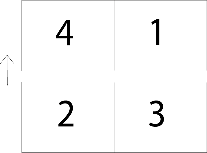
After doing a bit of research on artists book’s and fanzines, I feel fanzines are not as covered and these are more modernly used particularly by universities as they are more concentrated information rather than lots of information in a large book. Thinking about how a document normally folds I need to be more experimental so traditionally a document is folded from 4 sides see rough illustration below.
Given that most documents that are folded are generally square i’ve decided to use a different shape to make this pamphlet look different and more playful. I’m going to use the artists from this page below as i really loved the look of these zines, they’e so creative and brightly coloured.
I’ve kept the pamphlet as basic as possible using American typewriter font to keep in style with modern print styles that are more vintage looking. I chose orange and red to keep interest bright and colourful is more eye catching especially to a younger audience which i want to attract at a university level. Most students will actually look online before they go and view something in a gallery. So i have included QR codes for the above webpages featuring the zines i have mentioned in the pamphlet so they can view the page themselves, a very modern approach to a printed document.
All the world’s a stage, and all the men and women merely players: they have their exits and their entrances; and one man in his time plays many parts, his acts being seven ages.
– William Shakespeare
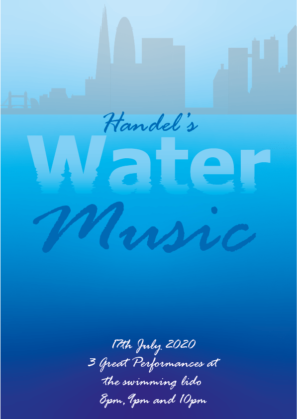
After deliberating between doing Shakespeare’s A Midsummer Night’s Dream and Handel’s Water Music, i thought i had more room to be adventurous with Handel’s Water Music as i know nothing about the play and can research into this.
The first performance of the Water Music is recorded in The Daily Courant, the first British daily newspaper. At about 8 p.m. on Wednesday, 17 July 1717, King George I and several aristocrats boarded a royal barge at Whitehall Palace, for an excursion up the Thames toward Chelsea. The rising tide propelled the barge upstream without rowing. Another barge, provided by the City of London, contained about 50 musicians who performed Handel’s music. Many other Londoners also took to the river to hear the concert. According to The Courant, “the whole River in a manner was covered” with boats and barges. On arriving at Chelsea, the king left his barge, then returned to it at about 11 p.m. for the return trip.
Handel’s orchestra is believed to have performed from about 8 p.m. until well after midnight, with only one break while the king went ashore at Chelsea. It was rumoured that the Water Music was composed to help King George steal some of the London spotlight back from the prince who, at the time, worried that his time to rule would be shortened by his father’s long life, so he threw lavish parties and dinners to compensate for it. The Water Music’s first performance on the Thames was the King’s way of reminding London that he was still there and showing he could carry out gestures even grander than his son’s.
After doing a bit of reading on Water Music and it’s history, I know i wanted to create a water looking effect so i researched how to do this in illustrator on YouTube. I want to create something modern but still respectful of the era this piece was created. So using more elegant typefaces would be the obvious answer. So after searching through types i found one i think looks almost like a written scroll. The background i’ve decided to use a London skyline, of which i drew out myself, i feel this is appropriate as the first showing of Handel’s Water Music was shown on the thames river in London some subtle foreshadowing adds effect to a poster making it look more appealing and upper market to the public. I used a more basic sans font for the Water text as this worked better with the water effect using the wrinkle tool in illustrator.
The water effect used on this is really impressive giving a 3d effect to the poster. Subtle but it works. I’ve added the date and times to the bottom as the same date used in the original performance for the King, as a sort of homage to the original piece.
A manifesto is a published declaration of the intentions, motives, or views of the issuer, be it an individual, group, political party or government.A manifesto usually accepts a previously published opinion or public consensus or promotes a new idea with prescriptive notions for carrying out changes the author believes should be made. It often is political or artistic in nature, but may present an individual’s life stance.
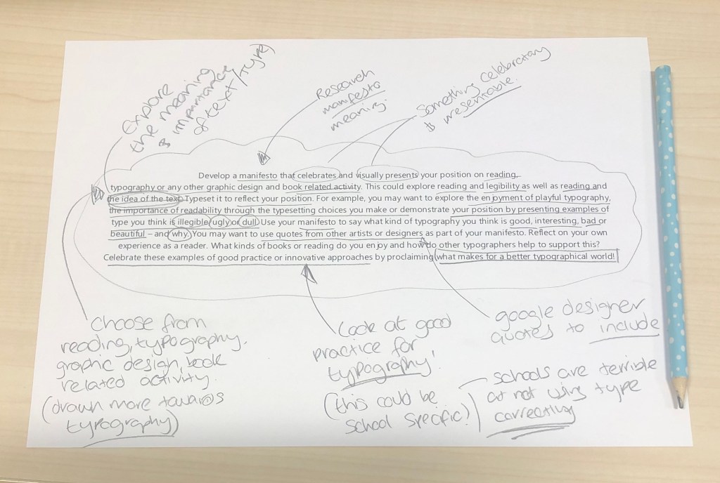
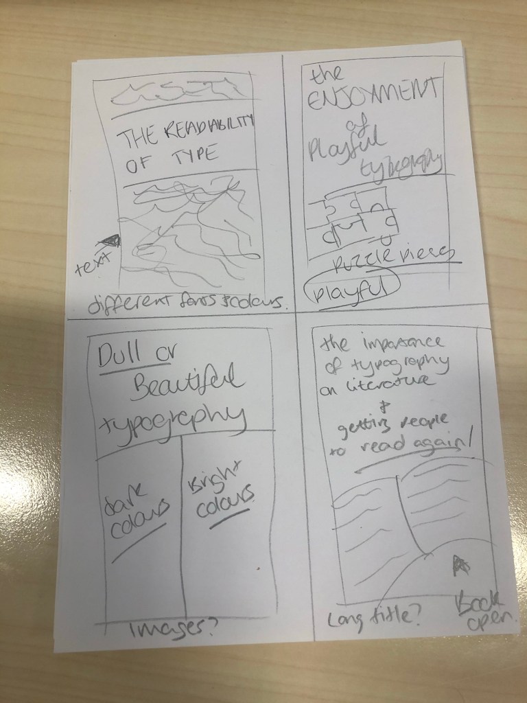
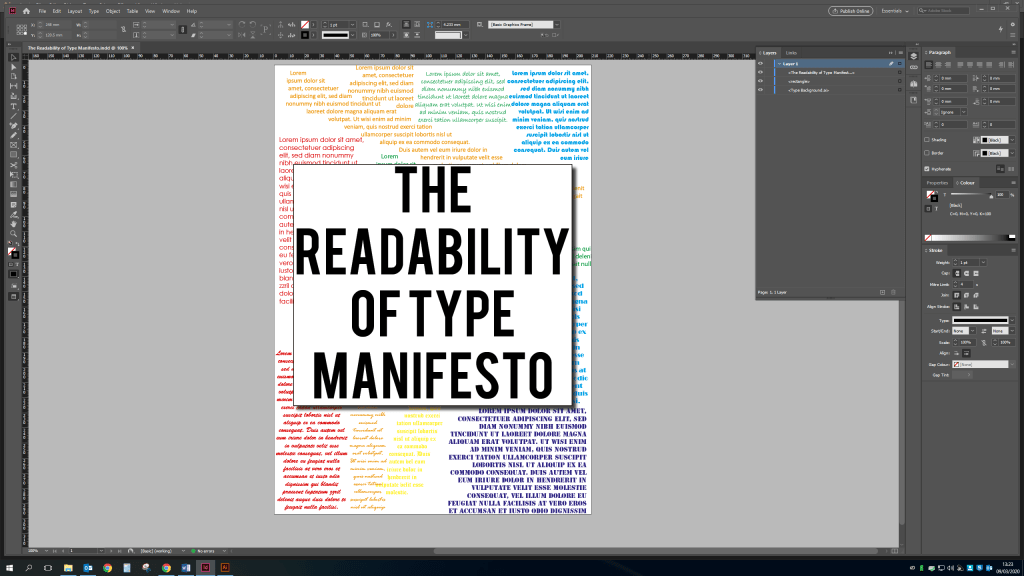
To start i wanted to focus on what my manifesto would be and what the title page would look like. So after analyzing the brief a bit more i decided to focus on ‘The Readability of Type’ looking at different fonts used to different occasions and how readable they are. I then started my work on the title page, i want to create something quite basic not distracting from the main issue but still be eye catching and visually intriguing. So after doing a few sketches and then using a mixture of adobe illustrator and indesign i have created the below. Using different lorem ipsum font types and colours to show the readable and not so readable elements of typography while displaying a bold and clear title.
I then decided to use the rainbow colour style as a background for each page, making it nice and colourful before adding my text in. The text was a bit more tricky, what do i want to include in my type manifesto, who is my target audience? Well after working in a school for two years in the reprographic’s department I’ve seen all the work that is created by teachers and it’s not exactly a designers dream. So i would like this manifesto to be sent to schools and given to teachers and students alike so they can see the difference having readable good typography can make.
It came out alright i think, i considered the print making process and kept to 8 pages. Which for me is quite important as for the printer this makes the job easier. The colours look nice and appealing the text is all readable and keeps my message of clean crisp type. I haven’t included a lot of information as my mind has gone a bit blank but this still works as getting my viewpoint across, it would be beneficial to actually send this out to teachers and students that i deal with on a daily basis but i wouldn’t want to be insulting!
My general style of typography tends to lean towards the more creative and outstanding but i have worked on pieces for certain demographics which are more sensible and formal which have still been pieces i like the look of, like designing logos for a housing association in some of my previous work and then going onto designing poster displays for school projects. I’ve collected some images below of things that caught my eye leaning towards my style.
Taken from Google Images
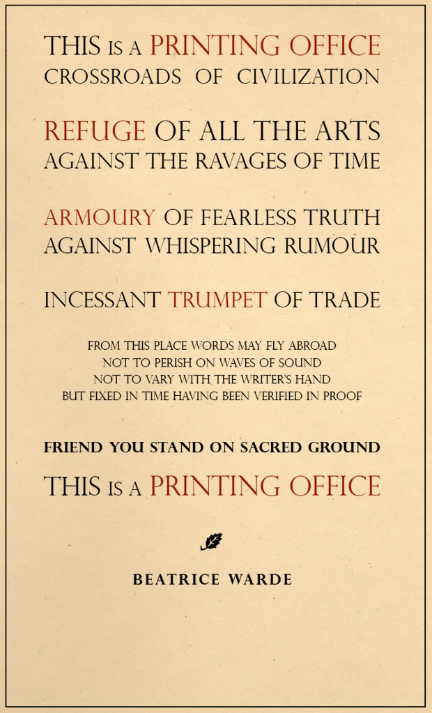
Generally Beatrice Warde’s approach to typography and typesetting is very formal, the lettering is evenly spaces correctly and clear white space in between paragraphs as per image above. I would say this is a good way to of typesetting for certain circumstances for example a business pamphlet etc. however the look is not very eye catching and is unlikely to entice certain individuals, like myself, i find it boring the lack of colour and fun display. But for someone older and more professional than myself would be fine with this.
Taken from Google Images
Whereas Jonathan Barnbrook’s approach is vastly different, this is bright, colourful, edgy and most importantly eye catching. The varied use of fonts and images works really well in the image above for a younger audience this is brilliant however you have the same issue in that this will not appeal to a certain demographic. I suppose with typography and typesetting there needs to be a certain balance between both of these styles depending on what the type of job is.
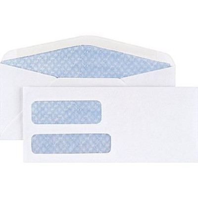
To design a new pattern for envelopes i needed to first look at the current design. The colour is blue i imagine this is for a reason. Most of these types of envelope are for security reasons so no one can read the contents of said letter. However with the modern age it’s very rare to receive confidential letters unless requested for example i no longer receive a paper copy of my bank statement, an email is sent to my private account stating the bank statement is available to view on online banking.
Taken from Google Images
See above the general design for security envelopes, i want to create something a bit more dynamic but still professional.
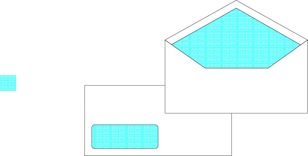
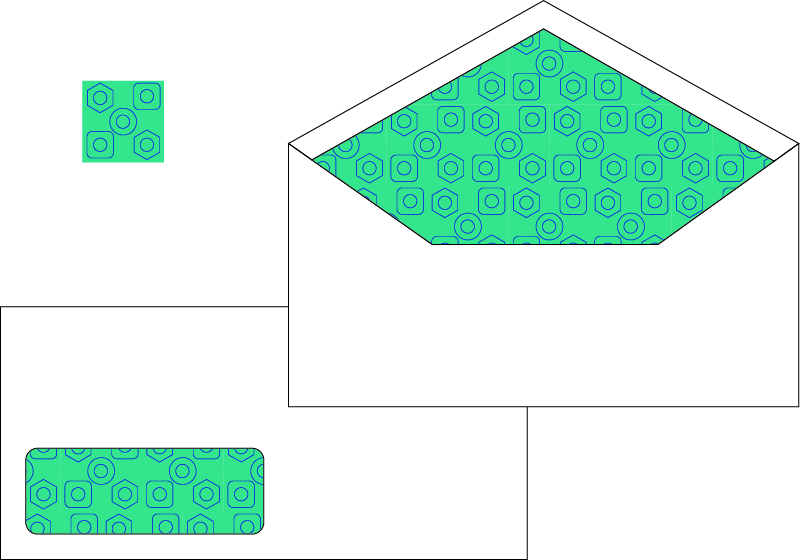
I came up with this design first using the shape of a envelope as an image then creating a pattern in illustrator, this works really well as a professional design and a generic design, something to consider with this brief was i have no idea in what context the business wants to use the new security envelope design. So something generic seemed the easy option.
Then i came up with the below design, purely from using different shape styles but this time i tried a different colour rather than white on blue as previous i have used a dark blue and teal colour. This looks much more visually dynamic and easy on the eye as well as fulfilling it’s purpose as a security envelope.