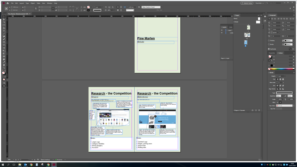
I started this exercise off by doing the research on the competition for this type of website. Generally the sale of books online is done through online giant Amazon. I’ve included screenshots analyzing the details on the page from logo placement, ads and the general format so the client can view and i will add my input on the page and what the client should do for their own page.
I’ve kept the design simple sort of like a booklet that will be sent to the client that they could potentially give to a company to show exactly what they are after in terms of web design and layout.
I’ve then added a bit of statistics about selling through online sites/apps the advantages and disadvantages. Before then also adding some sketches done on my iPad procreate app to give a rough idea of what the webpage could look like.
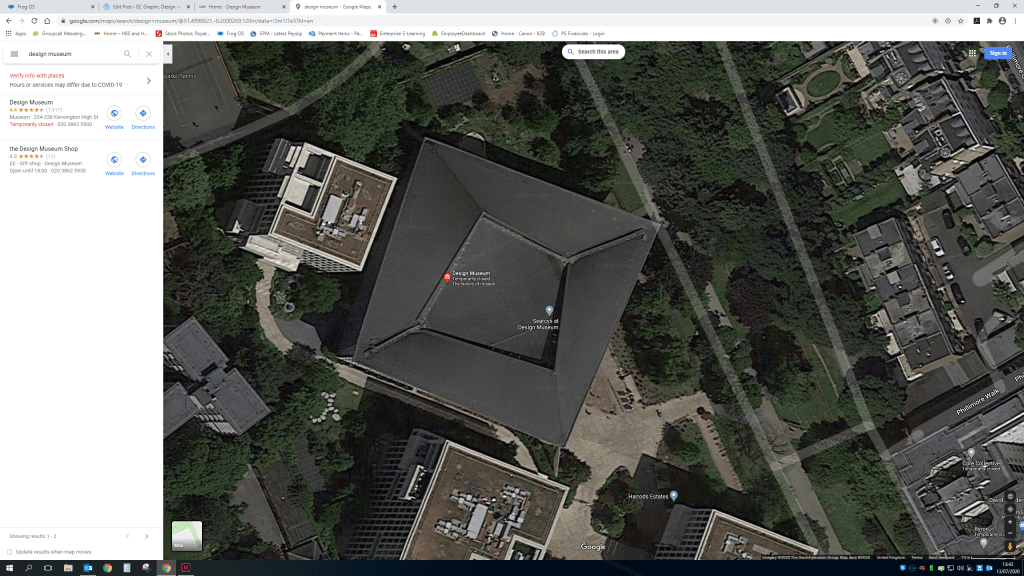
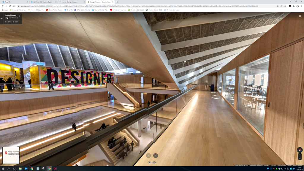
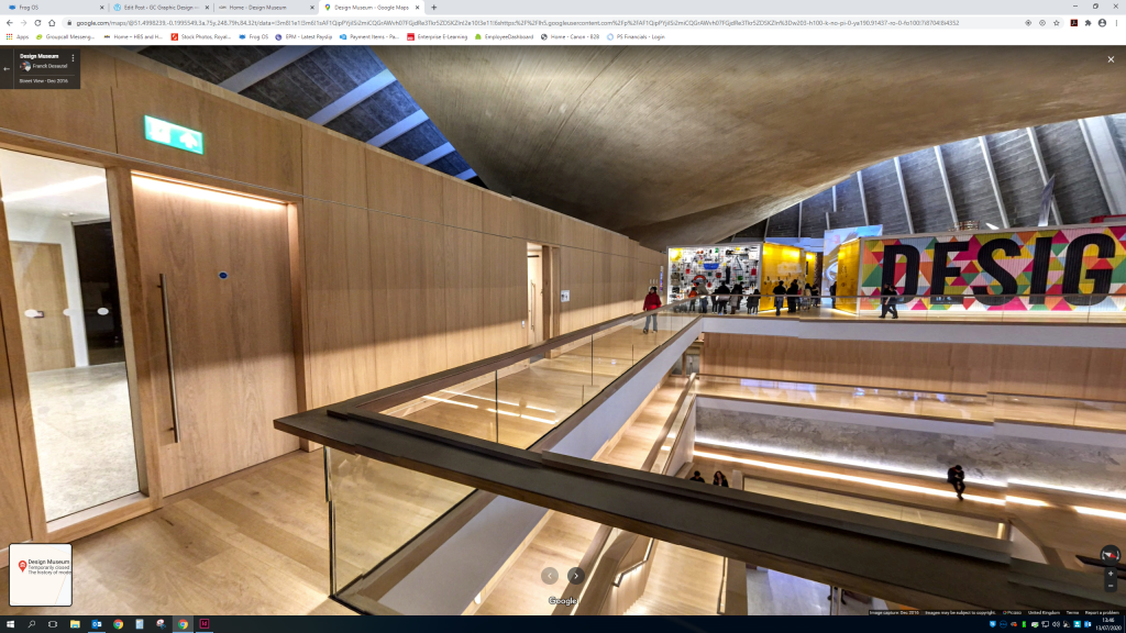
As there was no layout available on the design museum web page i used google maps to have a look at a birds eye of the museum.I also discovered you could view the top floor of the inside of the museum. I found this really helpful as so often design museums have such amazing architecture like the Guggenheim in New York and it would be a shame to miss it.
As the design museum is currently still closed while we are in a global pandemic of coronavirus unfortunately i cannot visit the museum and all it’s glory. So a google map view is the best i can do at the moment to develop ideas for the map layout.
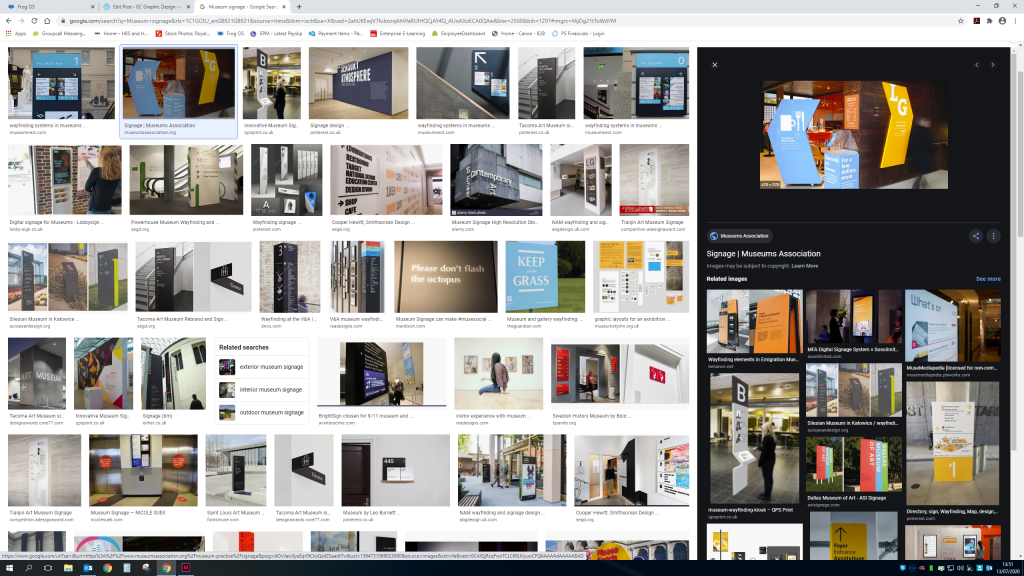
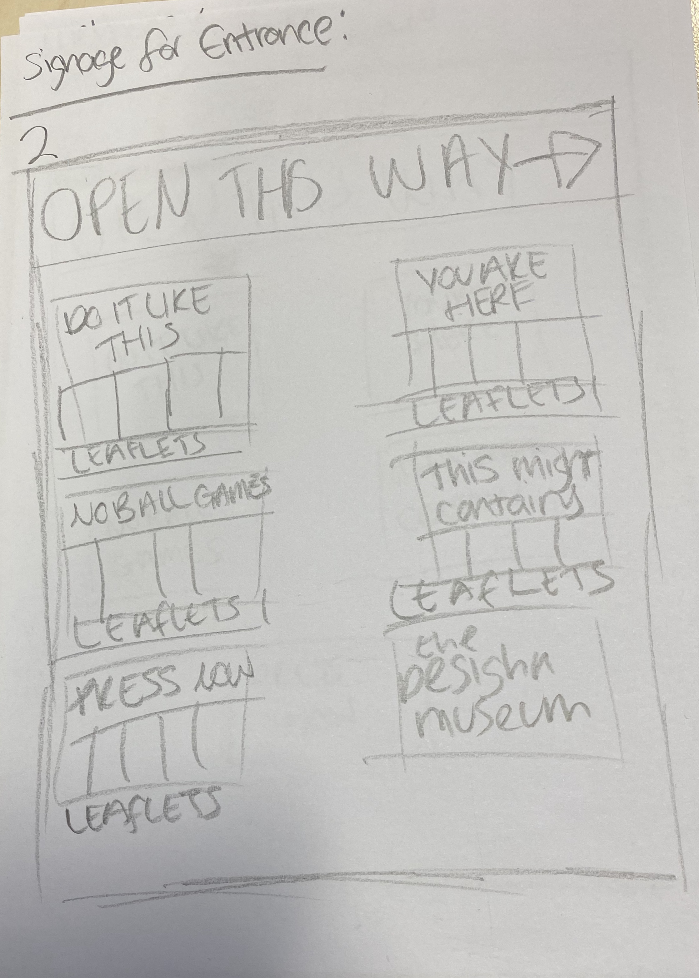
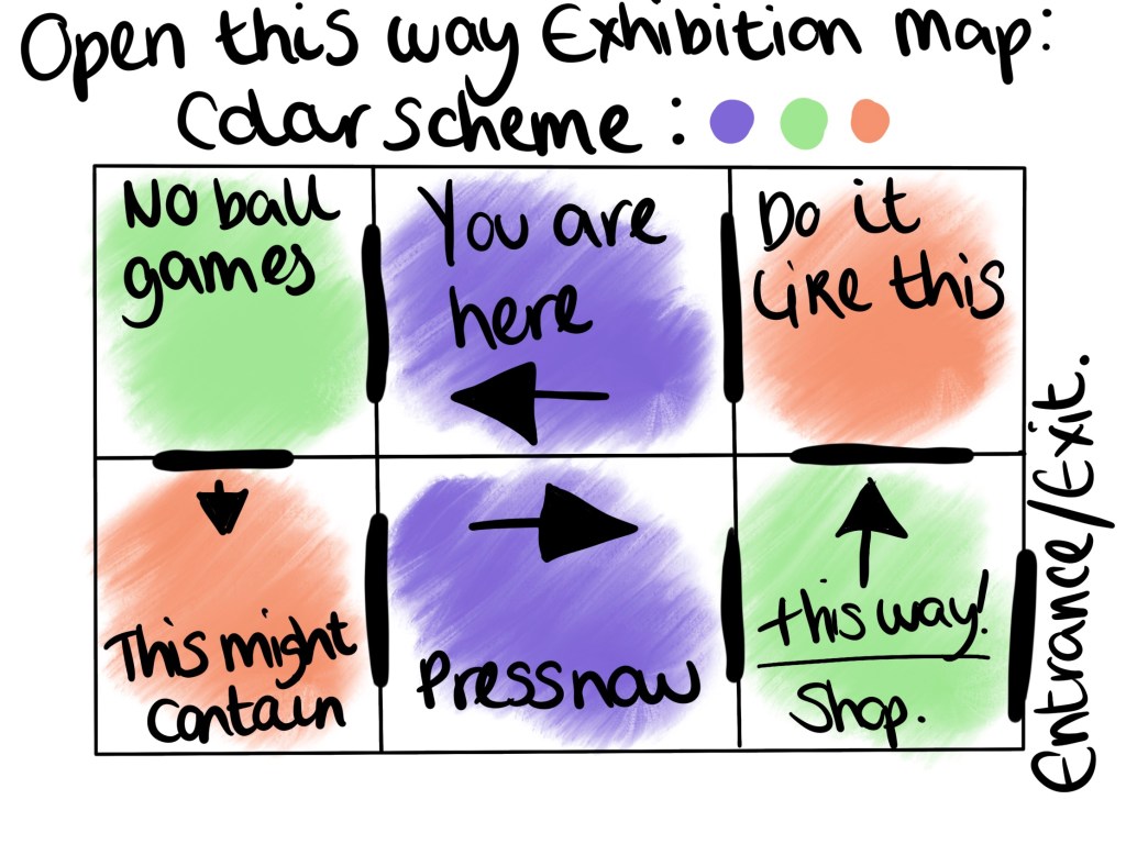
I also wanted to have a look at ways other museums have developed a signage system, i love the idea of the arrow being a part of the design rather than for its primary purpose.
Generally the signage uses a clear sans font in either black or white depending on the colour scheme to contrast.
I will also need to consider signs for toilets, stairs and elevators alongside signs for the exhibitions entrance and exit.Also looking at the current layout of the website i want to keep it as similar with this as possible. Using the same colour scheme and style.Some pages use quite plain backgrounds alongside the same type.And some use images of the actual museum. I’m not sure how well i’d be able to achieve this without images.
Sketches
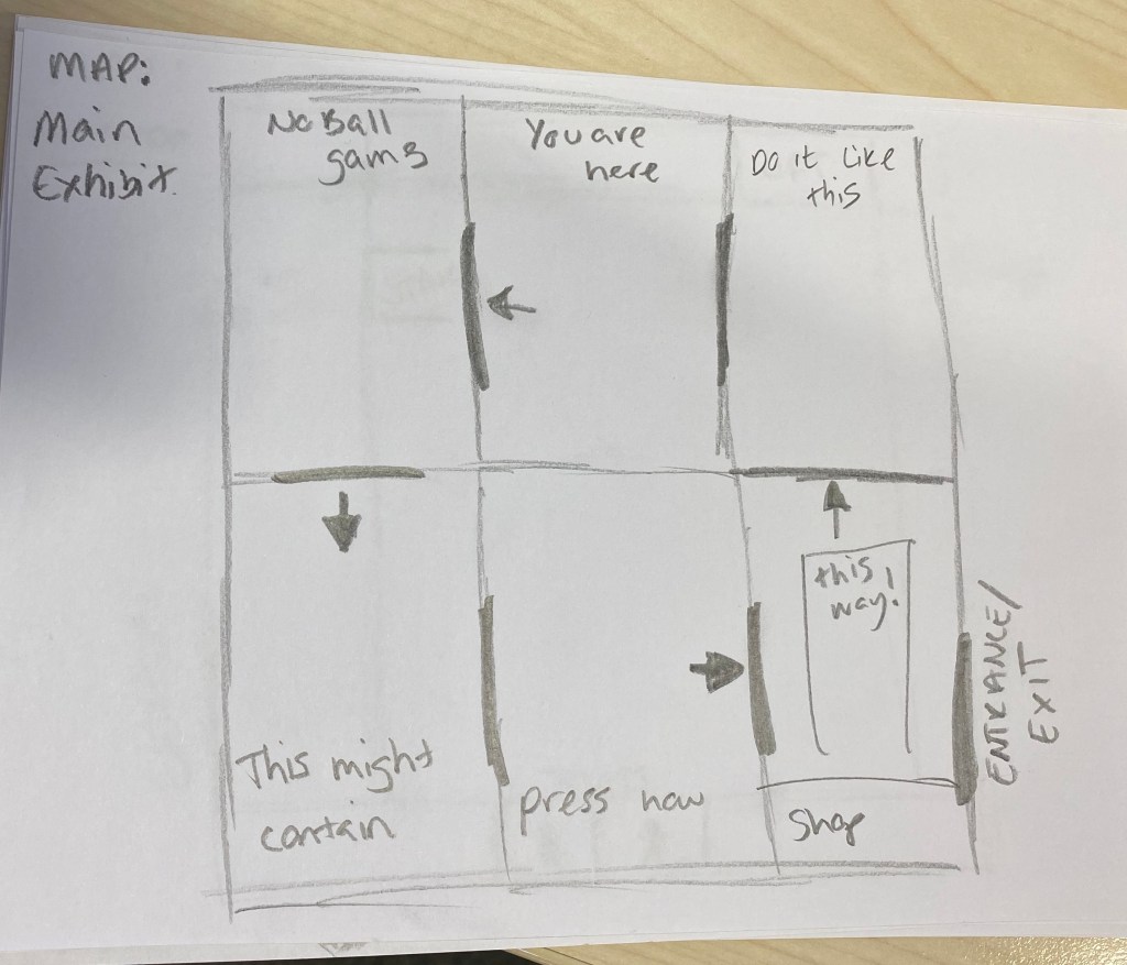
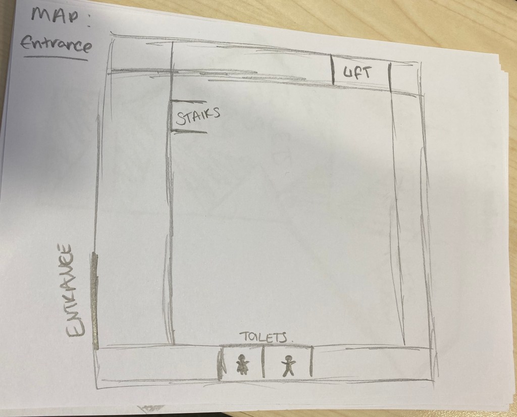
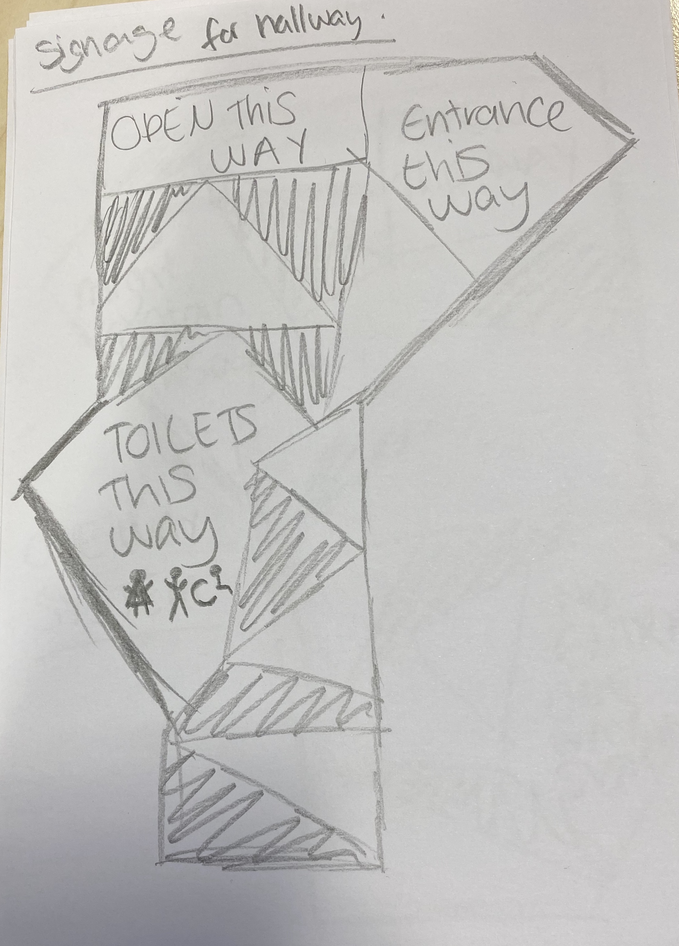
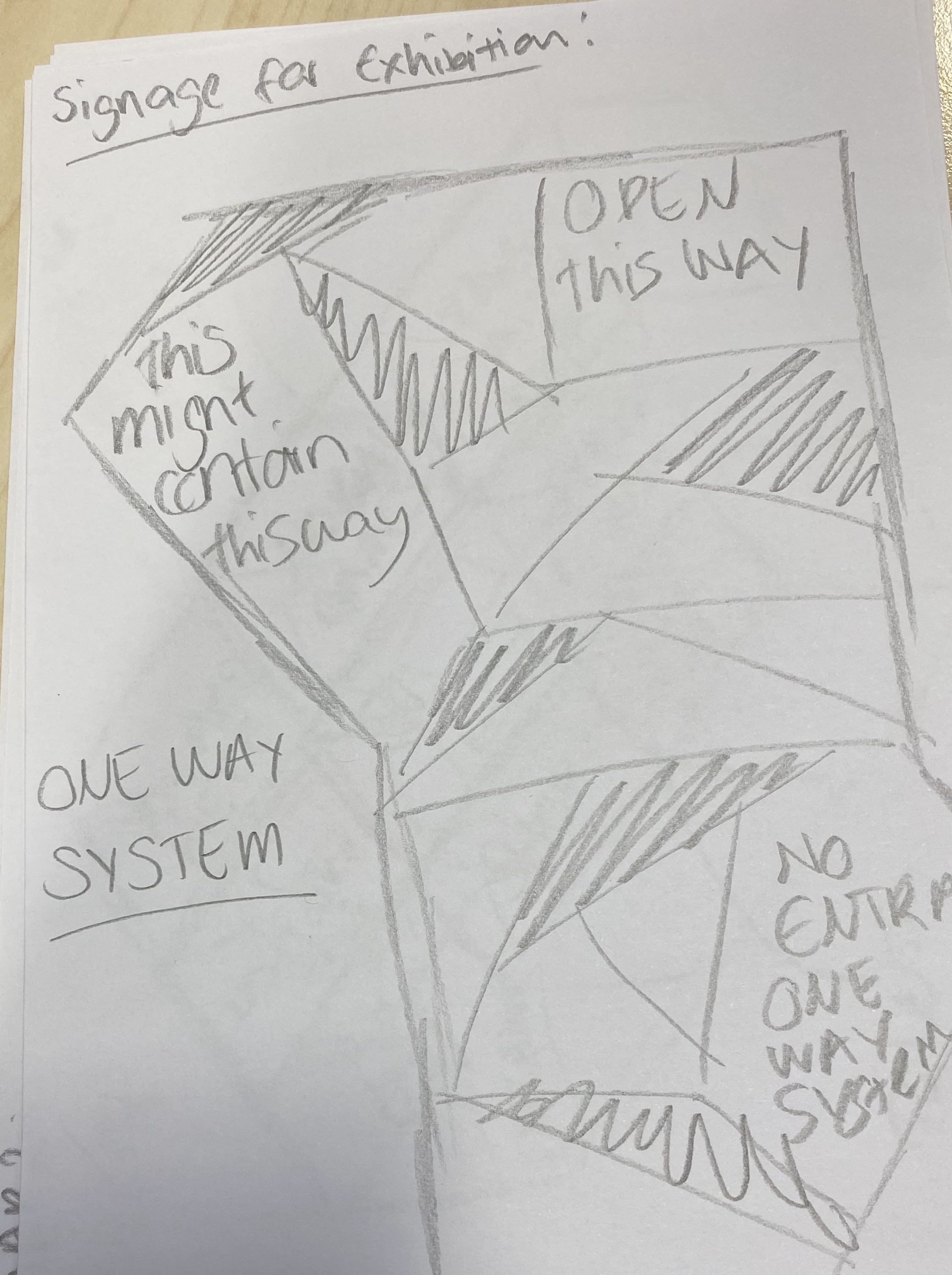
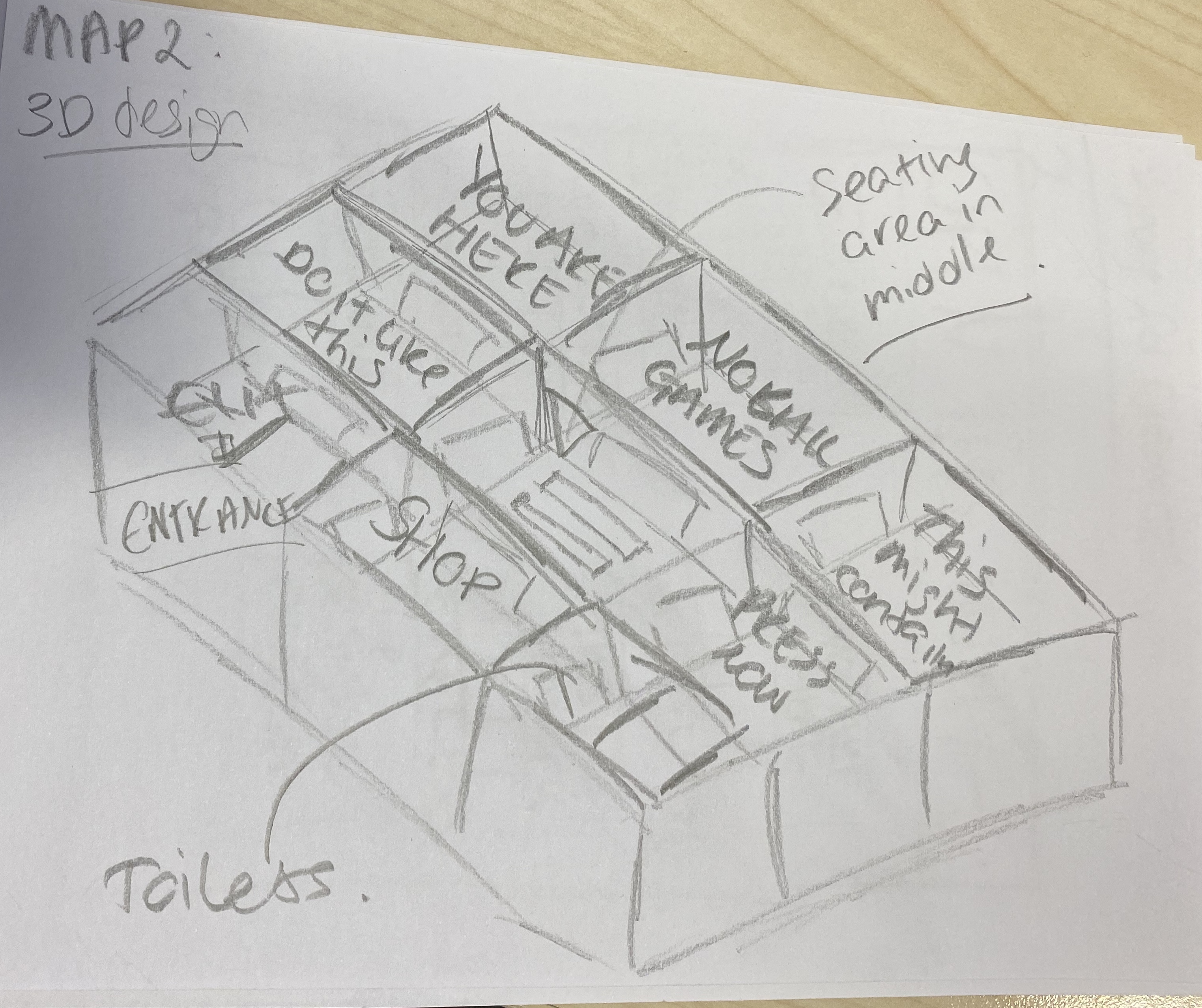
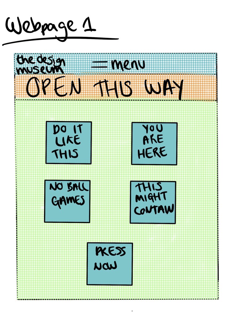
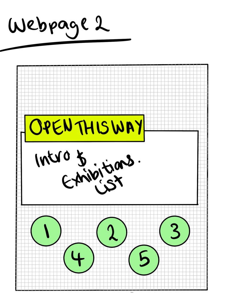
I did some basic sketches of map layouts, signage and webpage designs just to get a basic idea before choosing the design I want to develop further.
Developing ideas
Final Piece
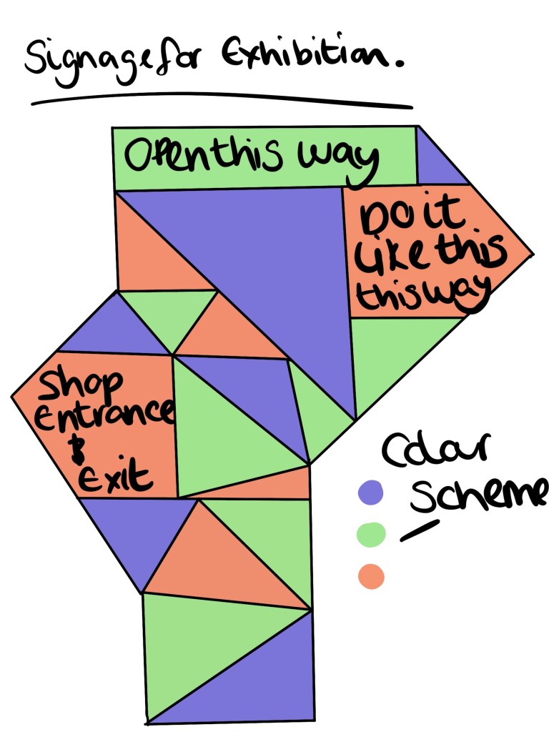
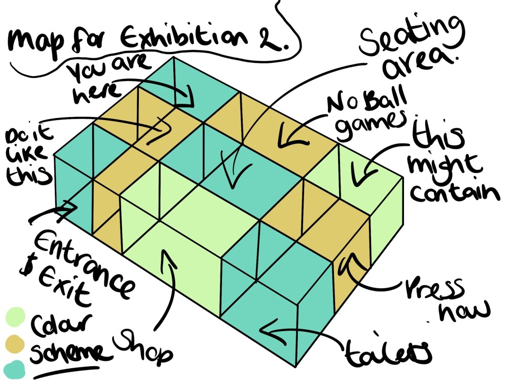
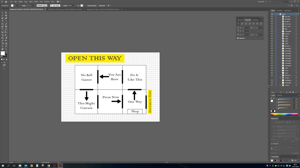
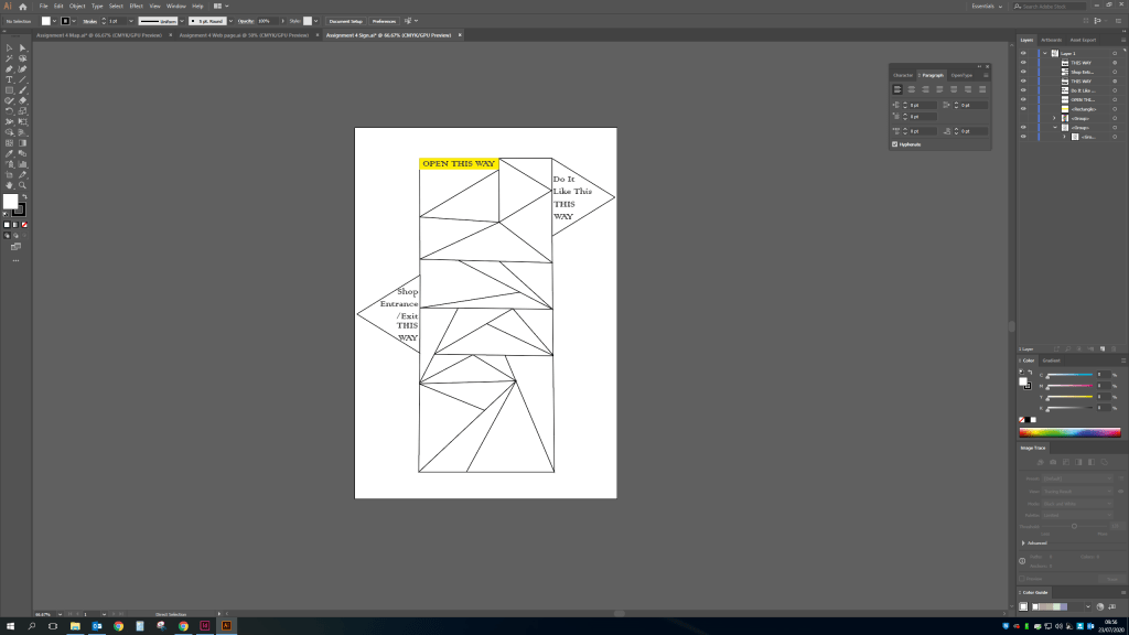
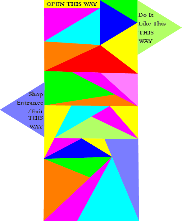
I decided on combining the look of the web page 2 design and the triangle style taken from the screenshots of the ‘DESIGNER’ wall from the design museum.Final Map – I wanted to keep the design of the map very simple and easy to navigate.The signs will be bright and colourful while keeping with the theme.
Final Sign – these will be situated at the entrance of every new room showing the previous exhibit and the next.
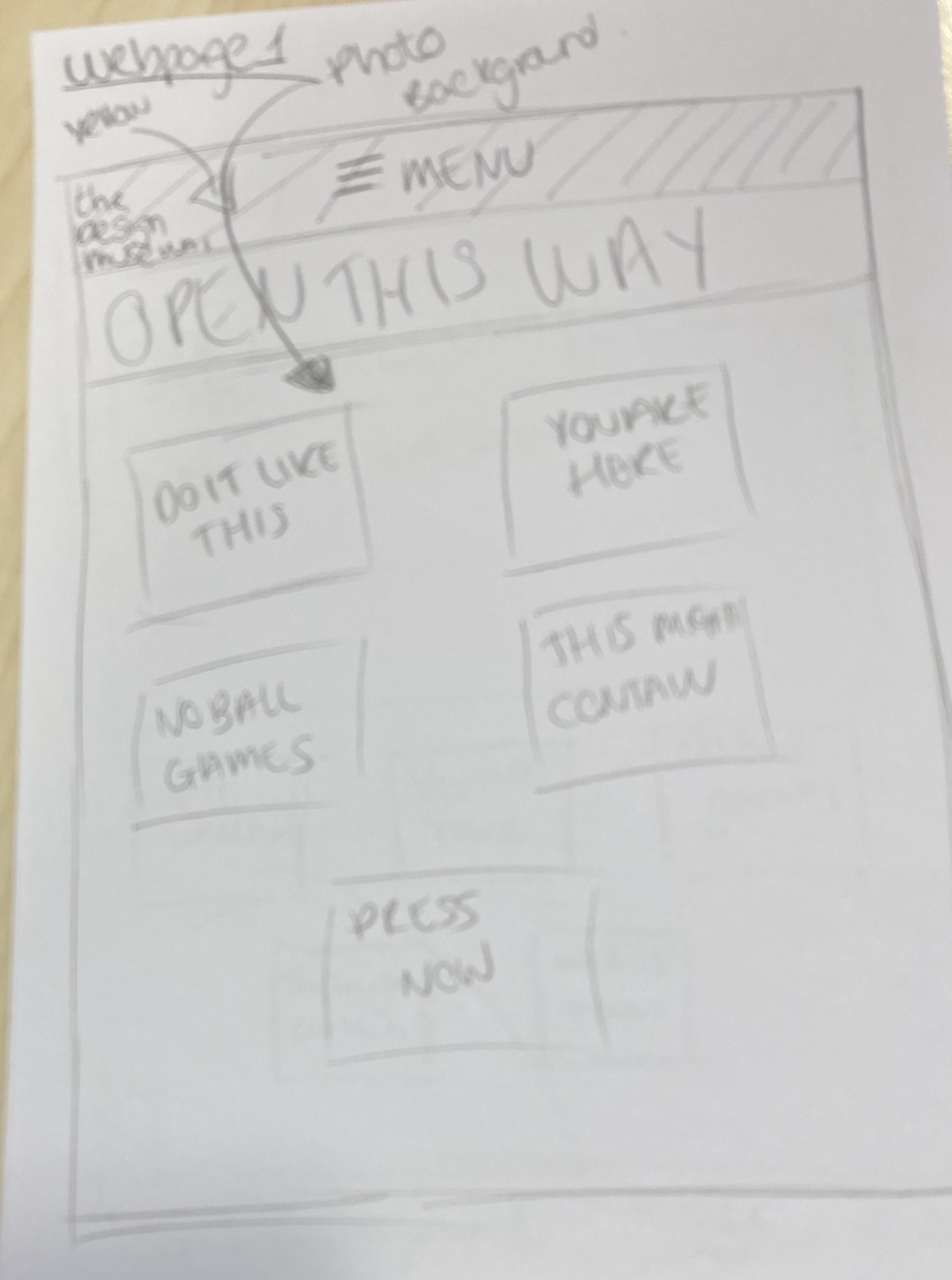
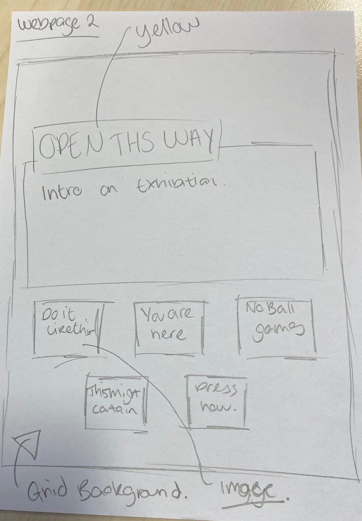
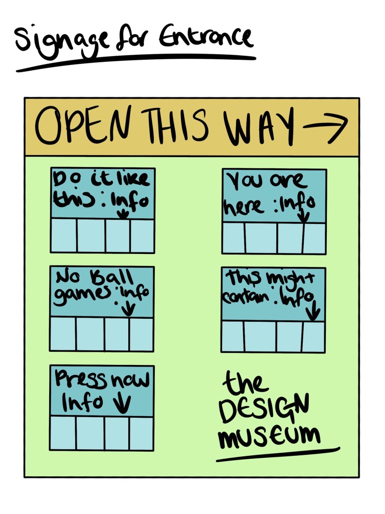
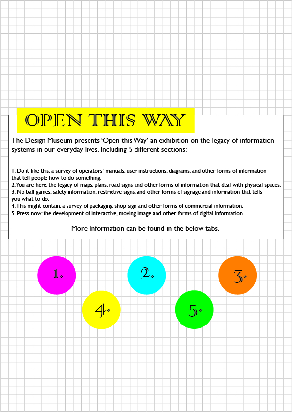
The web page i have kept with the design and added text taken from the brief.
Final Web page – Looking at this again i would change the circle designs to triangles to keep with the theme.
Review
The overall look of the exhibition works really well, coinciding the colour scheme, font and general look together with the already put in place design taken from my research. Looking at the features i would probably add more information if i was to repeat the task as the information is very minimal but as i imagine this exhibit will not be free, its good to keep the mystery about the exhibit to encourage people to attend. I wanted to keep with a one way system for the map as i believe this is what would take place now due to current restrictions from the coronavirus global pandemic. I also feel it would add a level of structure to the exhibit which seems fitting given the nature and the title ‘Open this way’.
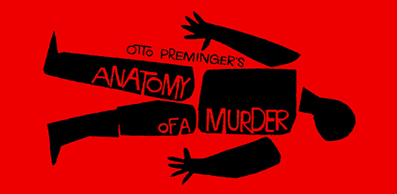
Otto Premingers Anatomy of a murder – taken from google images
After googling Saul Bass and looking at a few bits of his work i can see the similarity in other pieces, see below.
The anatomy of a murder image reminds me of the pixar film monsters inc the intro uses a very jumpy, jaggered edges style but in-cooperates the movie theme.
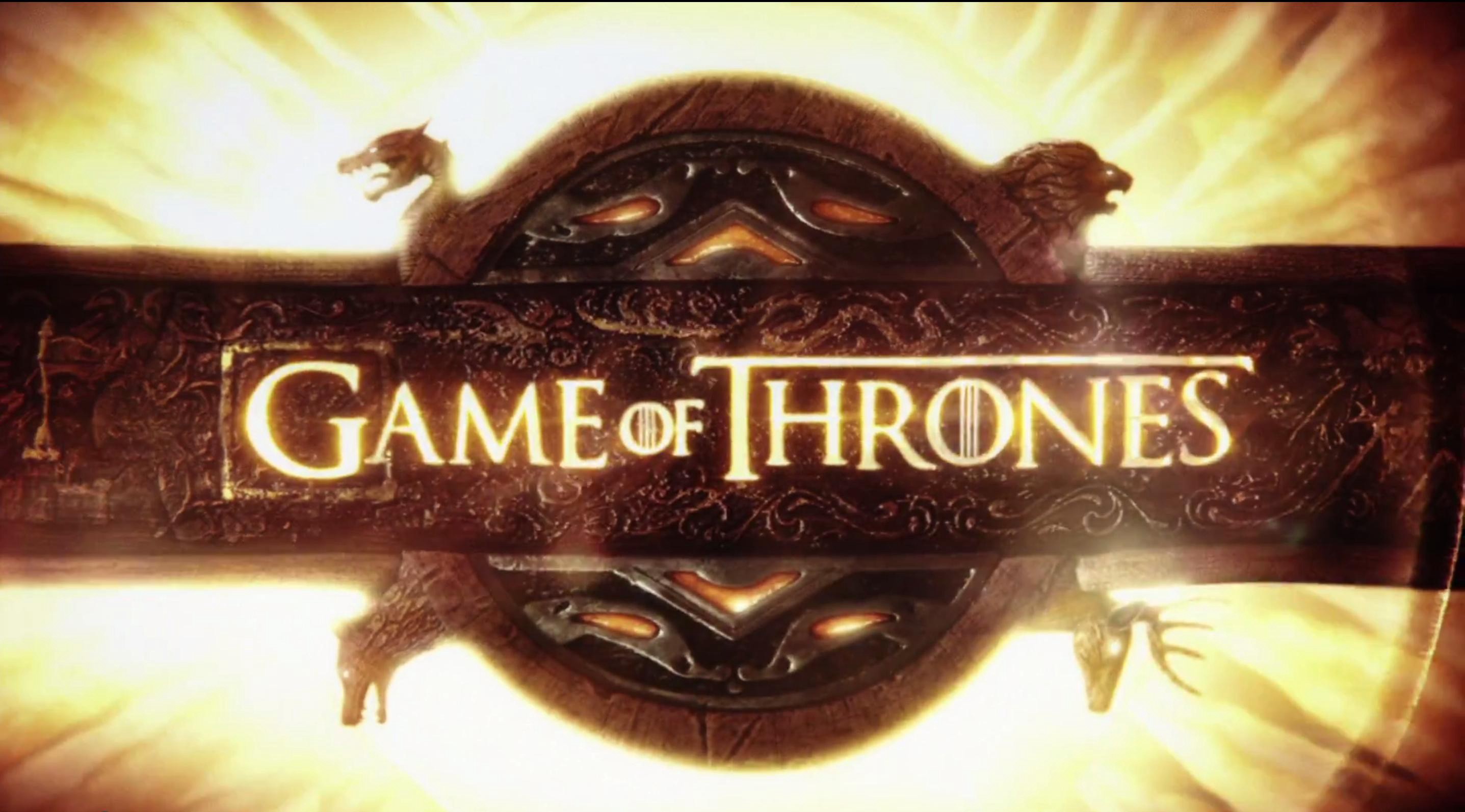
I love the intro used for game of thrones, the text and imagery intricately go together so well, while showing you areas in the world.
The stranger things into doesn’t actually feature anything other than the text but the text and title of the programme is enough to intrigue you.
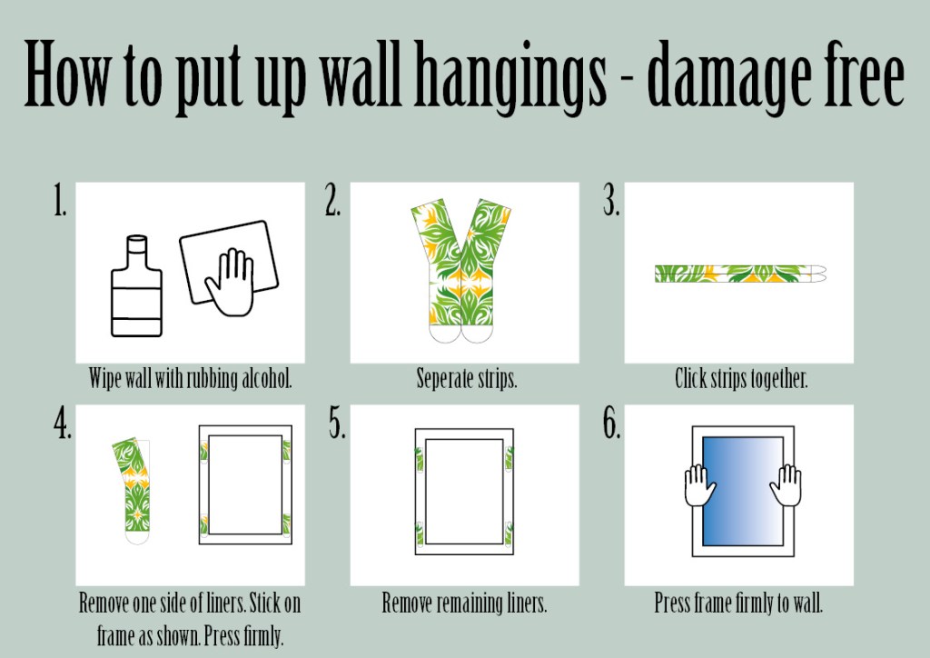
As i’m not very good at DIY I’ve chosen to do a basic task that i do on a regular basis and since moving will be doing a lot more. How to hang wall displays without damaging the wall with a nail etc. using command strips.
First i needed to decide on layout, traditionally instructions are white background and simple text which i do want but i also want this to look visually aesthetic too. So i decided on the below font and page layout with 6 steps to hanging up wall decorations damage free. The text is nice and thin but easy to read alongside a mint green background with white squares clearly displaying each step.
The trouble I’ve always found with DIY instructions is that there is often too much information and it’s difficult to understand where you are supposed to be in the steps and what equipment you need. To go on the back of the command strip packets this needs to be simple, small and easy.
So above is my completed design with added drawings of the instructions i have done in adobe illustrator taken from the website explaining how to carry out this task.
So for this exercise i first need to decide what an alternative national heritage looks like. The traditional look for Englands national heritage would be the union jack flag or some landmarks from our capital London city, personalities would be that English people are generally considered quite ‘posh’ to other countries like the US. So I’m going to use the various stigmas that are known across the globe about this country for example the known fact that the English love an alcoholic beverage considering the amount of pubs there are in the country.
I’m going to use Photoshop at a low resolution to create some images using a minimal palette of colour but still portray an image.
I ended up with the below image i also added a ‘sun’ at the top of the image as this country relies so much on how the weather chooses to behave. Especially when it comes to the consumption of alcohol as nationally we enjoy what’s called a ‘pub garden’ consuming a cold beverage in the sun is considered rare but part of our alternative national heritage.
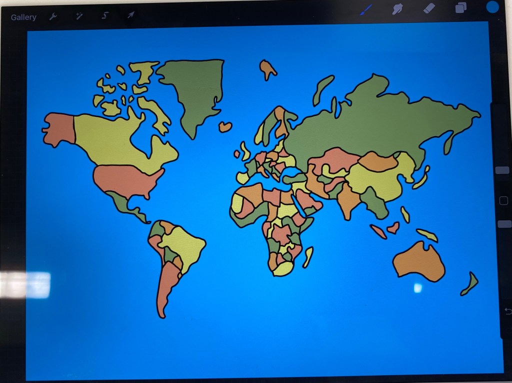
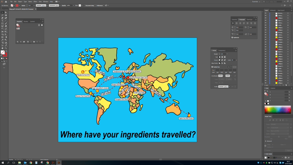
For this exercise i want to display all the information but in a clear and easy way to read. So I am going to use a flat layout of the world and display where the ingredients are sourced from and where they travel to and then arrive at the shops to be bought by customers. I want to show how we are getting ingredients from all over the globe and how much this is probably costing us in terms of the environment.
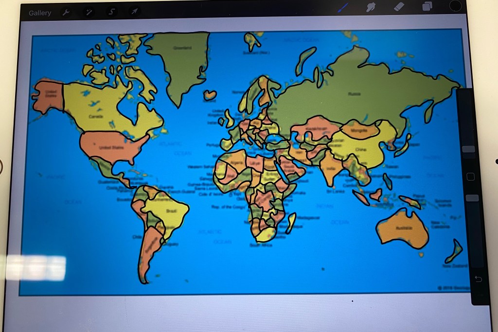
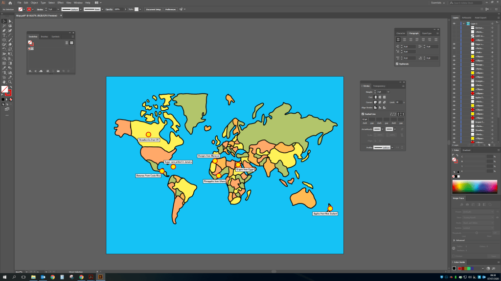
Using my iPad and procreate (a drawing tool) I found an image on google of the globe map and did a rough outline.Before then adding some colour to differentiate each country and uploading onto my pc.I then added the locations of all the ingredients across the globe on illustrator.I’ve then added dotted lines and miles to show how far the ingredients have travelled.
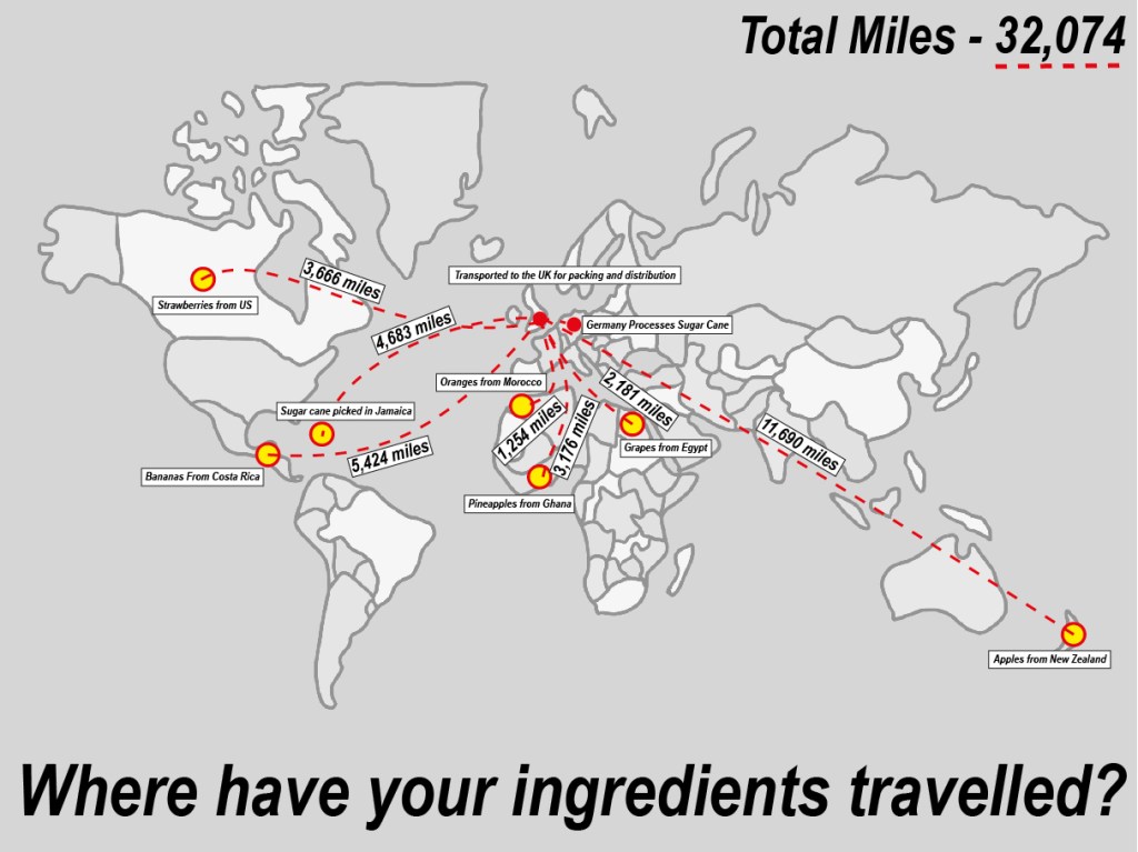
Here is the final version including the total miles and the total – Where have your ingredients been? I decided to make the map less colourful to illustrate that this is a serious issue, we shouldn’t be shipping so much across the world when so much is available in our own country and would cost considerably less money wise and be better for the health of the planet.
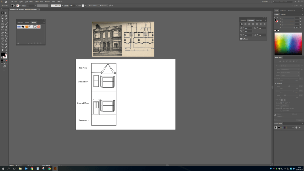
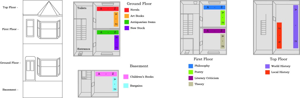
As the handheld book struggles to keep up with modern demand of instant reads such as the kindle. It’s important to highlight how many second hand bookshops will be finding it difficult to keep up. So with this exercise i want to highlight the buildings historic features alongside a 3d model of each floor and each section labeling the a-z in each area.
I started this exercise by doing a basic drawing in illustrator from an image of an old Victorian terrace house labeling the different levels of the bookshop.
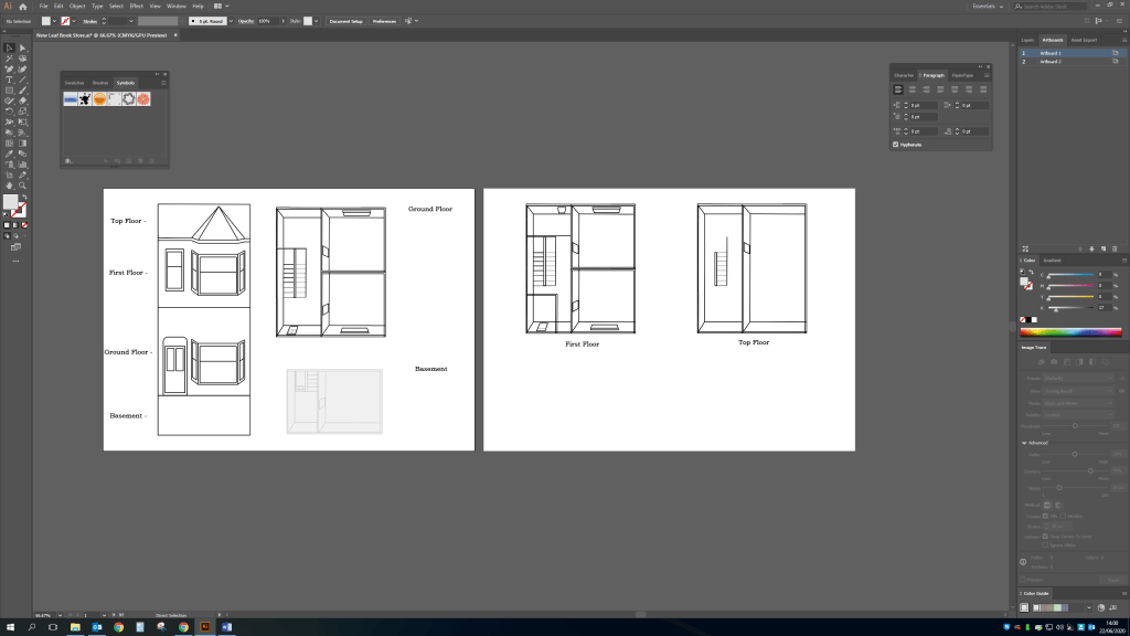
Before then doing an outline of each level in more detail i will then add the bookcase in a different colour and add what the section includes.
See below the finished piece i’ve kept this very basic and easy to read but still shows the elements of the house and where bookshelves are and what sections are where. I wanted to keep sections to only two areas per room, with the current social distancing rules implemented for the foreseeable future i think it’s important to keep people apart as much as possible, that and long term i find it easier to find things i want when i know exactly where to go for example if i was looking for Novels i know to go into the back room on the ground floor, back shelf. Almost like if i looked on google to see where a certain shop was and how far i need to walk/drive to get in and out quickly as possible.
I have actually been involved in a lot of directional signage with the current pandemic, i have had to create signs for different zones to keep people away from one another. So this included a directional sign with an arrow, an entrance sign to make sure they are using the correct route and toilet and classroom signs. Considering this i believe the same can be achieved through tourist attractions.
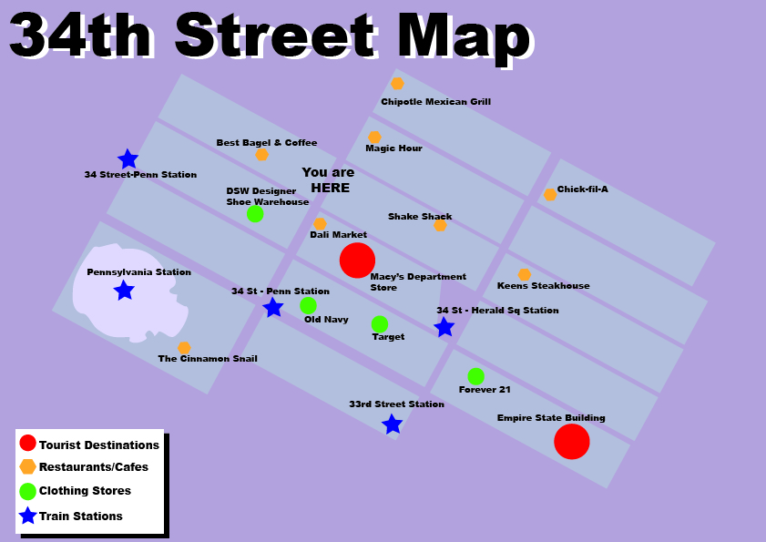
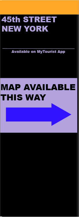
I’ve decided to use my trip to New York a few years ago as a starting point for this exercise, as making sure i could see as much as possible in a short amount of time was paramount. I stayed at the New Yorker hotel on 34th street in the centre of the city, see google maps below.
So i have decided to use the idea of maps on each poster for each area similar to what is used in most cities for tourists, however i want to include restaurants as well as tourist destinations and travel stations. As a keen traveler i usually want to stop at a restaurant for food at some point in the day and this is NEVER included on tourist signage.
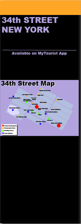
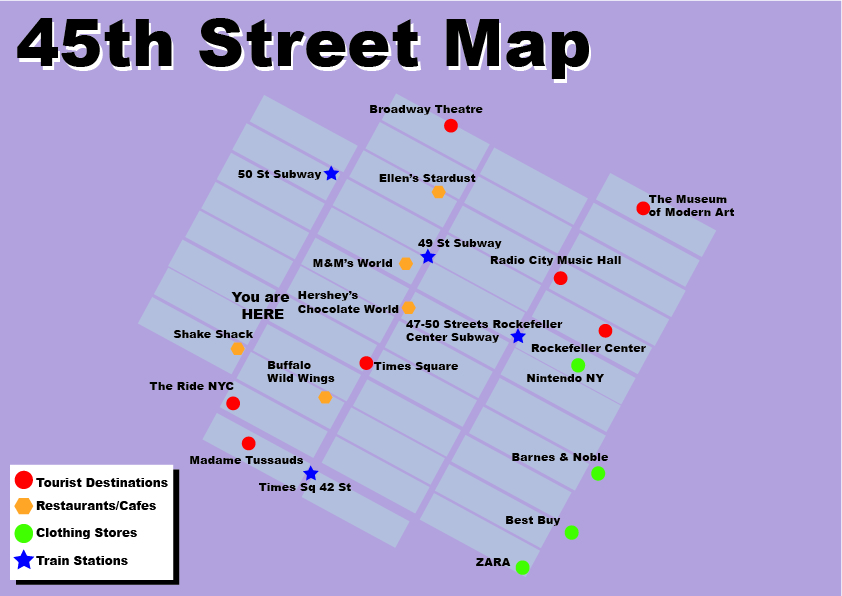
Using the information i have collected from what i know i have created the below map of 34th Street area and then added to a post like the above. I have also included that this information is available on an app. I usually use google maps to find nearby things and most people would if they knew the information would be there. Failing that they can use the signage which will be located at every tourist area.
I will also have map directional posts every block to direct tourists to map hot spots where you can either download on your app or view the post. I feel this would be beneficial as a tourist map signs may be about but you might not necessarily see them straight away and you may be far from the area you are wishing to go to. So this will guide people to the map and the area.
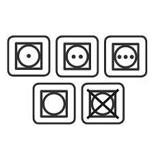
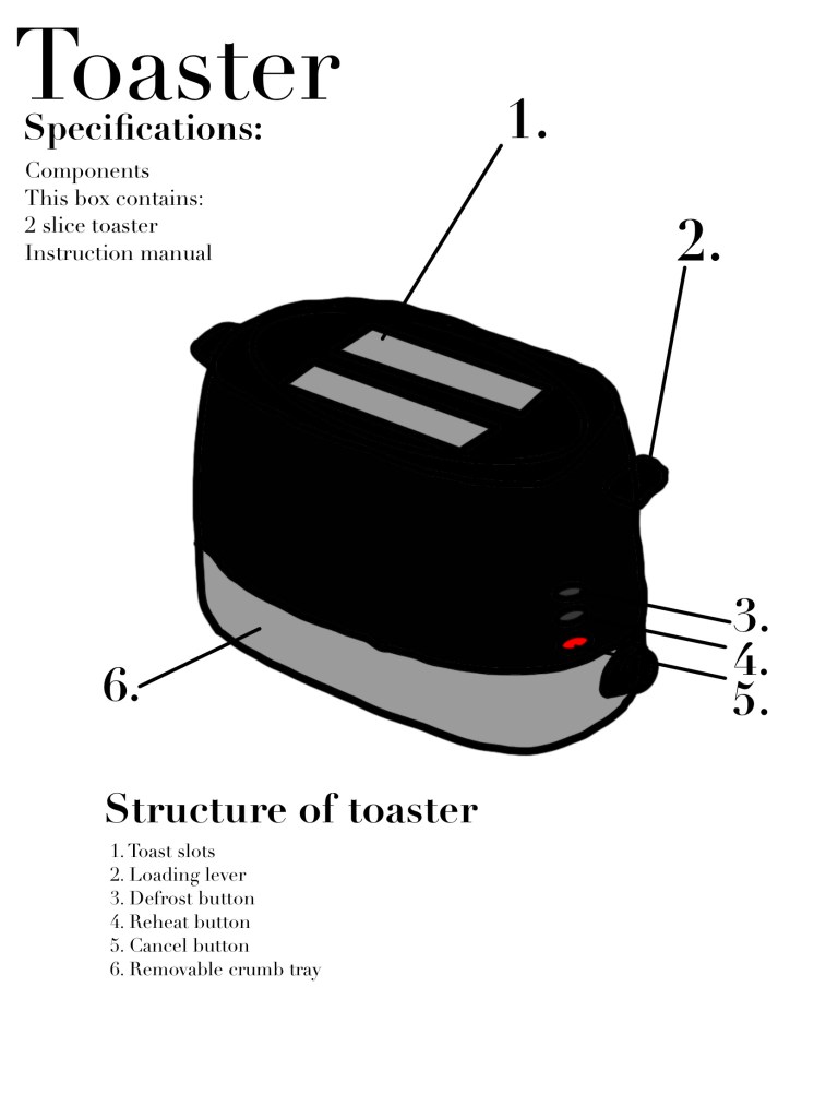
I’ve decided to use the household appliance a toaster for this exercise so I had a quick google and looked at an existing toaster manual with safety precautions inside and there was no illustrations other than a map of the toaster and what everything does. I find this quite shocking as I assumed most manuals for appliances used symbols and illustrations to show what not to do as some things may be obvious to some but not everyone.
I used this manual found on google for inspiration and created the below with added basic symbols similar to a washing machine or a tumble dryer symbol like this.
So using the combined above I have created the below, the look is very simple and easy to understand while using a nice clean crisp font to portray elegance with a simple household appliance.
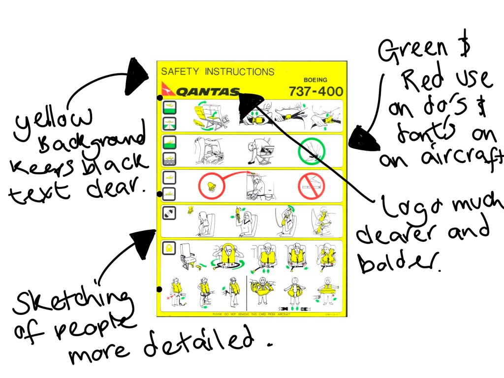
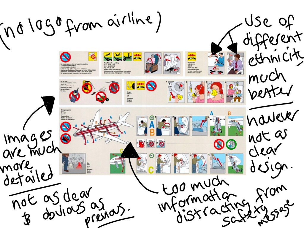
Using google search i have found the below images of aircraft safety cards from different airlines to see how they have displayed information differently.