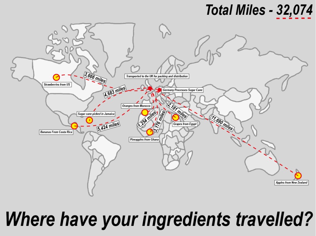
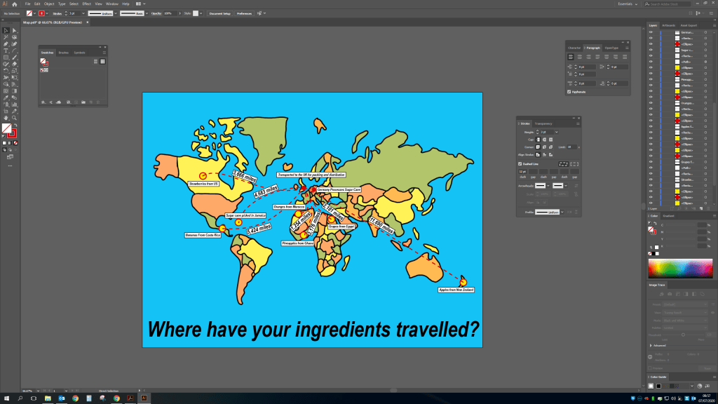
For this exercise i want to display all the information but in a clear and easy way to read. So I am going to use a flat layout of the world and display where the ingredients are sourced from and where they travel to and then arrive at the shops to be bought by customers. I want to show how we are getting ingredients from all over the globe and how much this is probably costing us in terms of the environment.
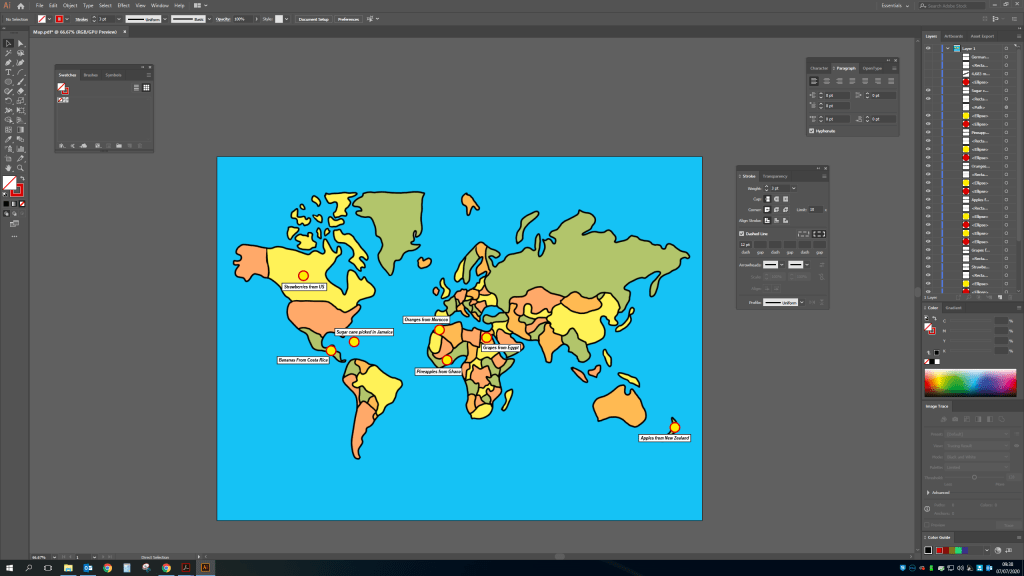
Here is the final version including the total miles and the total – Where have your ingredients been? I decided to make the map less colourful to illustrate that this is a serious issue, we shouldn’t be shipping so much across the world when so much is available in our own country and would cost considerably less money wise and be better for the health of the planet.