For this exercise i wanted to try a similar principle to Simon Bonds 101 Uses for a Dead Cat by picking something simple and used in one way to come up with as many different ways as possible. I used google to have a look at 101 uses for a Dead Cat just to get some idea. I then got inspiration from items on my desk so post-it note pad, elastic bands, paper clips etc. So i went for the one i came up with the most ideas to use in 5 minutes and that was post-it notes.
London’s transport systems have benefited from the pioneering work of a number of graphic designers, for example Harry Beck’s London Underground map and Stanley Morrison’s typographic designs for the London Underground. There’s a long tradition of presenting culture on the Tube, through posters, poetry, mosaics, illustrations and other forms of visual culture. In addition, as an international city, London has for centuries been a melting pot for different cultures and identities; European, African and Asian communities have all established themselves and added something new to the city. For example, London has long been a centre for musical innovation that has developed in the underground clubs of the city before migrating to the mainstream, such as jazz and reggae.
Brief Analysis
Research
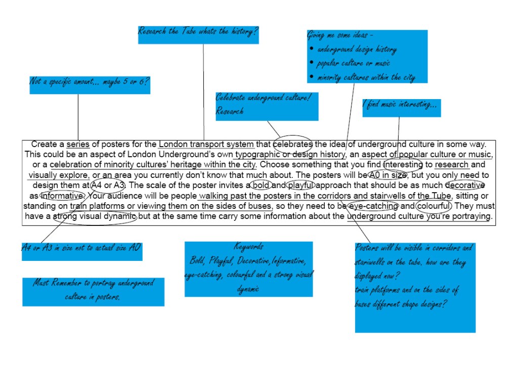
First i wanted to briefly look at the history of the underground is there anything significant i should be aware of or i could use in my design?
Early advertising posters used various letter fonts. Graphic posters first appeared in the 1890s, and it became possible to print colour images economically in the early 20th century. The Central London Railway used colour illustrations in their 1905 poster, and from 1908 the Underground Group, under Pick’s direction, used images of country scenes, shopping and major events on posters to encourage use of the tube. Pick found he was limited by the commercial artists the printers used, and so commissioned work from artists and designers such as Dora Batty, Edward McKnight Kauffer, the cartoonist George Morrow, Herry (Heather) Perry, Graham Sutherland, Charles Sharland and the sisters Anna and Doris Zinkeisen. According to Ruth Artmonsky, over 150 women artists were commissioned by Pick and latterly Christian Barman to design posters for London Underground, London Transport and London County Council Tramways. Art on the Underground was introduced in 1986 by Henry Fitzhugh to revive London Transport as a patron of the arts: the Underground commissioned six works a year, judged first on artistic merit. In that year Peter Lee, Celia Lyttleton and a poster by David Booth, Malcolm Fowler and Nancy Fowler were commissioned. Today commissions range from the pocket tube map cover to installations in a station.
It was really interesting to read about the underground history, especially the graphic posters section above. I never would have thought that 150 women artists work was commissioned for the underground, maybe this is something i could pay homage to in one of my designs?
London and UK has always been a highly populated continent. Even way back in the trading times our roots have always been multi-cultural. This mixing of Punk and Reggae cultures gave birth to well known bands like the specials in the late 70’s through to the 80’s. Throughout the English underground music culture a beautiful exchange of music was being heard in London and the UK.
After doing some initial research i decided to venture into London for a bit of inspiration after all how could i possibly know what to look into without having a look at what is already present. With modern technology vastly adapting everyday and especially now we’ve entered another decade i noticed that on the escalators in the underground used to show posters at the side, now its a TV screen showing multiple posters for various events. Thinking about this i feel i need to design something that will incorporate well being on a screen rather than a print out.
Light display in Tate modernTunnel light display Wembley
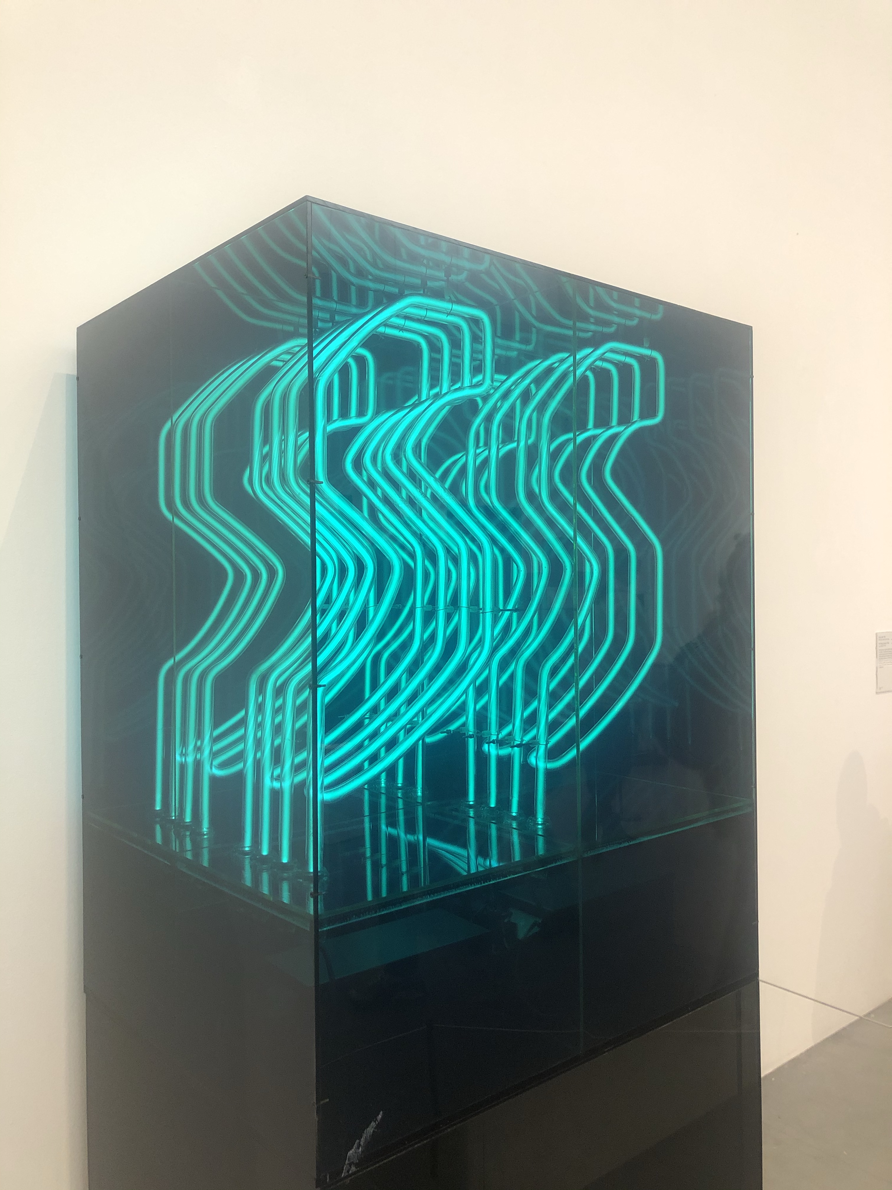
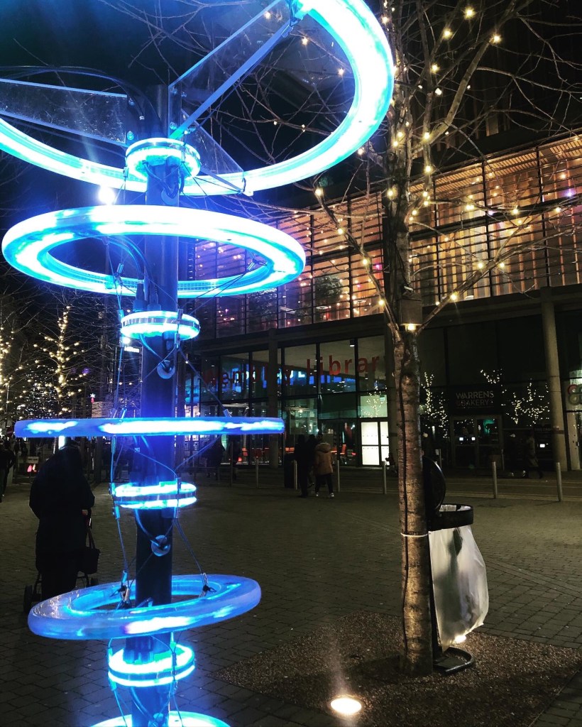
As i went to London just for Christmas, of course all the amazing lights were up around the city so I’ve had the idea of incorporating this into my design making a light effect to look like some of the old club branding.
Christmas light display in Wembley
I want to look more closely at London’s underground music/club scene specifically in the 1980’s. My mum was part of the London underground punk scene in the 80’s and talks about all the clubs she went to it’s something that is still present in parts of London today. therefore still relevant.
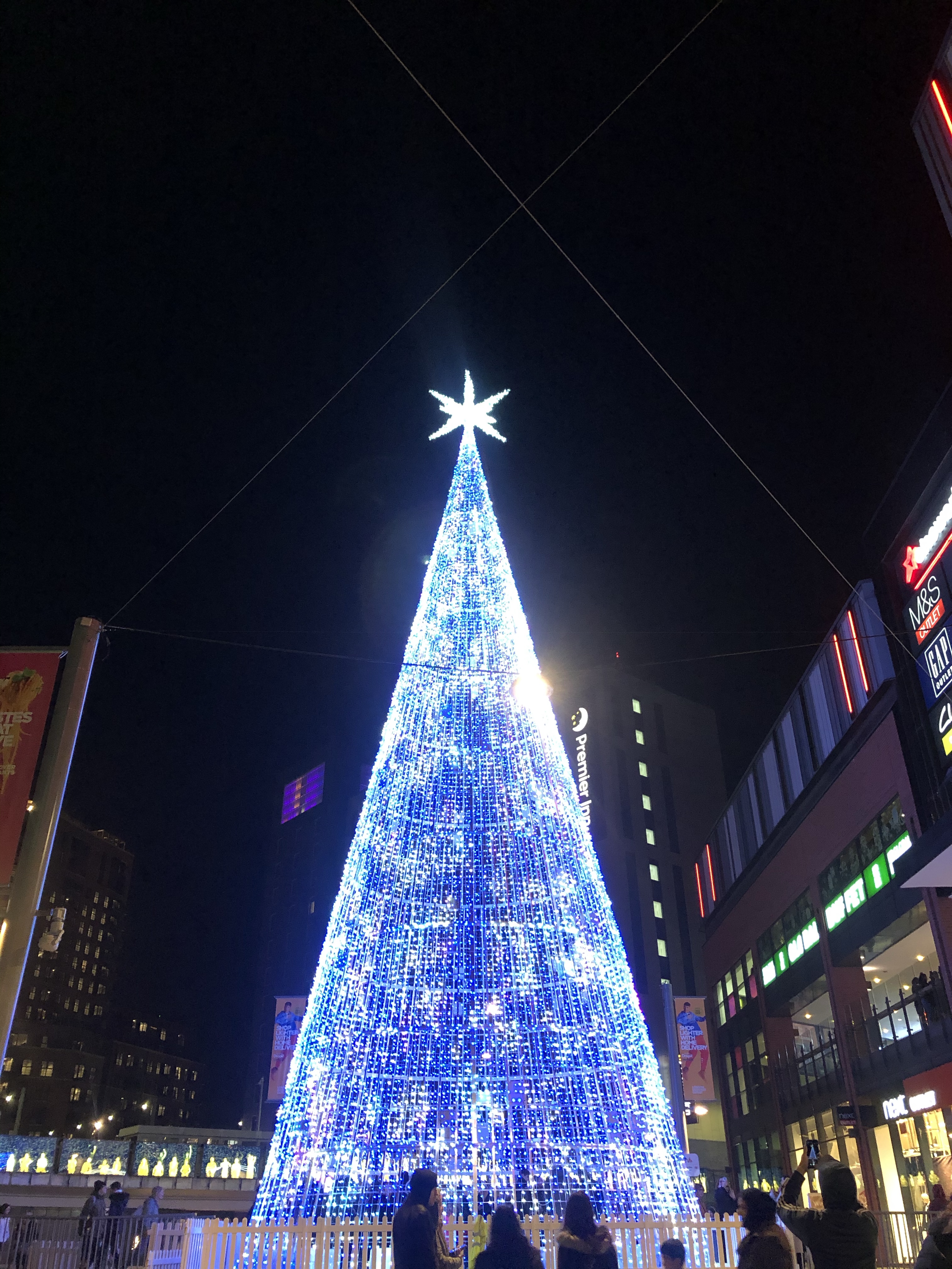
Christmas tree made of lights in Wembley
Final Posters
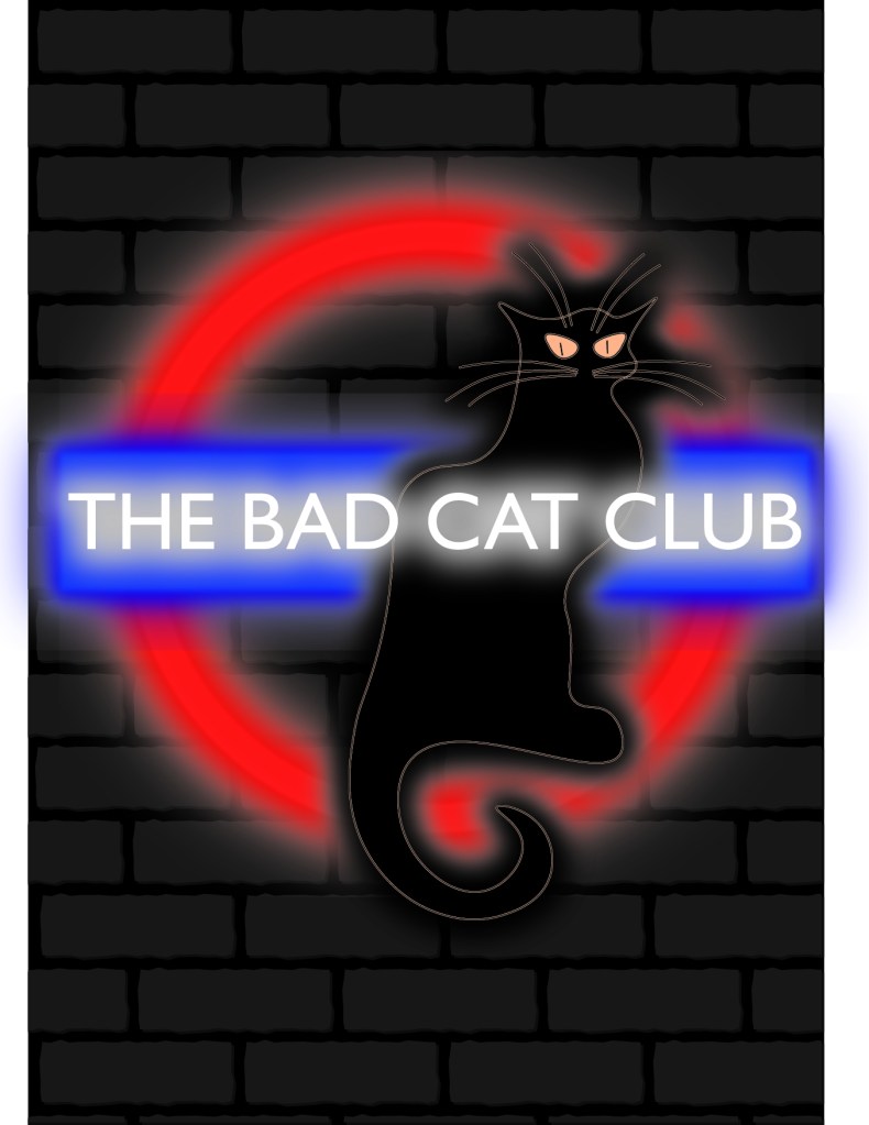
1.The Bad Cat Club – After hours of searching i have found no trace of the bad cat club my parents visited in the 80’s, the only information i have is the logo which was based on Le chat noir from Paris. See below image I’ve done a basic drawing of the cat and added it to my poster that’s the idea i want to go with incorporating their branding into my own posters as sort of a promotion for London’s underground club scene.
Le Chat Noir – Taken from Google Images
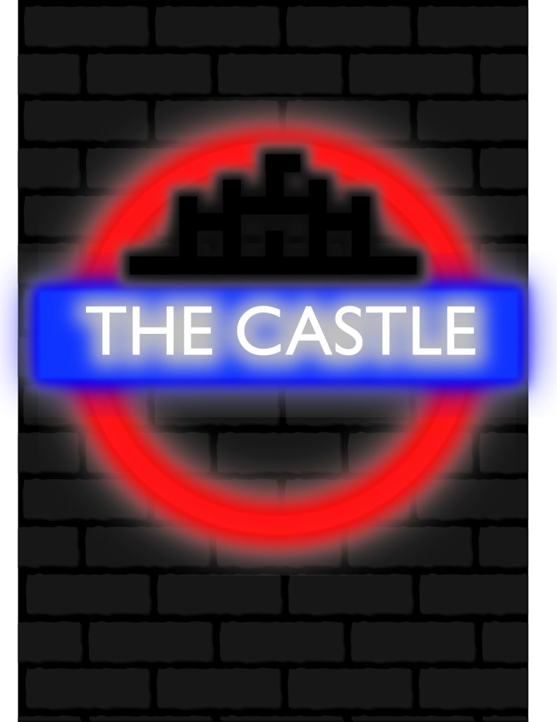
2. The Castle – There’s been a pub at the site since 1792. Situated on the corner of Goodman’s Stile & 44 Commercial Road, it was originally called the Dover Castle. The pub was owned at one time by Frank Maloney, the British boxing manager and promoter who managed Lennox Lewis to the undisputed heavyweight championship of the world. It is rumoured there was a ring on the top floor where boxers used to train daily. It’s fair to say the walls of The Castle have seen it all.
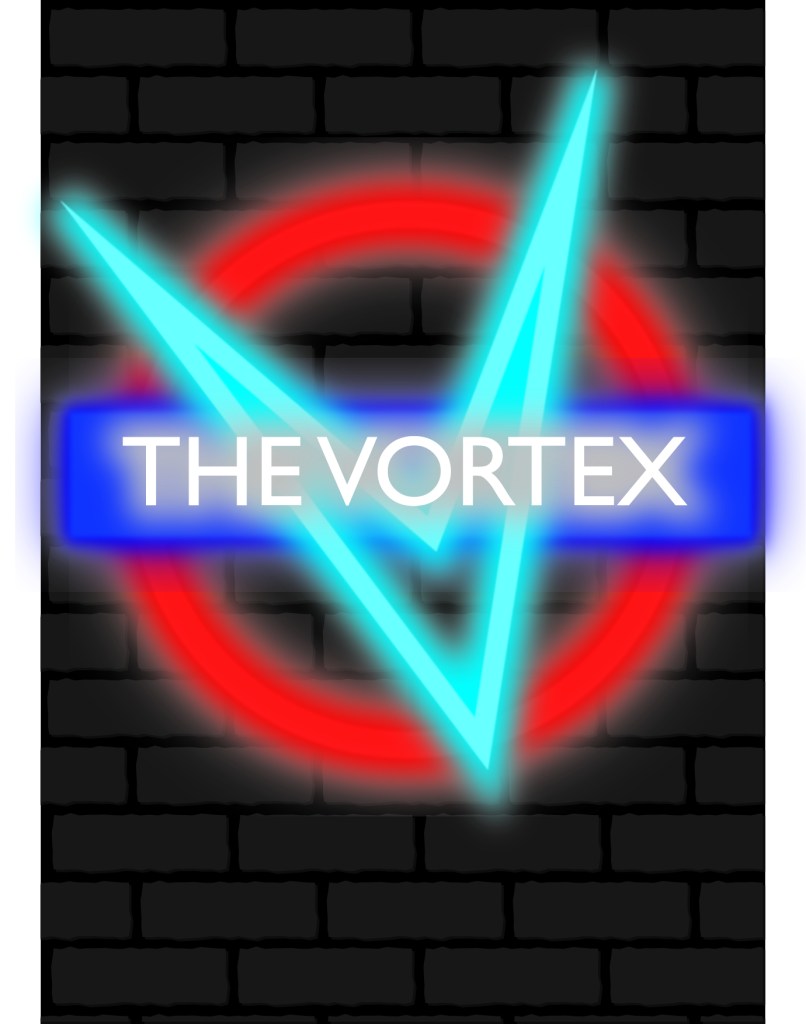
3. Vortex – The Vortex Jazz Club is one of the UK’s premier jazz venues, programming almost 400 performances a year in an intimate space. We were winner of the Live Jazz Award category at the 2013 Parliamentary Jazz Awards.As a volunteer-led jazz club in North London, Dalston, we have been given the accolade of being one of the world’s best, and have even been singled out by the prestigious Downbeat magazine as one the top 150 jazz venues in the world.
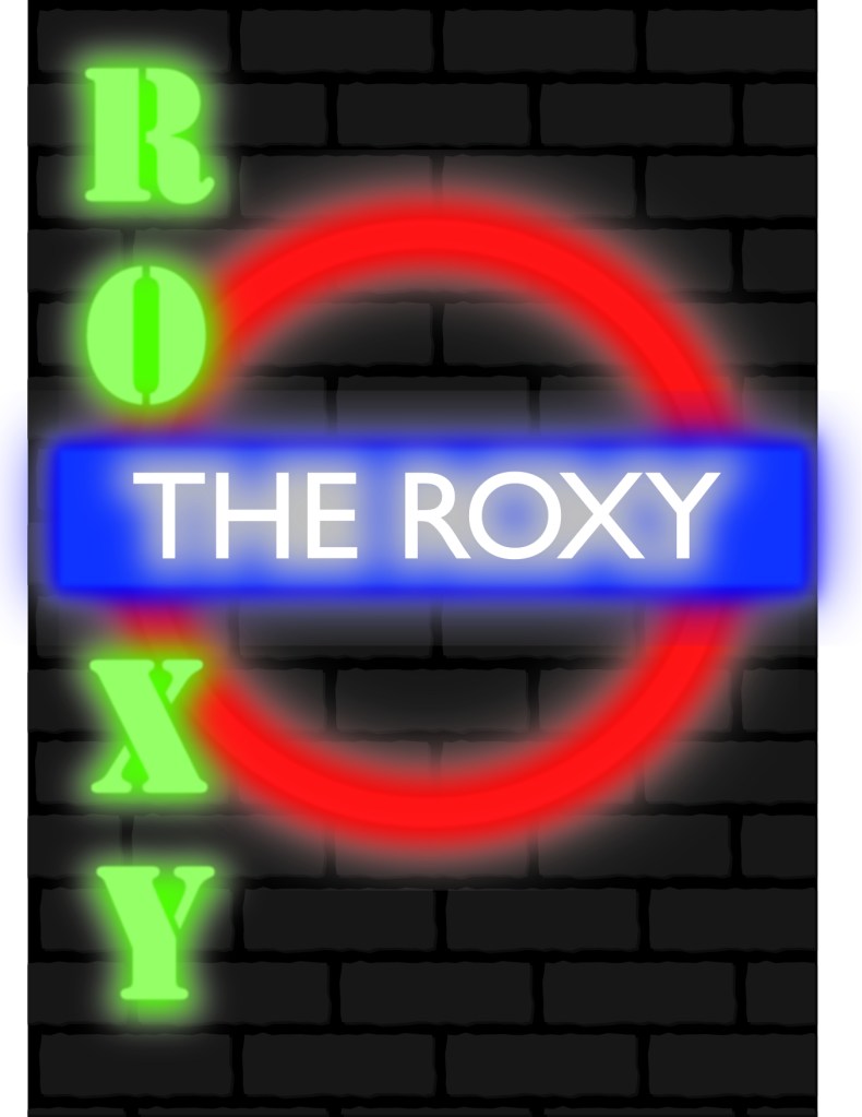
4. The Roxy – The Roxy was a fashionable nightclub located at 41–43 Neal Street in London’s Covent Garden, known for hosting the flowering British punk music scene in its infancy.
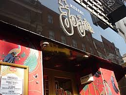
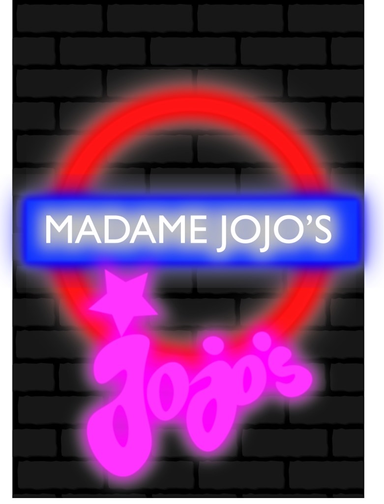
5. Madame JoJo’s – There has been a nightclub on this spot in Brewer Street since at least the early 1950s, when Soho was London’s most famous red-light district, populated by the sleazy, scar-faced underworld gang leaders who had thrived in the post-war era. It is believed the club acquired the famous name of Madame Jojo’s some time in the 1960s. In that decade it was bought by Paul Raymond, who can be said to have preserved much of Soho as we know it today, simply by buying most of it and leaving it alone, so that it remains largely untouched by the brutality of modern re-development.
Image of Madame JoJo’s Club – Taken from Google Images
6. Underworld – Over the years The Underworld has become the heart of the alternative music scene in England. Little is promoted about the history of the venue, although it dates back to the opening of pub above The Worlds End. The venue is itself owned by Glendola Leisure.
Overall this assignment has stretched my imagination making me connect ideas to research and looking at the brief in great detail to come up with something with a strong visual dynamic. All the posters keep within the theme of bold, playful, and decorative eye-catching and colourful. Although i haven’t included much information on the posters it would be nice to include some information but as i was creating i thought London is such a busy city, the underground being constantly filled with people no matter the time or day, people often don’t stop long enough to read hordes of information on a poster even when going up an escalator it’s hard to read the posters, you are more drawn to the imagery used than anything. The bright light effect was quite easy to achieve once i knew how, i researched how to make a neon light effect on YouTube and followed the instructions. I think the effect works really well it’s bright and modern, the brick effect background gives an edgy look and adds a bit more substance rather than a plain black background. All the while still promoting London’s underground culture with various clubs from the ages.
3 Things i am interested in – Film, Music and Makeup.
For each area i am going to use different ways to find examples so for film i will be mainly using google to find examples i like, for music i will be using spotify and taking screenshots of the album artwork and for makeup i’ll be looking at different brand logos and promotional posts.
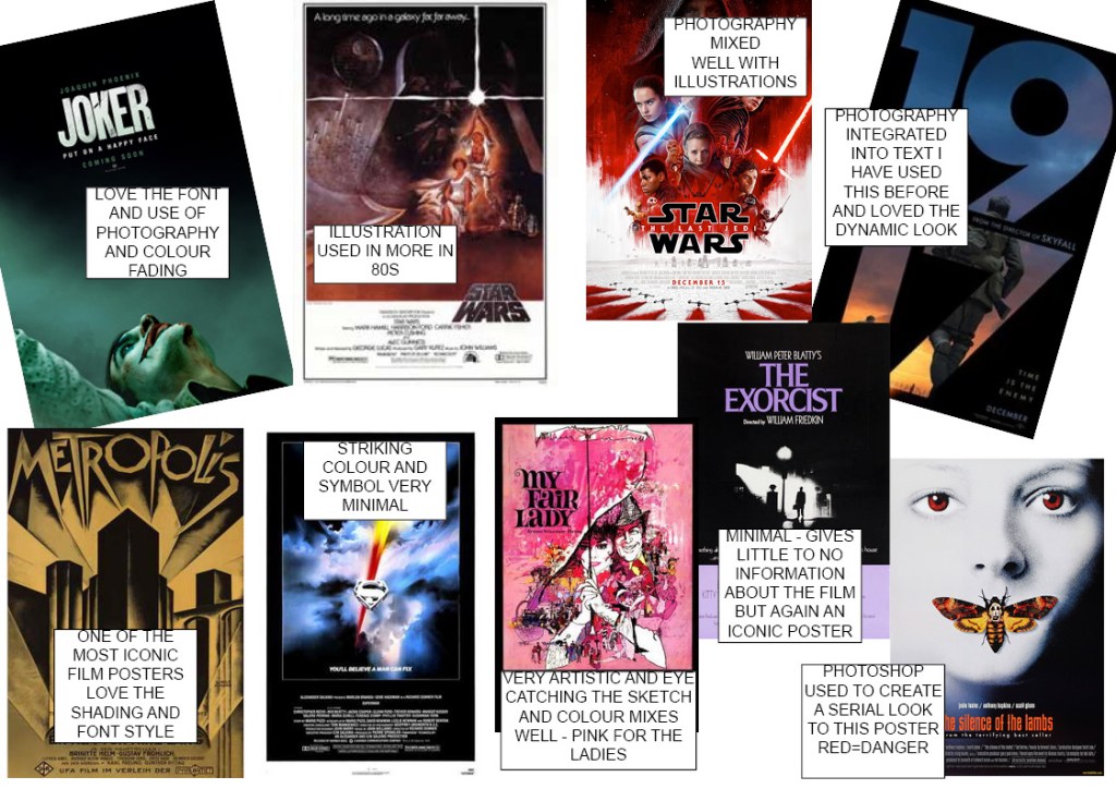
Film
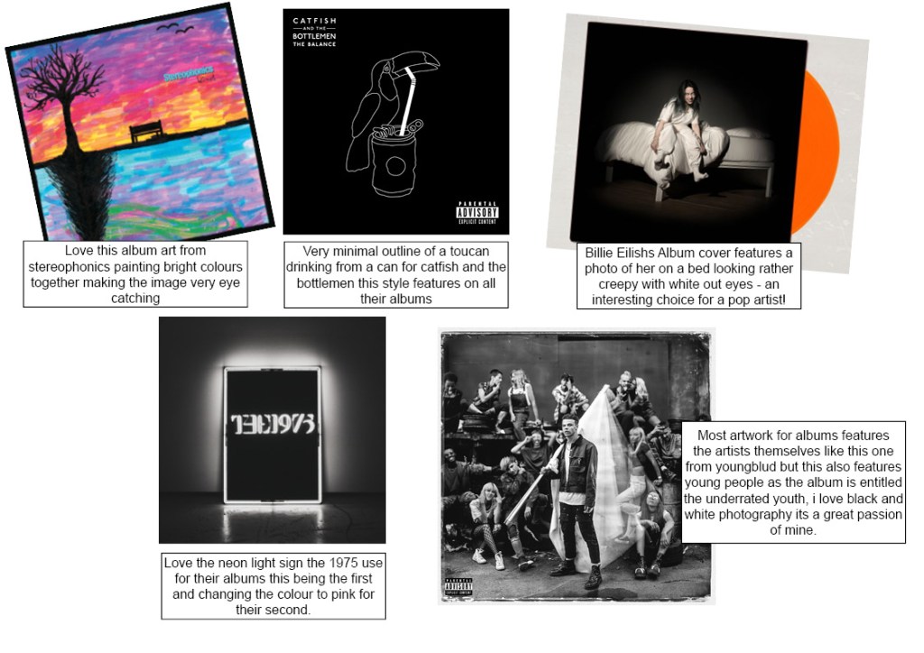
Music
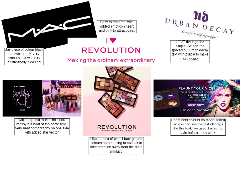
Makeup
Looking at my selection its clear that i am drawn to either bright colours or black and white colour wise. I like readable text and basic design that’s intriguing but subtle. Interestingly I’ve never looked at my hobbies before and admired the graphic design work other than with movie posters i suppose that’s because they are so detailed, they entice you to look at them more and decipher things that may be included in said movie. What might be useful to do is both explore my already clear ‘go to’s’ for graphic design and get better using these types of style but also my development of colour and combining the use of photography and graphic design together.
Reflect on how well you know how to use these tools and tick the level that most closely describes you.
□ NoviceI’m not sure what the tools can do; I need to follow instructions to do most tasks.
□ Advancedbeginner I can do some tasks but need support for anything else
□ Competent I have a good idea how to do most things and could learn how to do anything else without help.
□ ProficientI have a very good working knowledge of what the tools can do.
□ ExpertI am fully aware of the limitations of the tools.
You might find it useful to list the tasks that you’re absolutely confident with. Next, list some of the tasks you know the tools or software can do but which you’ve not mastered yet. Now identify resources that you have to hand or online that can help support you in developing your ability to work with these tools. Identify what tutorials and support would be useful to your learning. Don’t worry about trying to learn everything immediately; you’ll have plenty of opportunity to develop your skills as you progress through the course, but keep your list to hand so you know where to find software or other support when you need it. You may want to start by visiting the OCA website to see the latest resources, or talk to fellow students who have found solutions to some of the problems you’ve encountered.
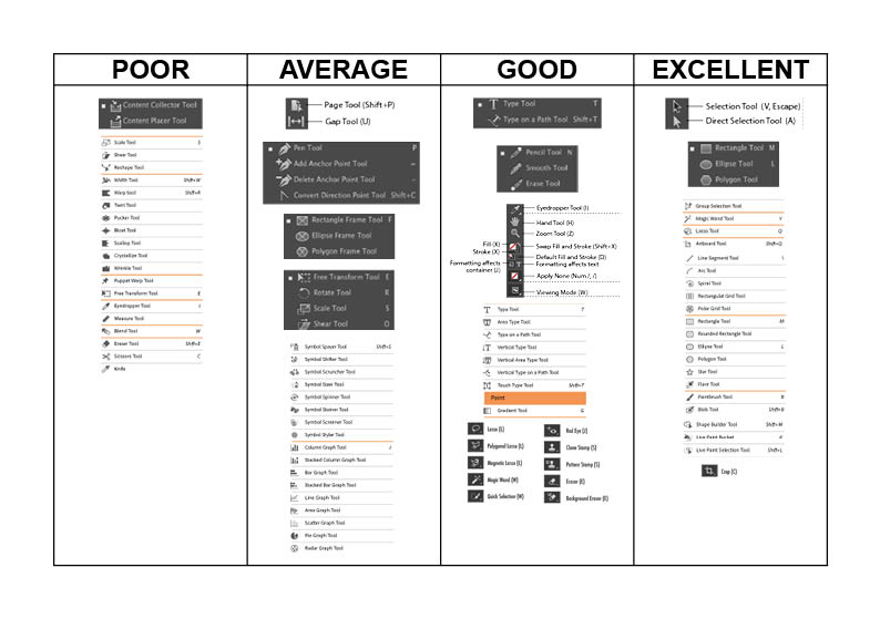
After using Adobe Creative Suite (mainly Photoshop, illustrator and indesign) for nearly 6 years i have a proficient ability to use majority of the tools. However there are new tools added to ease the end user like most technology its constantly changing and adapting.
Here i have made a basic chart entitled with poor, average, good and excellent sections to which i have placed all the tools i do and don’t understand.
As you can see the tools i do and don’t understand is average across all the areas there are some i feel i am excellent in and others im poor in.
Previously when I’ve attempted something in my work and either can’t figure it out for myself or have never tried i will look on YouTube and watch a tutorial or two! I find these to be the best way to learn something new as they actually show you step by step rather than reading through a manual and possibly not understanding the terminology used. Failing this i would look at the adobe creative suite tutorials on their website i may even contact someone from their team they have been very helpful in the past.
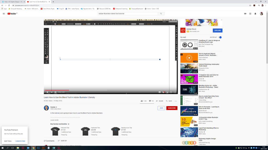
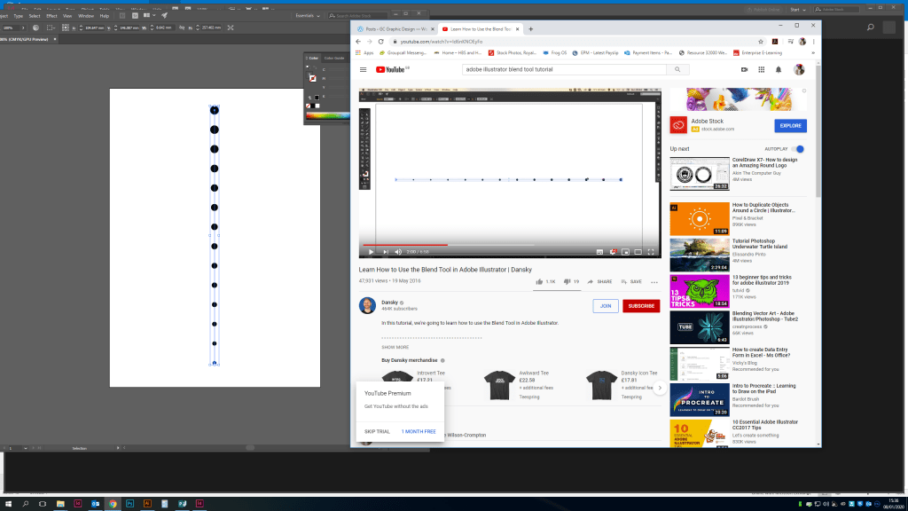
The You-tuber Danksy is a particular favorite of mine, his tutorials are quick and easy to follow see below where i have learnt how to use the blend tool in illustrator.
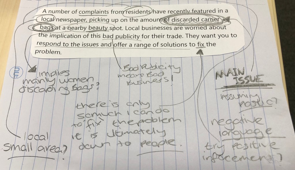
A number of complaints from residents have recently featured in a local newspaper, picking up on the amount of discarded carrier bags at a nearby beauty spot. Local businesses are worried about the implication of this bad publicity for their trade. They want you to respond to the issues and offer a range of solutions to fix the problem.
Brief analysis
Are they plastic bags?
Is it a small local area?
What has the community tried already?
Do the other businesses use plastic carrier bags too?
Research
After analyzing the brief given to me i have taken the keyword ‘Plastic bags’ and its implications on the environment and researched them on google.
I searched in the news as i wanted to see what is currently being discussed about the use of carrier bags as we move into a new decade and hopefully the banning of use of plastic bags altogether.
A plastic bag can take between 400 to 1,000 years to break down in the environment. As it breaks down, plastic particles contaminate soil and waterways and enter the food web when animals accidentally ingest them. … Plastic bags cause over 100,000 sea turtle and other marine animal deaths every year.
One of this worlds biggest issues is our use of plastic. It’s killing the planet and now its our job to try and reduce our use of plastic and the best way, stop using carrier bags! The biggest problem i and i know a lot of people i know suffer with is buying the bag for life but leaving it in the car or at home… so the solution i want to offer is a poster/leaflet given out to homes and people in this neighborhood to remind them to bring their bags for life this can be displayed in their home or in the neighborhood and therefore reduce the plastic bags seen. It might even be worth contacting the nearby beauty spot about their use of plastic bags and if there is another solution the community can come up with together. Before getting into the design process it would be good to visit the area speak to the local businesses, maybe get some photos of the discarded carrier bags and use them in this campaign.
This exercise has taught me when i look into a brief i look at the larger issues, the larger issue here is that the use of plastic in general needs to stop or be dramatically reduced, i think i responded to this brief rather well. It’s something i’m passionate about and want to help stop the local area from receiving bad press about their discarded carrier bags and ultimately stop the use of plastic carrier bags from damaging our environment.
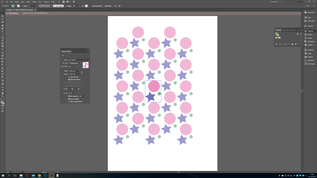
Reflecting on the last few exercises i think my strengths are colour, i love experimenting with different tones and what works well together. I do however need to be more creative with my layering and layout styles i tend to keep to the same sort of format with my work, taking risks isn’t the end of the world! I did really love looking at patterns with typography it would be interesting to look at other ways to create something visually dynamic with other shapes. I know this is more possible with the update on adobe illustrator for this year. So here is my research into this below.
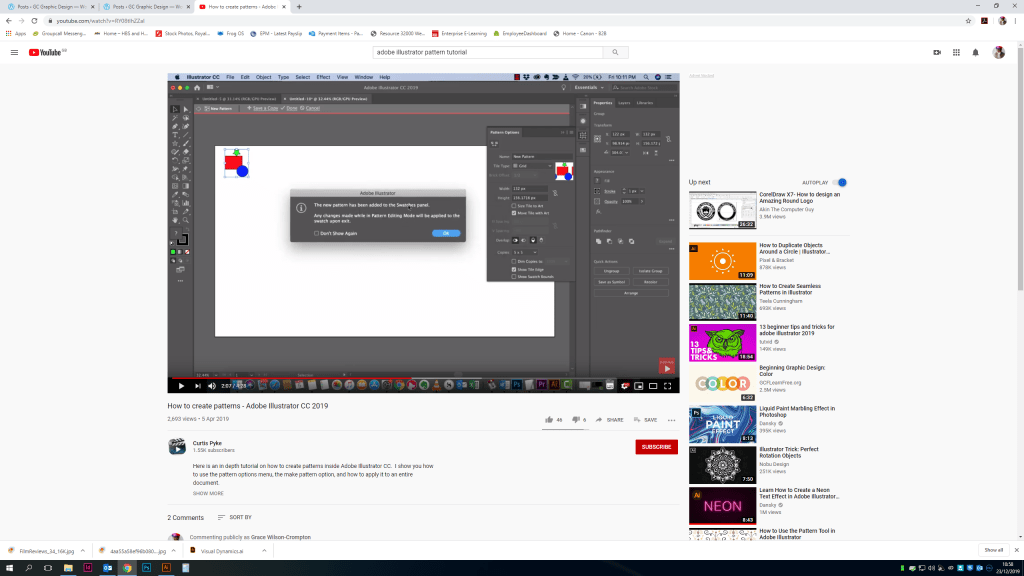
I watched a YouTube tutorial video on how to create patterns in illustrator, these are so helpful and easy to follow, so i have tried to create my own version following these steps.
Having never used this tool before i have fallen in love! There are so many options for the layout and to create different sizes and this was just created with a few shapes the possibilities are many with this tool, glad i looked into this and will definitely be using this in future exercises and assignments.
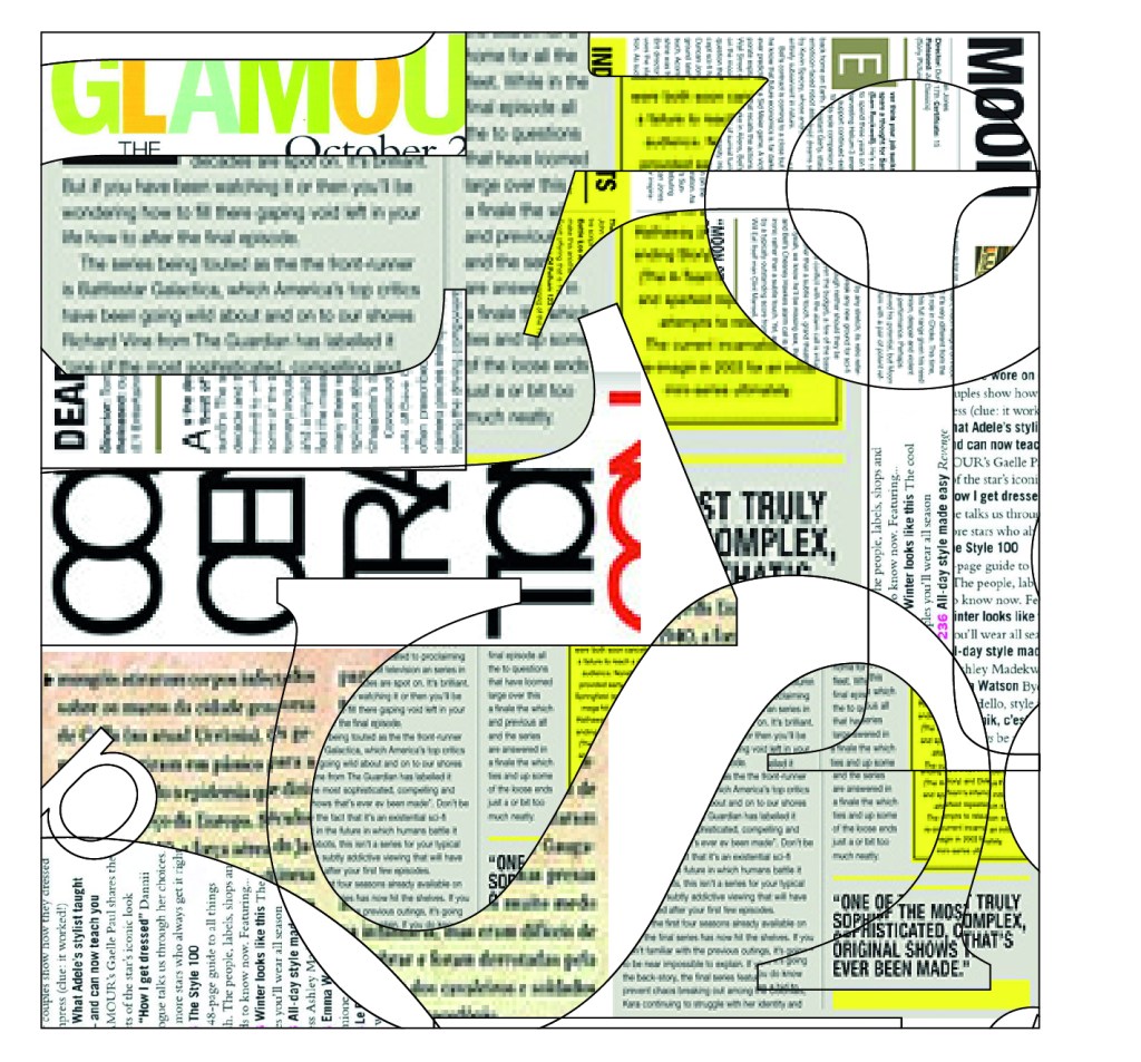
Going back to my previous exercise I’m going to use the same artwork just a different section or possibly rotating the artwork so i get a different visual effect.
After adjusting the artwork to a bigger section from the piece above and choosing some magazine pages taken from google i came up with this.
I do like the messy collage style of this however difficult it was to layer the artwork different angles and sizes to cover most of the page with still keeping the text outline around the images embedded. I found this quite difficult doing on illustrator but i wanted to try this rather than buy some magazines and cut them up into text shapes creating a similar collage to the one above. Mainly because of the time consuming aspect but also because it seemed an unnecessary expense for the planet!
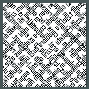
For this exercise i decided to start of with a totally new font style to create a pattern. I used a combination of all of these potential processes for being decorative through repeating, reversing, rotating and overlapping and on first look the pattern looks very complicated although effective as a pattern with all the repeating.
So i simplified the design a bit more by taking out elements i deemed unnecessary and this was what was left.
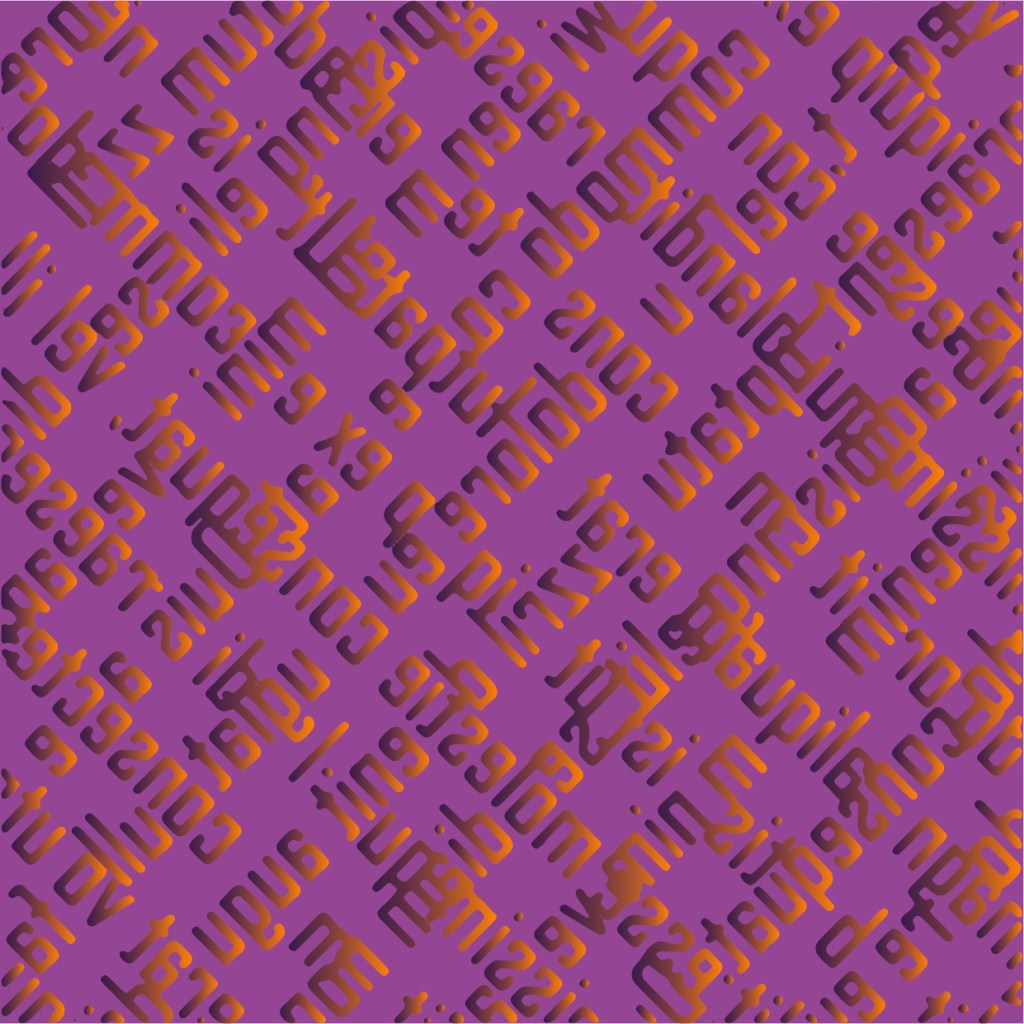
I then decided i wanted to play around with the colour aspect a bit more. Making this seem more like a background patterned piece. I really like how this looks the colour really tones down the harshness of the pattern into something more subtle and soft with the gradient and dark purple undertone.
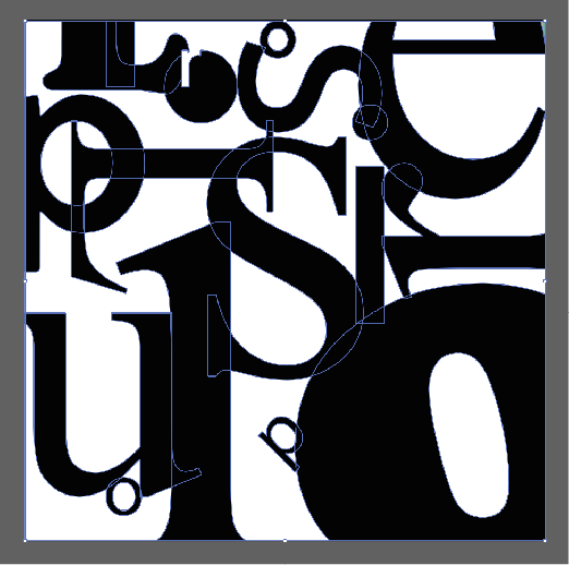
Here is a series of short exercises to help you start creatively exploring what you can do with visual dynamics. 1. Choose a typeface and zoom into some of the letterforms to pick up on the detail of the lines, dots, curves, stems, bowls and serifs that make up the letters. You can do this by scanning your selection at a higher resolution, blowing it up on a photocopier or working with vectors on Illustrator. 2. Using a square format to frame your selections, develop a grid of designs that makes the most of the visual dynamics you’ve found. Think about how you use scale, cropping or framing. 3. Repeat the exercise, but this time exploring the dynamic of using different colour or tonal combinations.
I started this exercise of with illustrator using a square page with 4 different randomly selected fonts before then vectoring each sets so I could see the different outlines on each font, specifically the difference between sans serif and serif style fonts how much more detail is in sans serif styles to get the right curvature compared to serif styles which are more traditional simple line style.
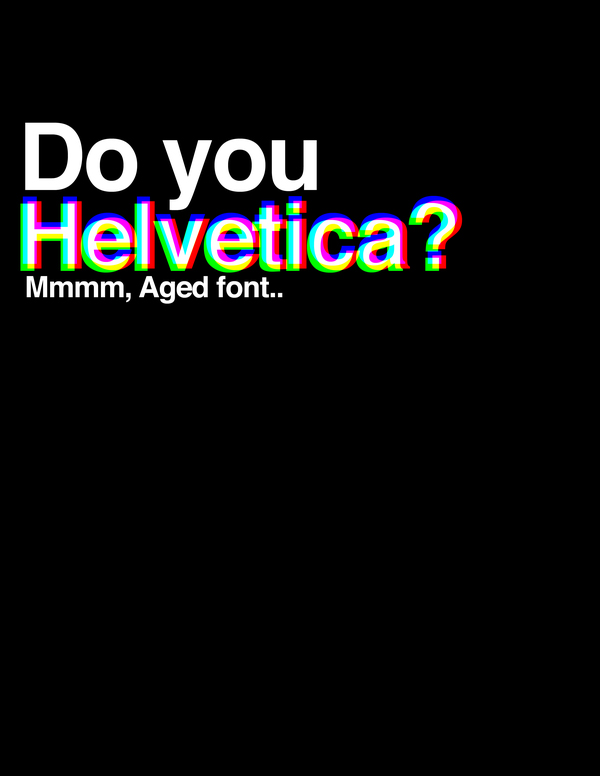
See below the same image now manipulated with the use of different colours. You can see how this hugely effects the visual layout of the image. I love how this turned out it looks so interesting and isn’t overly obvious I’ve only used different type styles ad sizes to achieve.
design for the screen – web design, TV, film, mobile phone apps, game consoles, interactive and multi-media design.
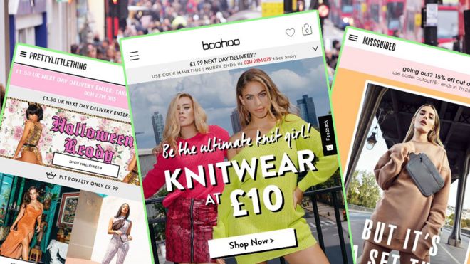
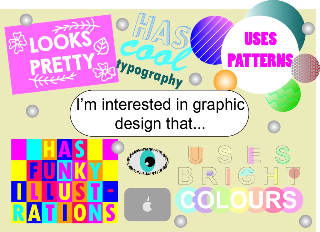
I however am interested in graphic design that looks good. It’s literally as simple as that, graphic design is obviously subjective to each individual but frankly I like simple, easy and aesthetically pleasing graphic design. Most of the work i have done in the past falls under design for identity, design for print and publishing. Keeping the brands identity for print and publishing services particularly. I would love to look more into retail design and design for the screen as these are areas i have next to no experience in. Here are some examples i have found of all the different types i enjoy, mostly typography with small add ins of illustrations.
And here are some areas of graphic design i would like to look into:
See below my postcard I have created based on the images I have collected. I loved doing this, I’ve never realized how much a ‘voice’ or style graphic design has and how much it can vary but still have the same outlook, varying typography styles mixed with illustrations.


![Vortex Jazz Club [Logo]](https://i0.wp.com/www.vortexjazz.co.uk/wp-content/themes/vortex2016/images/vortex_blue.png)