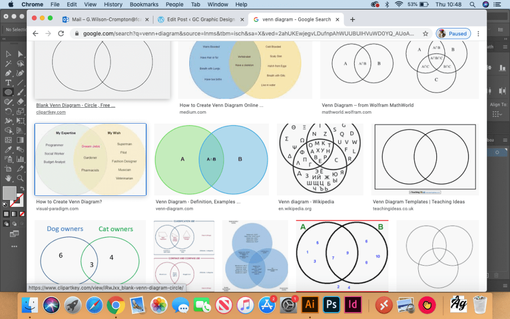
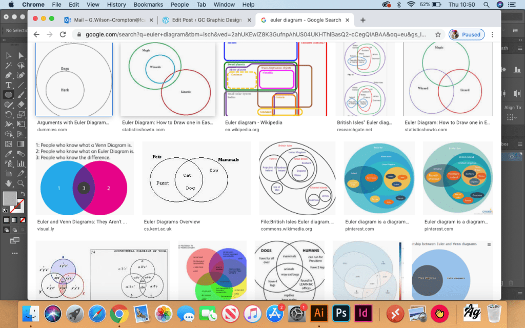
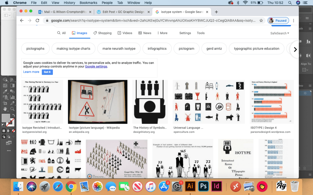
For this exercise i first researched a few different methods of displaying information the venn diagram, Euler diagram and the isotype system. Just to see what method i will use to display whats in my fridge and the connections between ingredients.
Venn Diagram – Google SearchEuler Diagram – Google Search Isotype System – Google Search
I decided to use the Venn diagram as this will go well with the ingredients i have in the fridge and connecting them together to make something for example cheese, butter and bread makes a sandwich. So i’ve used this to create the below, with basic ingredients in my fridge that i use.
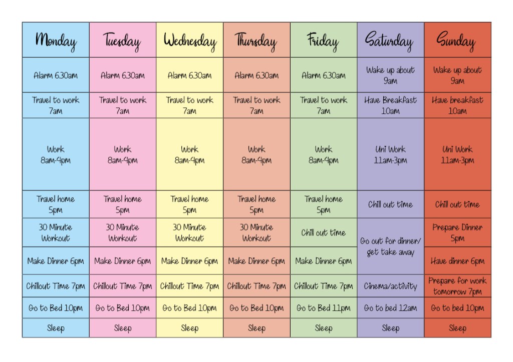
As working and normal general life has effectively gone out the window it’s nice to reminisce about what my usual working week would be like. See below, i have developed a table of sorts with what my usual week looks like.
My Week 1
I’ve kept this design very basic and brief and added rough estimated times for each activity now whether i actually stick to this religiously who knows. By adding a bit of colour and a fancy style font it makes my week look slightly more interesting rather than the same thing everyday.
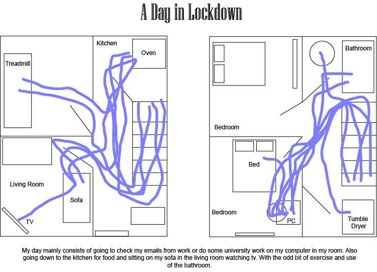
Now since being in lock down for about 2 months, i wanted to create another way of categorizing my time by making a map of my house and where i am for how many hours of the day. Using a bit of colour like the first table of my week. I have created the below.
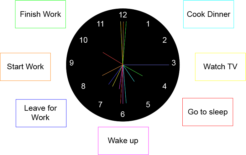
Since so much of our day is reliant upon what time it is, i decided to make a clock and add tasks of my day colour coding by what time it is (see below).
Time is relative; it’s only worth depends upon what we do as it is passing.
Albert Einstein
It reminds me of a game sort of style, where i would need to match up the wording with the time on the clock to see what activity i have to do next. It’s quite child like and simple but it’s clear and easy to understand without having too much information like the previous two examples. The first having too much text in one area, an idea would be to split them into days rather than the whole week. Similar with the second design the colour blends a lot where i am moving from one position to another in the house constantly. To better this would be to use a different colour for each movement.
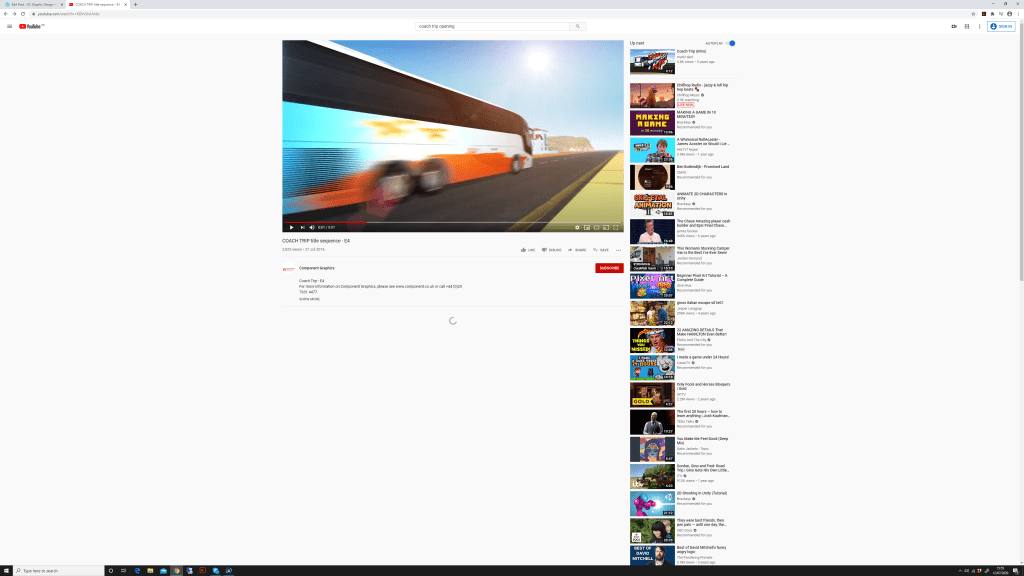
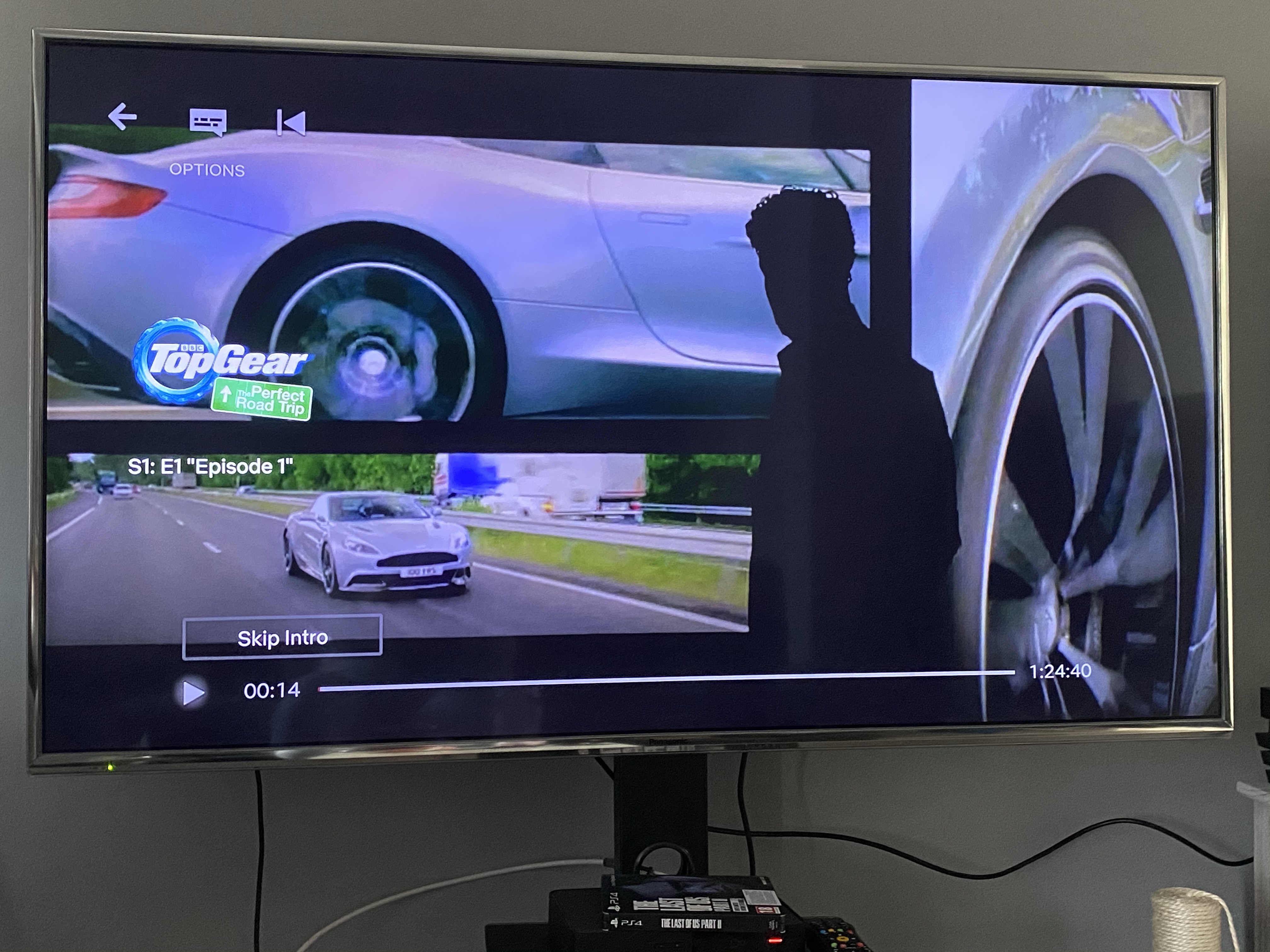
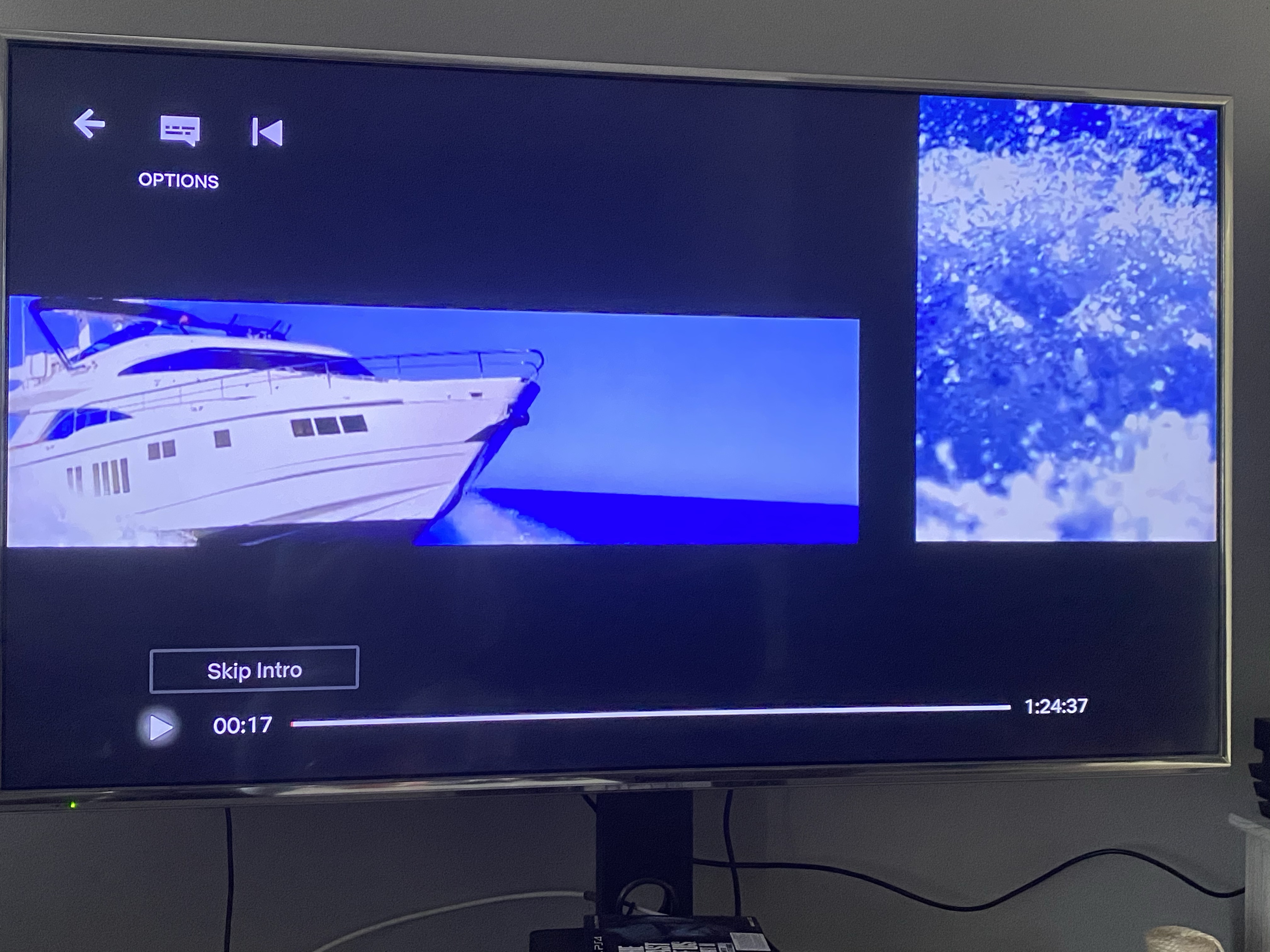
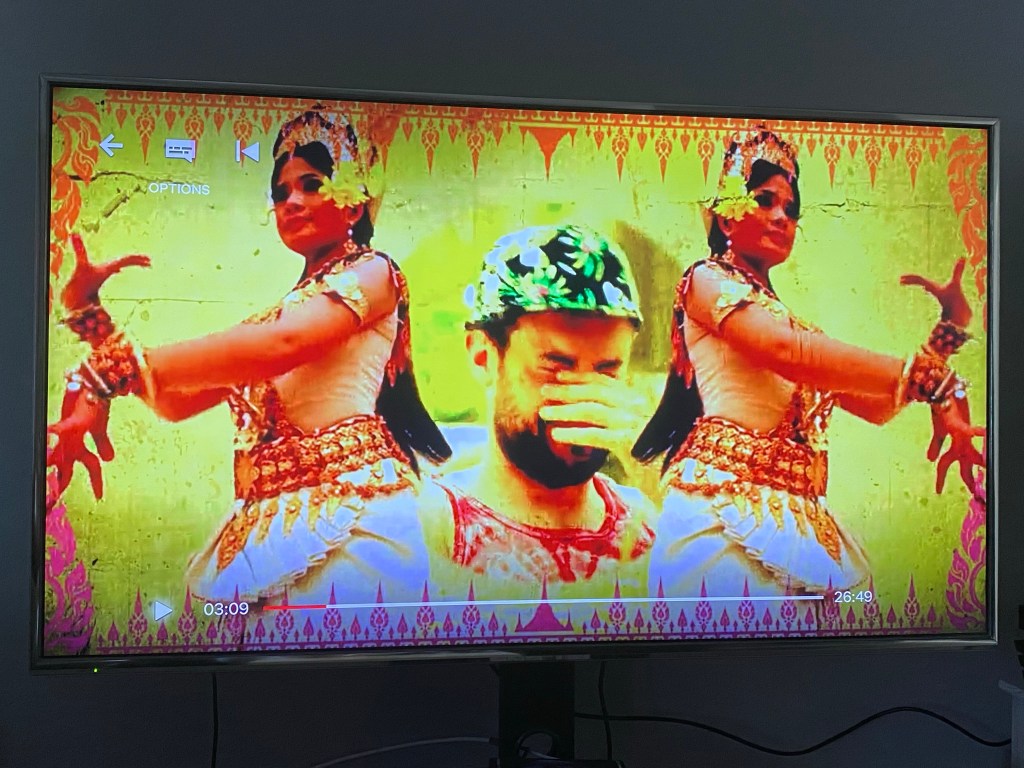
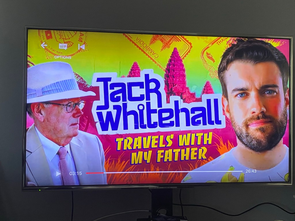
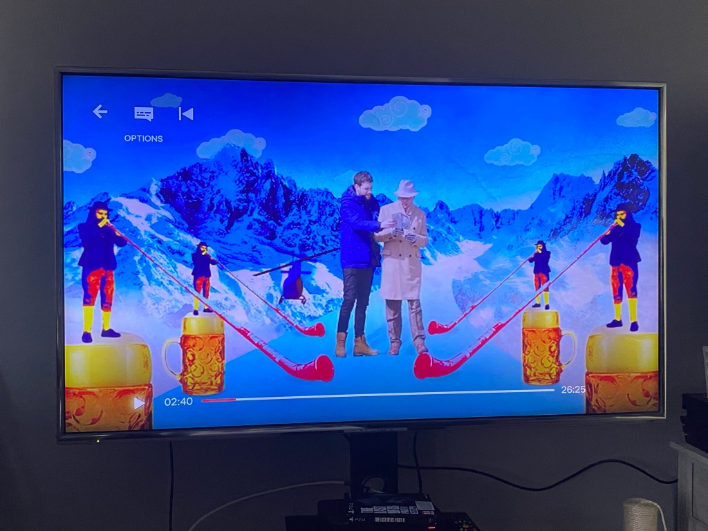
To start this exercise i looked at similar programmes that have been out recently and what their opening credit sequence looked like. See below screen shots of various things that i thought highlighted the journey sort of style.
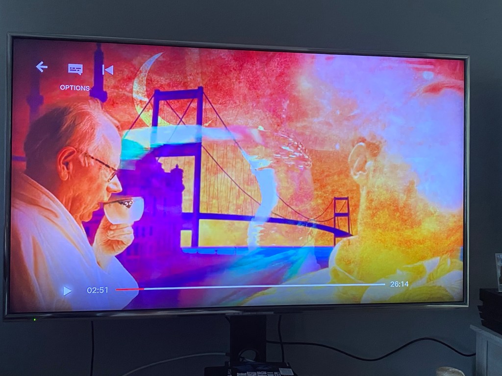
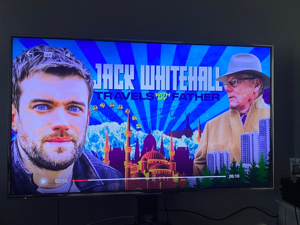
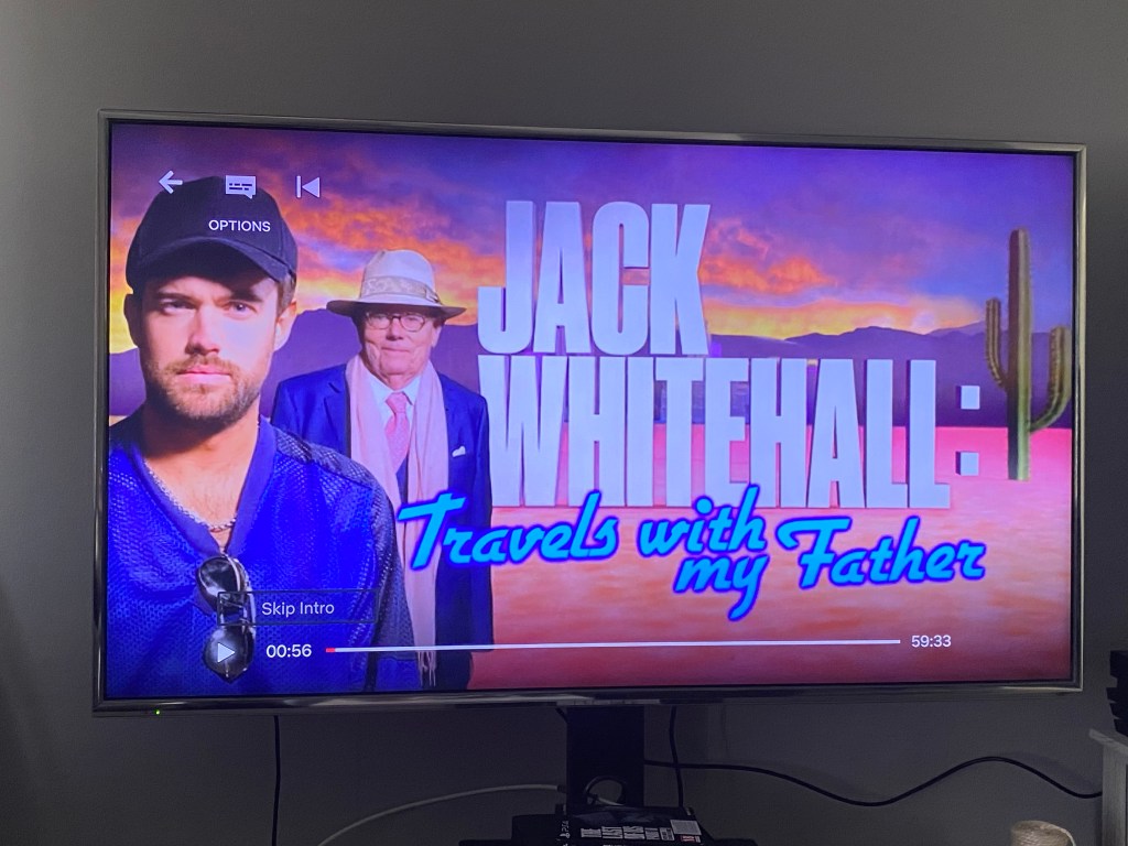
taken from youtube the programme coach trip uses a coach on a road travelling to its destinationtaken from netflix, originally shown on bbc. a topgear special depicting a road trip.Again topgear using another method of travel other than a car.taken from netflix original programme jack whitehall travels with me fathereach season uses colourful imagery of each destinationincluding different activities the pair get up to in each seasonalongisde landmarks and imagery of the presenters in the programme.Again each season uses different text, imagery and colour scheme.assuming the storyboard i am creating is for different episodes in one season in different locations i want to include all in the sequence.
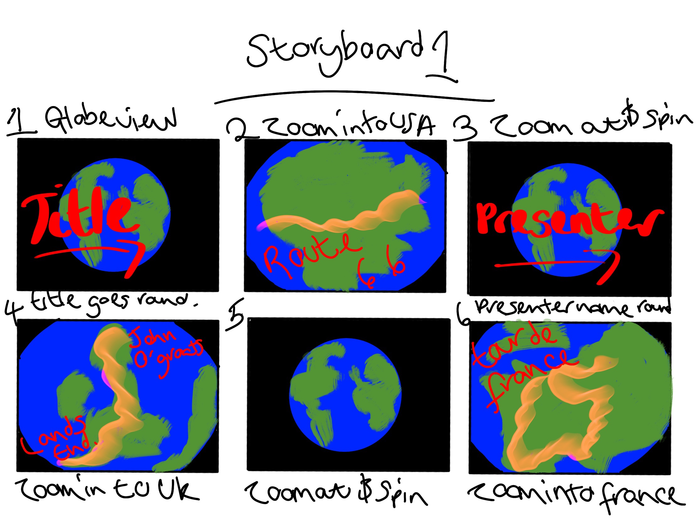
Using my iPad and procreate i’m going to roughly sketch out an idea I’ve had taken from this research.
video of me sketching the below final storyboard.
I came up with the above using the idea of travelling the globe and showing the routes that will be taken across each country. while including the title of the programme and the presenter. The use of colour is bright and eye catching while also keeping very simple and to the point.
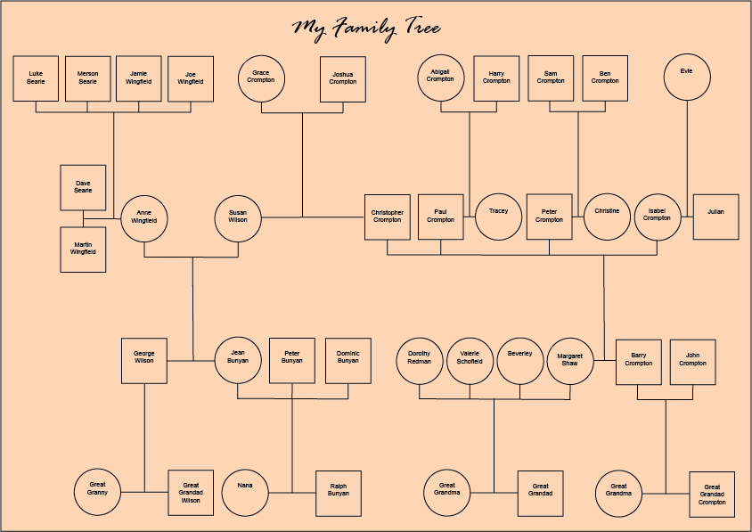
First I created a basic family tree from my little knowledge of my family history. It’s never something I’ve been interested in but i have more so since losing a lot of family members. I know that my mother and father are from two different areas in the country, my mother from Luton and then moved to London and my father from Huddersfield and then moved to London where they met and had two children, me and my brother.
Family Tree
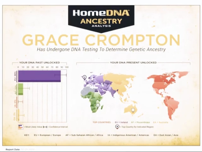
After briefly researching what a cartogram was I discovered I have actually had a cartogram from my DNA done before (see below) where this takes my saliva and comes up with a result of where my DNA is from so you can see I am predominantly European, specifically Irish which must be where the red hair colour in my family comes from now whether that is my mums or dads side I will never know but it’s fascinating to see.
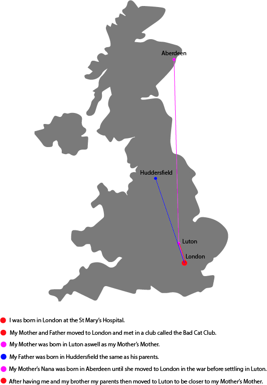
So I created my own version of a cartogram of my family history and where i come from, the little pieces i can remember. Along with information about where things took place across the country.
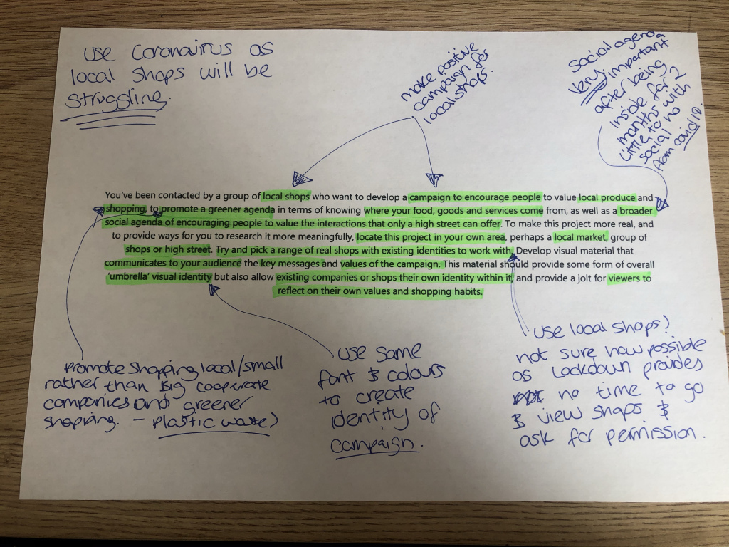
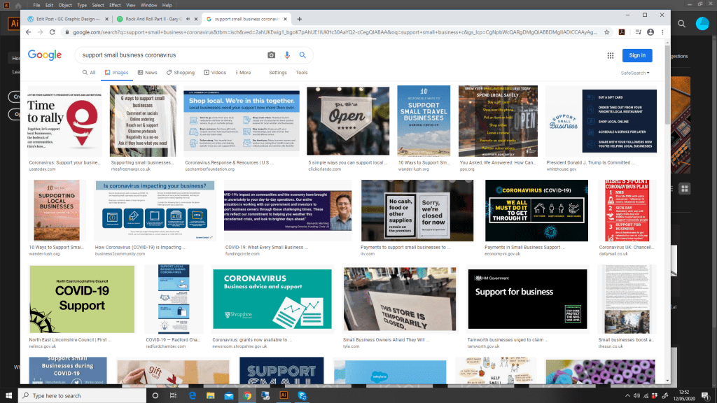
I don’t think this assignment could have come at a poignant time as the world battles coronavirus our small businesses have been forced to close and when they reopen will be struggling as a result. So coming up with a campaign for this will be perfect as i can use the current situation to promote us using local business rather than big companies that have profited from the outbreak.
Research
Above are some images i have found by researching ‘support small business coronavirus’ I want to create something similar to these focusing on small local business’ that will be struggling to get by without laying off staff or even worse case scenario closing.
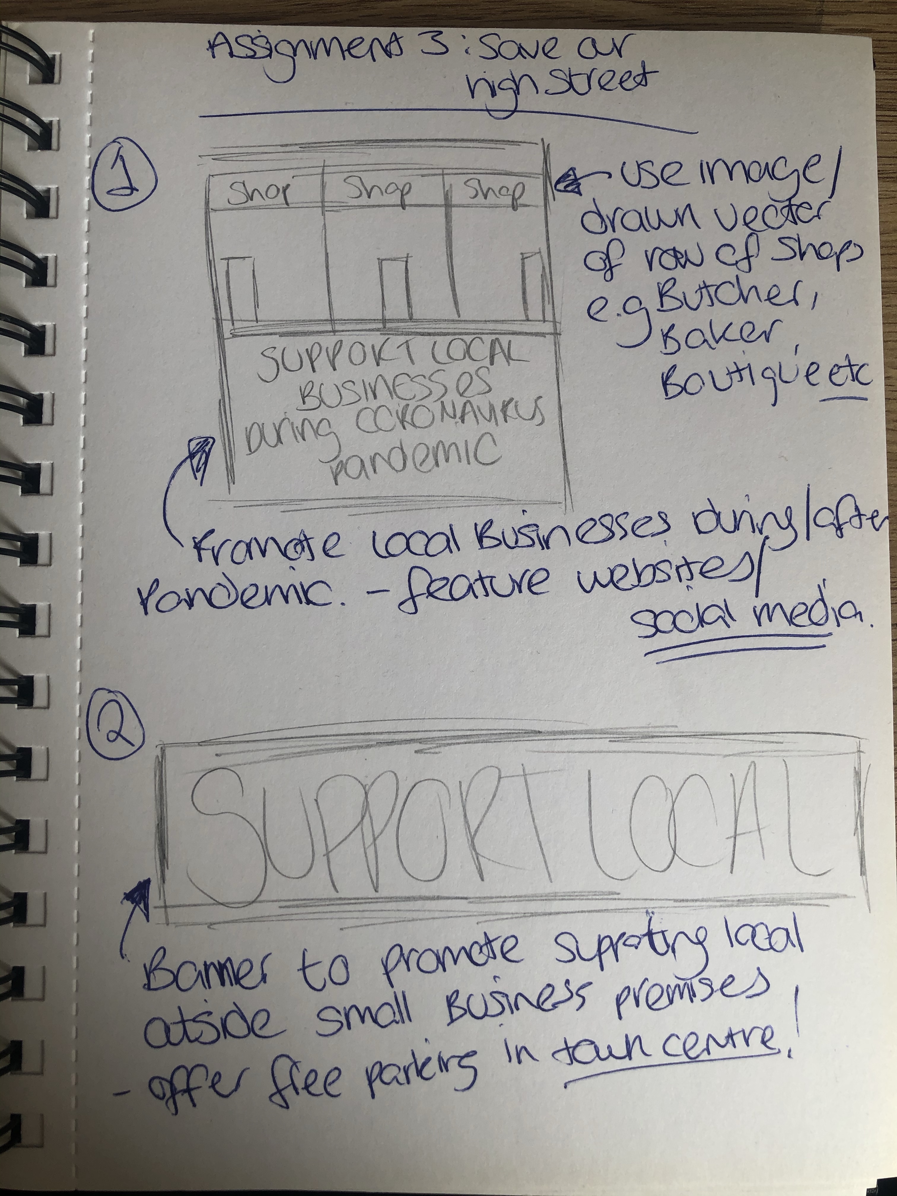
Sketches
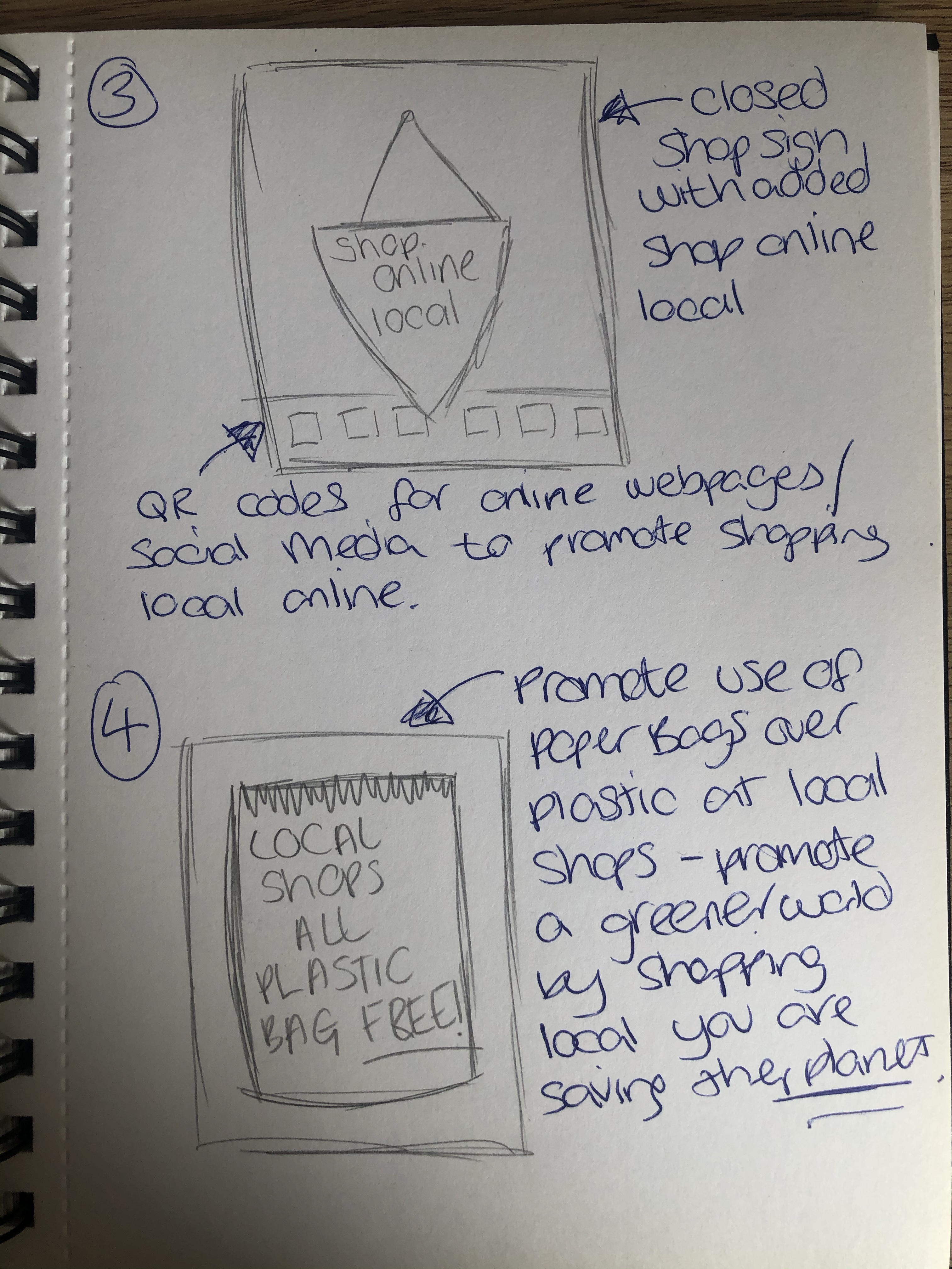
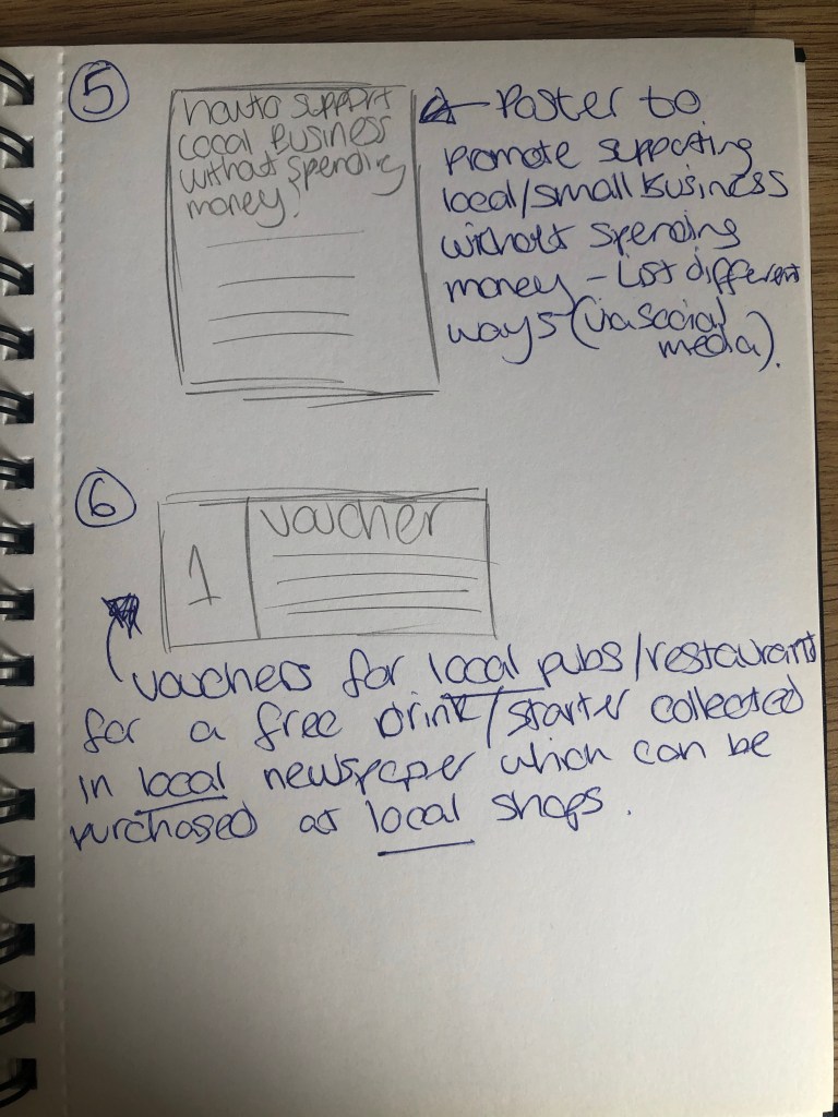
I started off by doing some sketches of rough ideas in my sketchbook see below. I have used various methods of promotion from posters and banners to vouchers. I want to use a variety of these in my final as i feel the more methods i use the more successful this could be for small businesses.
Final Designs
I then chose a few to develop digitally. I chose the ‘support local businesses’ poster first as the image of having empty or closed down shops is often quite striking and sad to see. So I drew out a vector image from rough memory of what small local shops look like, they are often rows together of old houses converted into shops. Added a colourful bright background with bold text and this is what i will use throughout to keep a consistent ‘brand’ or campaign image.
I then developed the ‘support local’ banner to include large striking typography and the added information of free parking passes to those who shop in local and small businesses, i feel this could work really well as currently most people are shopping online because of the pandemic and will probably continue to do so for the time being but once things get back to normal offering free parking is a great way to reel in customers. There is nothing worse than having to scramble around for change to pay for parking when you pop into town to get something.
I also developed a poster encouraging people to shop local as local and small businesses are using paper bags instead of plastic. Plastic bags are a big environmental issue and i want to encourage the use of paper over plastic. Big businesses are still using plastic excessively and by shopping local we can reduce that wastage.
Overall the campaign looks very good the imagery is consistent and nice and clear, my favourite is probably the idea of using paper bags. The environment is such an issue and with everyone being inside as a result of the coronavirus outbreak the environment has been much better off for it. Maybe this is just what we need to kick us into action and treat our world better. The campaign mainly focusing on the support of local business works really well however re-reading through the brief i should have included a bit more information about the idea of using local produce rather than things that have been imported like in big businesses. But i wanted to focus more on the fact that after this pandemic is over our small and local businesses will be struggling and there is undoubtedly going to be a lot of business closures and a huge recession. I wanted to keep the design as simple as possible as too much information on a poster or banner can often get lost. Banners especially as we often see them while driving, small text and lots of it won’t get seen. Keeping the message brief and to the point seems like a sure way to attract attention. The posters have more artistic use but again simple and basic messaging. The closed shops for example send a negative message, if we the consumer don’t help small and local businesses they will close. It is our responsibility to keep local businesses going during this crisis and after.
Pastiche – A pastiche is a work of visual art, literature, theatre, or music that imitates the style or character of the work of one or more other artists. Unlike parody, pastiche celebrates, rather than mocks, the work it imitates.
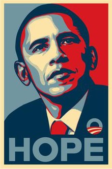
For my version of a pastiche i have decided to use the iconic Obama hope poster created by artist Shepard Fairey. It is widely seen as iconic and was used in the 2008 presidential campaign, see below.
To me this piece is so inspiring and depicts the idea of hope perfectly. The colour pallete of blue and red representing the american flag with an image of Obama looking up and the clear wording of HOPE below. I want to create something the opposite of this using an image of myself and creating a similar style and colour pallete but with no hope.
I think the opposite message is certainly being portrayed here as the image is looking down. I’ve tried to attempt the same colour scheme and style within the imagery. I really like how this turned out and could be used for a mental health charity, as in ‘feeling like there’s no hope?’ It would have also been nice to use an image of Americas current president Donald Trump with the wording ‘No Hope’ as frankly he’s doing a terrible job in my opinion!
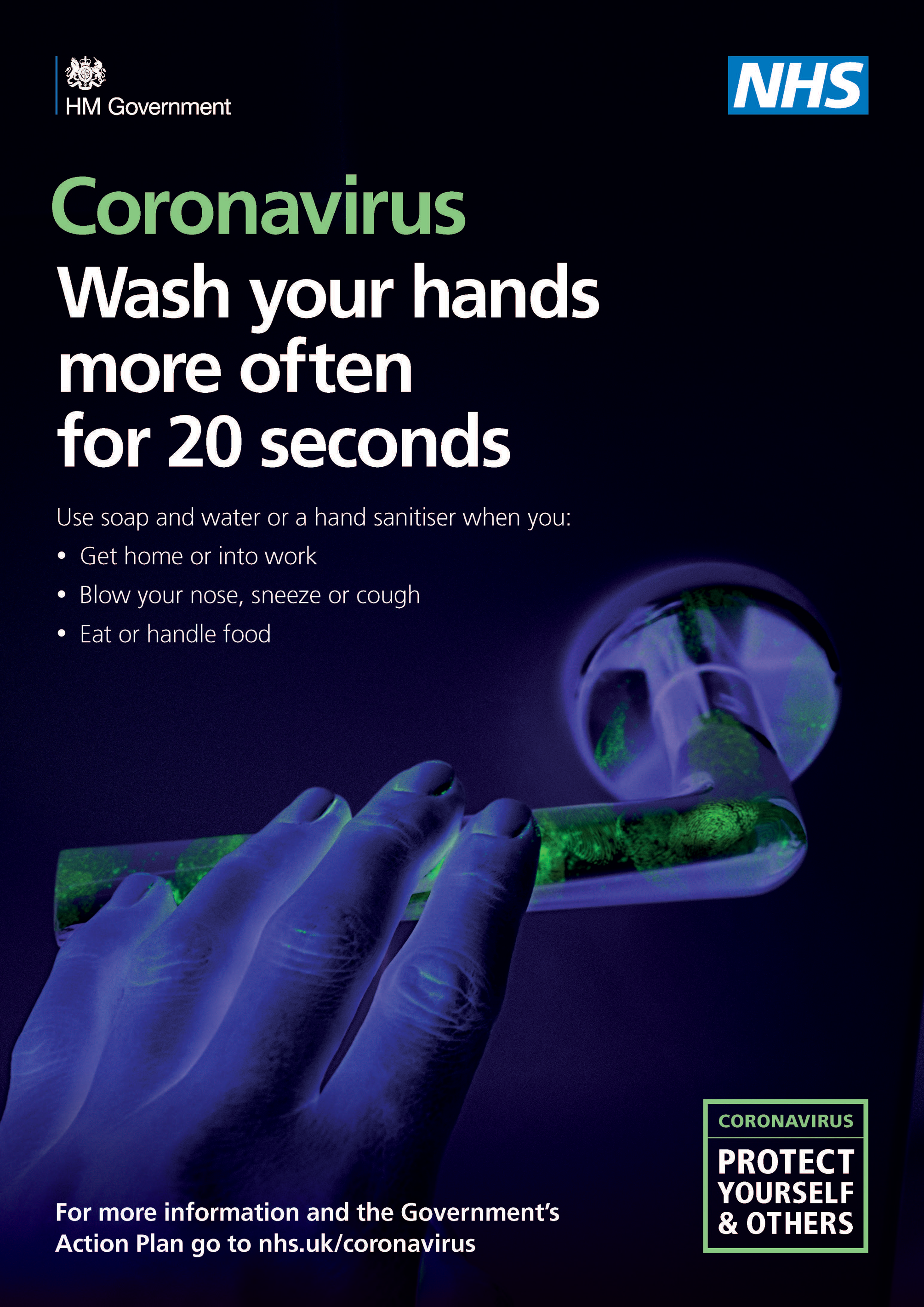
Given the current predicament it seemed fitting to reflect on some of the campaigning being done by the government about coronavirus/covid-19.
As you can see the posters start off as a sort of friendly notification of the current circumstances which at the time wasn’t that concerning, just to wash surfaces and if you have traveled to china then the self isolate for 14 days. This however changes with the second poster being more harsh with the image and colour use showing germs on a door handle and how this virus can be very easily spread and how we MUST wash our hands as frequently as possible.
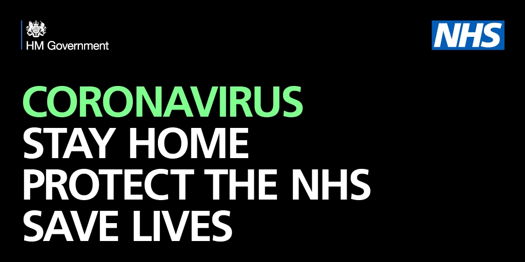
The current poster or tagline from the government is the above ‘Stay Home, Protect the NHS, Save Lives’. This gives a very strong clear message as we approach our month mark of lockdown for the UK. No imagery is used just plain capital letters to give the public a clear message while the NHS battle the coronavirus.
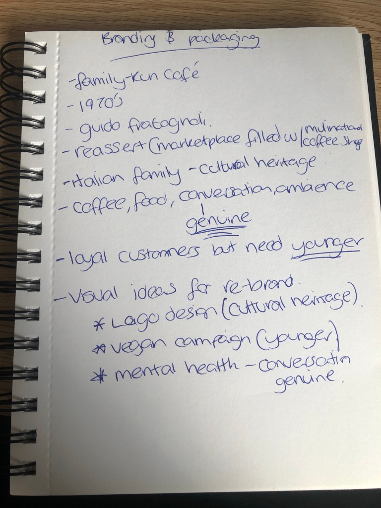
Firstly i wanted to jot a few key notes that i have taken from the brief so i know what is important to the client see below.
I believe to re-brand the cafe they would need:
A logo re-design representing their cultural heritage and how this is a well established family business
A Vegan campaign to appeal to the younger customers as this is quite important for the younger generation to be vegan or vegetarian.
A Mental health campaign as this is also important for younger people to have the option of someone to talk to who will not judge them and given the current circumstances in the world our mental health is suffering and this cafe offering genuine conversation is something that should be celebrated.
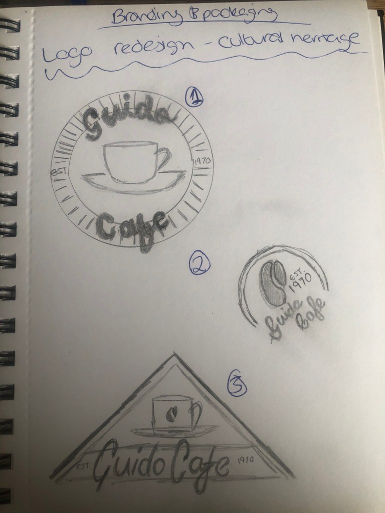
Logo Re-design
I started by sketching some ideas based on a retro style promoting the traditional style of cafe alongside the date the cafe was established.
Before then developing one of these as a logo with CMYK colours and accompanying fonts used.
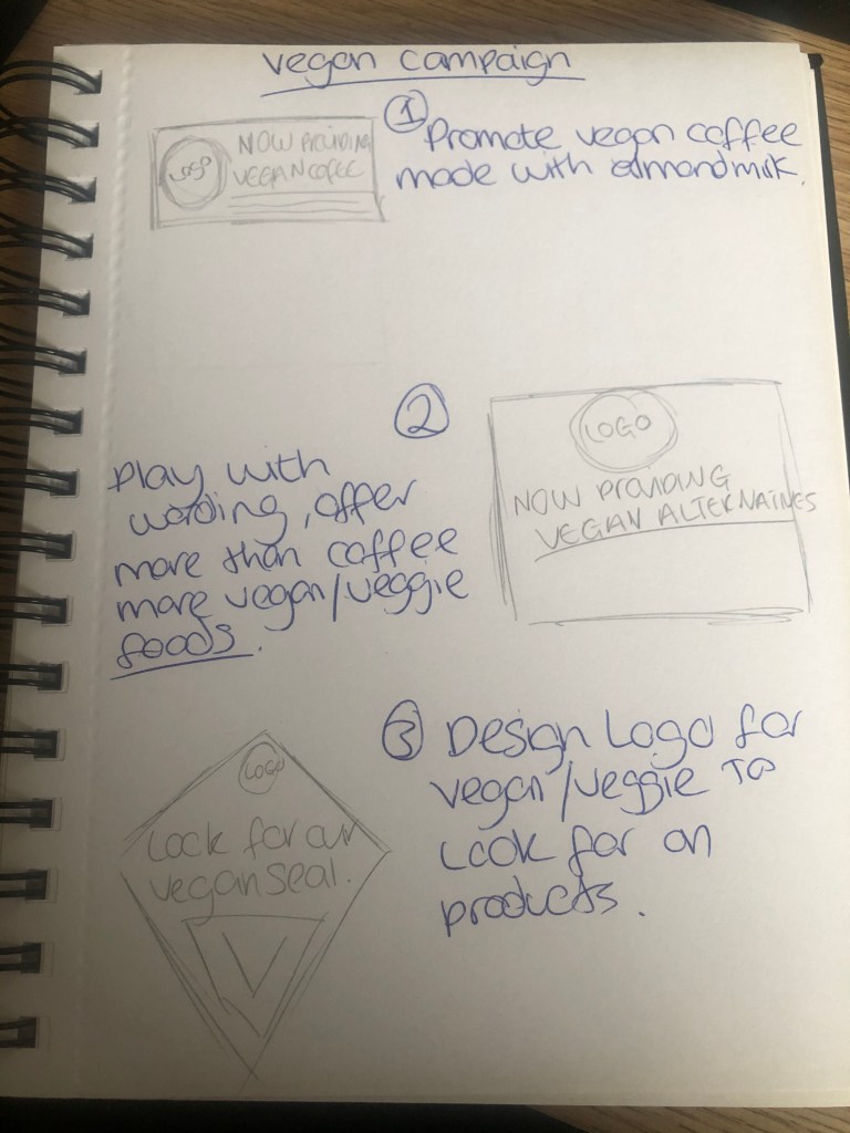
I sketched out a few ideas of how to persuade vegans to visit the cafe. Using different styles of poster/banner to promote outside the cafe and inside.
I then chose to add the logo i have designed along with the colour scheme and fonts used promoting vegan coffee being sold inside.
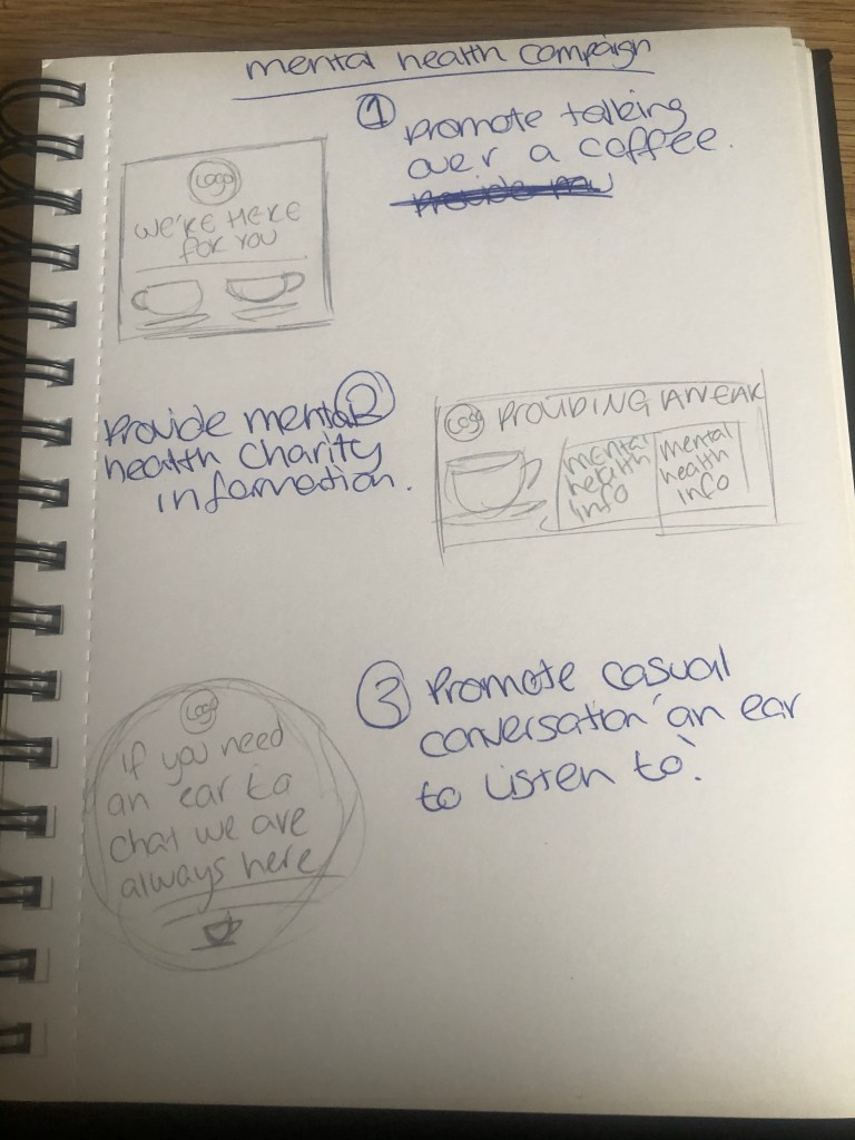
Again sketching out my ideas in my sketchbook before taking these ideas and developing them digitally. With mental health i want the cafe to promote themselves as an ear to listen while getting your daily fix of coffee. Sometimes it’s easier to speak to a stranger than it is someone you know.
I chose to combine the idea of using the cafe’s friendly chat ethos and mental health charity mind. As i feel it’s important to display this alongside. I have also included the fonts and colour scheme used for clarification so the cafe is creating a sort of brand.
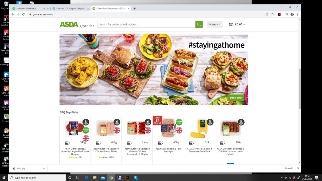
As going to the shops at the moment is next to impossible! I have used the food shopping online avenue. I’m using the ASDA webpage and with the current predicament the focus is staying at home. So the first range i have noticed is the BBQ range to encourage people to stay at home and enjoy the weather by having a nice BBQ.
The branding can be seen in the green and charcoal grey colour used in the text and the badge images on the food and the ‘shop bbq’ symbol in the corner of the photograph.
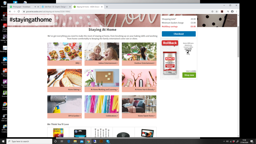
They also have a whole section for the hashtag #stayingathome to encourage items can be bought for entertainment purposes while we are all stuck indoors for the foreseable future due to coronavirus.
Here they have gone away from the bright green colouring from their brand and instead used a blush pink similar to the image at the top of the page with pink pillows and the word ‘home’ on them. I think this creates a sense of calm and fun at the same time rather than their usual bright in your face ASDA green however the font is still the same and the charcoal grey is still present along with a pop-down of the Kenco coffee on sale and a green shop now button suggesting they have strayed away from the initial shop.
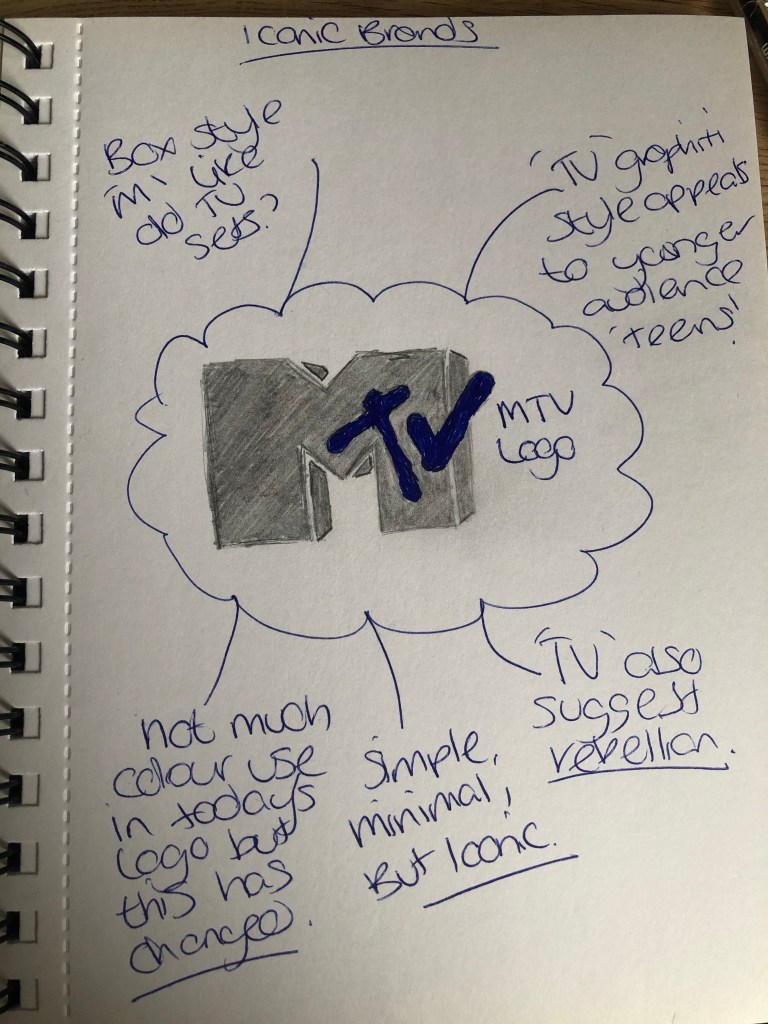
After a little google search of iconic brands and not wanting to use a logo i have already featured so far, i have chosen the MTV logo see below for my initial findings just from the image.
Company Founders: Robert Warren Pittman, Warner Communications
First designed in 1981 by Manhattan Design, the MTV logo was the collaborative effort of Frank Olinsky and Patty Rogoff, overseen by original creative director, Fred Seibert. From the very beginning, the MTV logo has been constantly changing in color, patterns, and images, that filled the block “M” on which “tv” is scrolled. During the 1990s and 2000s, MTV opted for a simpler white logo, while maintaining the original design of a bold “M” and scrolled “tv.” A 2009 rebranding overseen by Popkern reintroduced the idea of filling the “M” with various images, with the “tv” becoming a non-disruptive white.
There doesn’t appear to be an official brand guidelines available to the public it looks like a web page has created the above PDF.
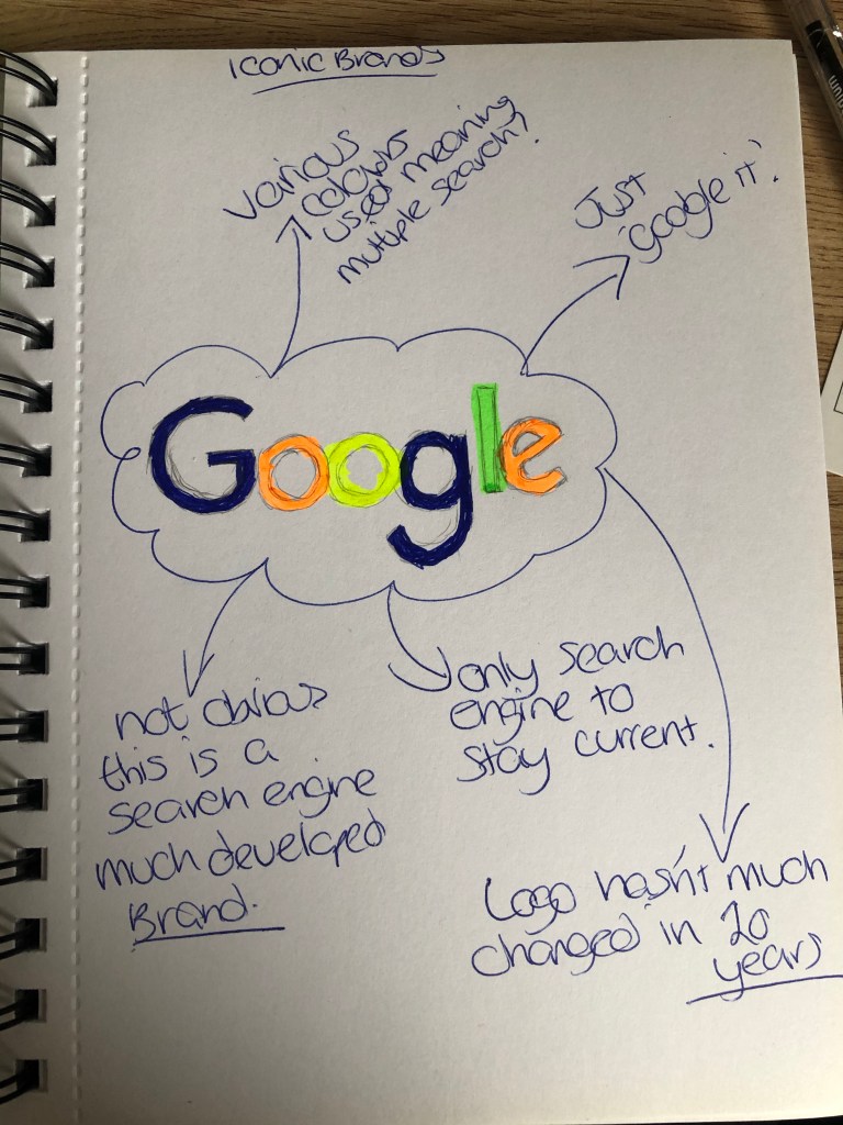
So after trying again i have used the google logo and come up with the below.
Google
Year Company Founded: 1998
Year Logo Introduced: 1998
Logo Designer: Sergey Brin (1998, 1998), Ruth Kedar (1999, 2010)
Company Founders: Larry Page, Sergey Brin
The Google logo was first envisioned in 1988 by Sergey Brin, one of the the founders of the company, using the graphics program GIMP. It was an unpolished rendition of the now iconic logo, with an added exclamation mark meant to mimic the Yahoo! logo. Introduced in 1999, Ruth Kedar’s polished Google logo (with no exclamation mark) stayed in use by the company until 2010. Kedar’s logo gained instant recognizability over the 11 years it was in use, making it one of the most iconic logos of all time. On May 6, 2010, Google launched its latest, updated logo featuring a slightly more orange “O” with more subtle shadows, but the end result did not stray far from Ruth Kedar’s original design.
The important parts to notice in any brand guidelines for a graphic designer is the do’s and don’ts for example changing the colour of the logo or modifying the text in any way most large iconic brands will not want their logo tampered with at all but some are more lenient than google. I wasn’t aware that google doesn’t offer sponsorship for events etc. But i suppose this is limited to certain charities. As a brand they don’t need to put their image out there as they have already established themselves over the last 20 years.