Assignment Six – Critical review

Bibliography

Introduction

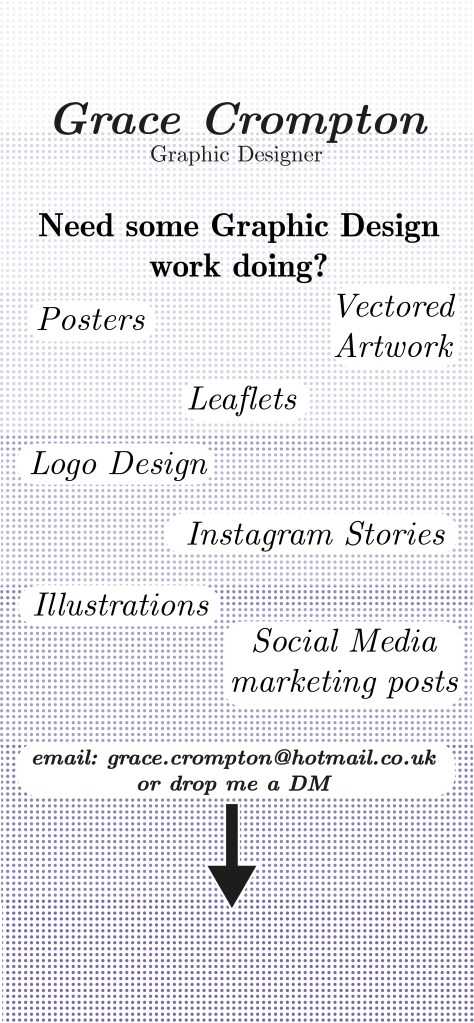
Being an avid Graphic Designer for many years now I have noticed things changing in what constitutes graphic design and what is needed from the client. Social media being a big impact on the graphic design world. So I want to explore what effect does graphic design have on social media? I will have two areas of research; the relationship between social media and graphic design, focusing on what design capabilities are available from a designer’s point of view and a non-designer. In addition, what companies/businesses use design in social media posts. Is this work from a designer or has this been created by a marketer or social media manager, is this something that you can tell as a designer? I want to explore this and show how designers have had to adapt their work to both print, digital and social media while also offering a service unique to a designer that social media managers could not achieve themselves. I will use screenshots and analyse various styles and applications to create different posts and see what gets the higher engagement from followers using my own account as a reference showing the effect graphic design has on social media in the modern age.

Chapter 1 – Creation

For graphic designers, social media is an opportunity or a challenge, and possibly even an intimidating problem to be overcome. However, it can’t be ignored. There is a symbiotic relationship between graphic design and social media. If you manage to master that balanced relationship, you can enhance your creative work as well as your success as a practical businessperson.

https://platt.edu/blog/relationship-graphic-design-social-media/

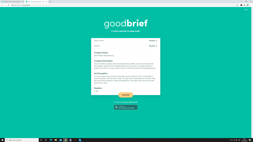
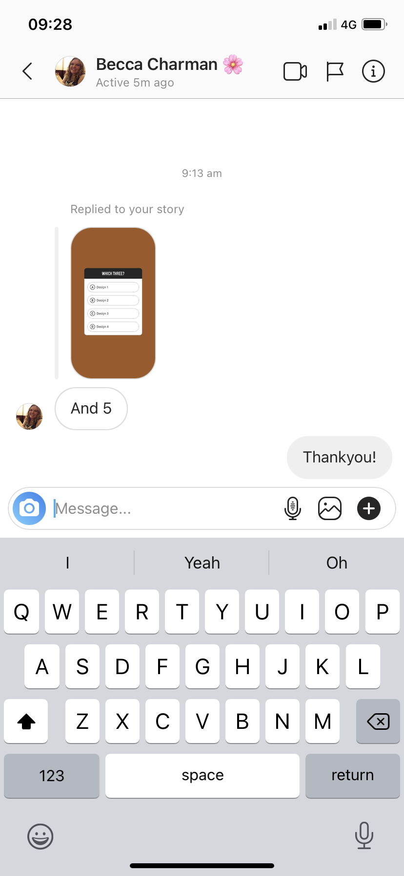
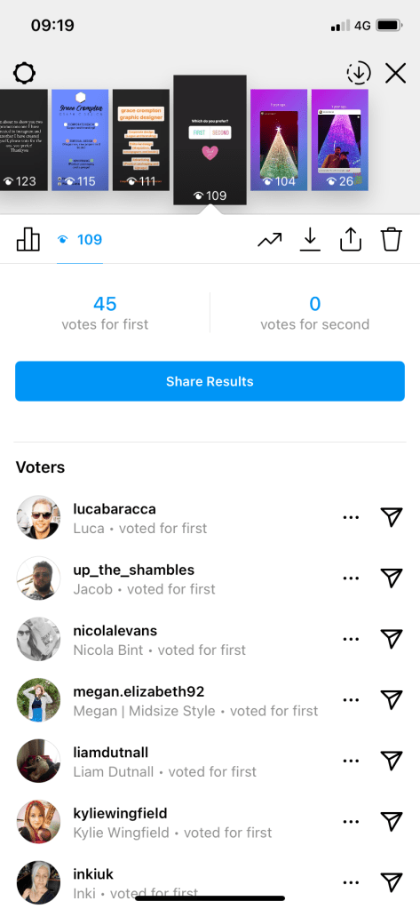
As there are many social media platforms, I have decided to focus my research on Instagram as this is a very image driven platform and therefore will show more design capabilities of my research. To get some perspective of what social media platform, Instagram is capable of creating and what me a graphic designer is capable of I am going to create two different posts and share them on the platform asking for feedback as to which the user/client prefers. I will use the in-app features to create a promotion for myself as a graphic designer and then create something in adobe illustrator using the same text but use wider range features, as a graphic designer would use.

First Design created in Adobe Illustrator

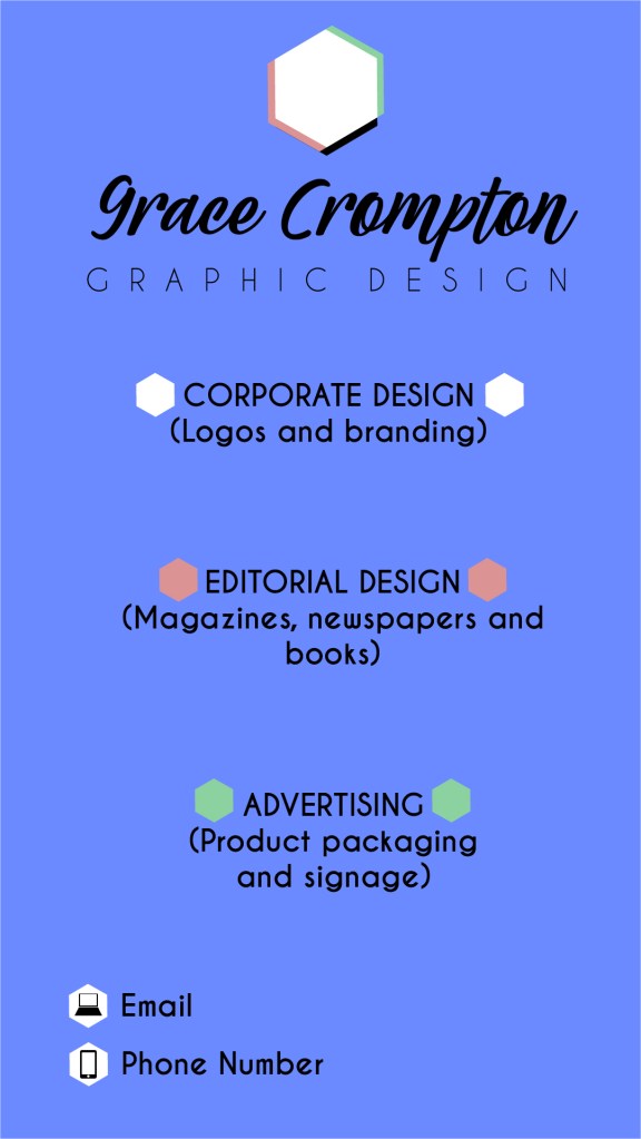
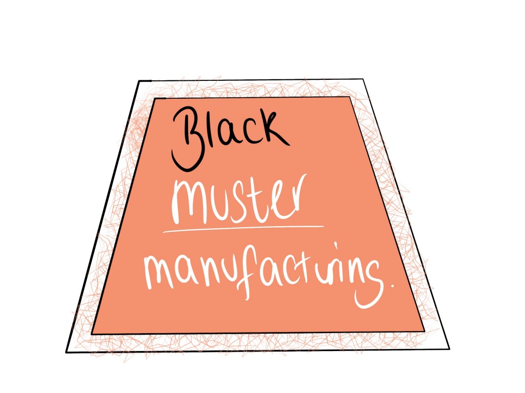
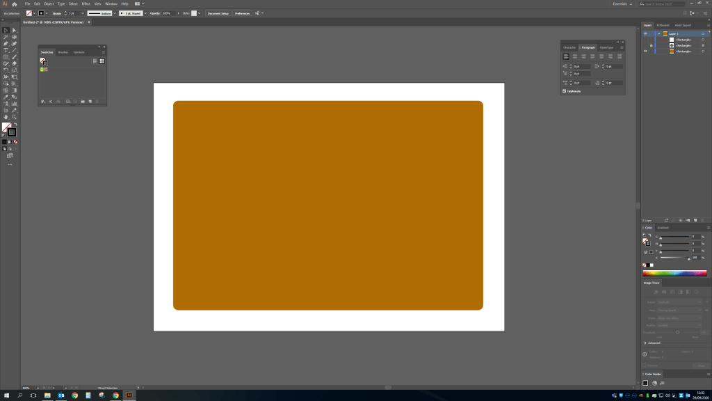
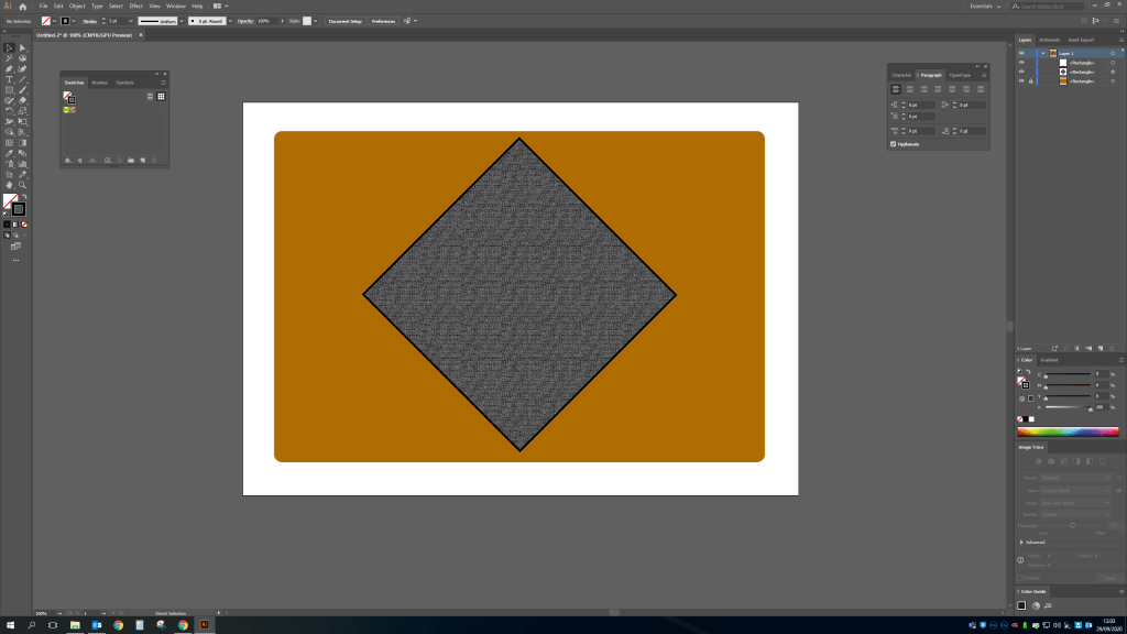
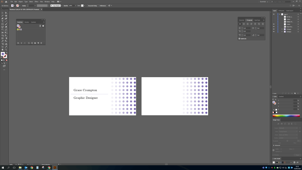
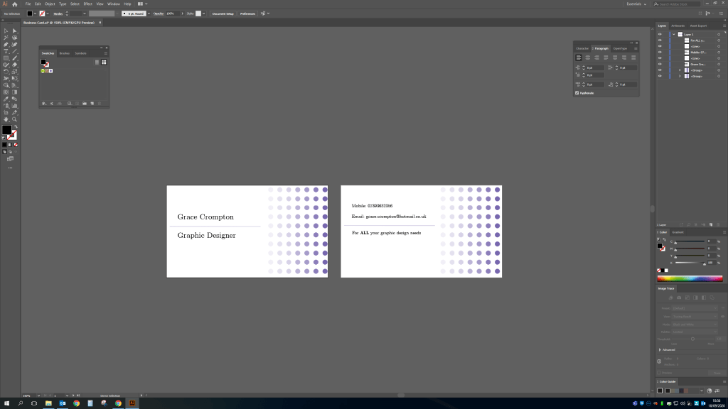
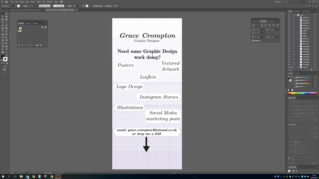
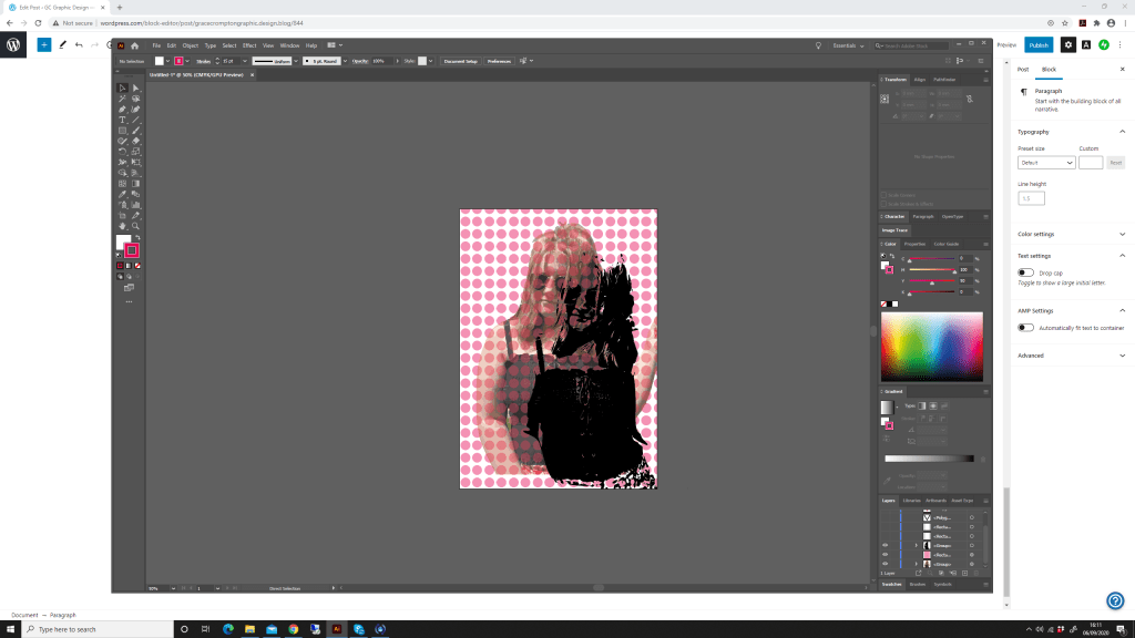
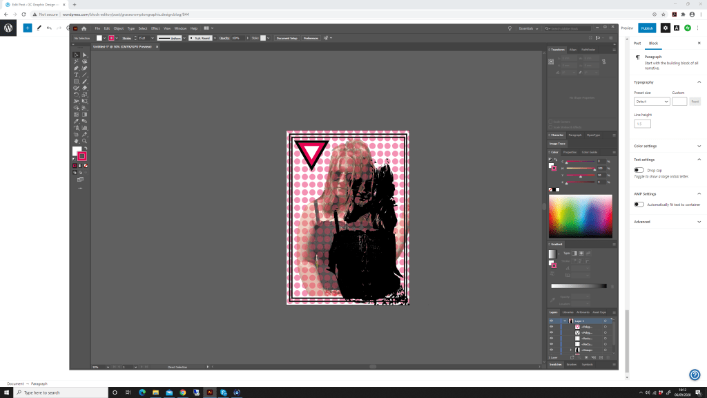
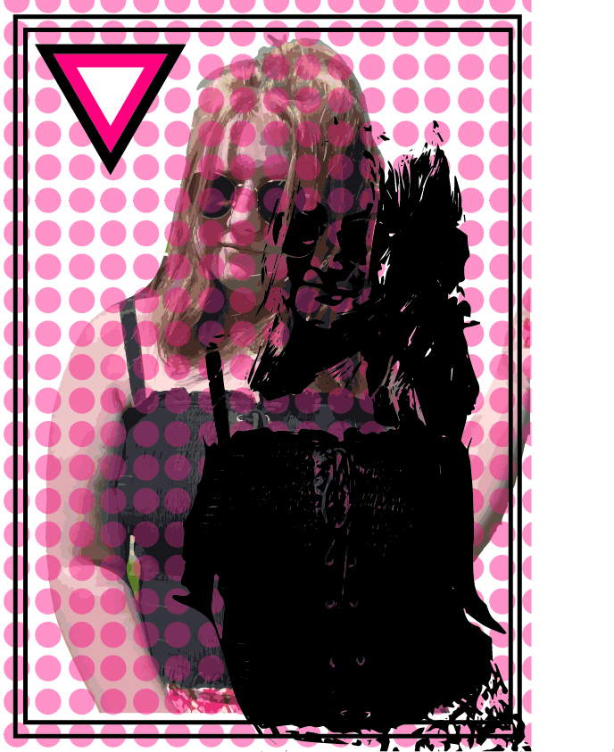
My first design I have used Adobe Illustrator to create an advert for myself as a graphic designer. I have used a bright background and coinciding colours for text and a logo I have quickly created. I have matched the fonts, using only two as using too many looks overcrowded and I want to create a brand. I have listed my capabilities using hexagonal bullet points in different corresponding colours to my logo. The design is simple and clear while being bright and appealing to my audience. For me as a designer and avid social media user I find I have more design capabilities in Adobe Illustrator to create a more striking and involved piece of work. To create something a bit more animated I could have dropped this page into Adobe after Effects but did not feel this was necessary for an advertisement of this style.

Second Design Created in Instagram

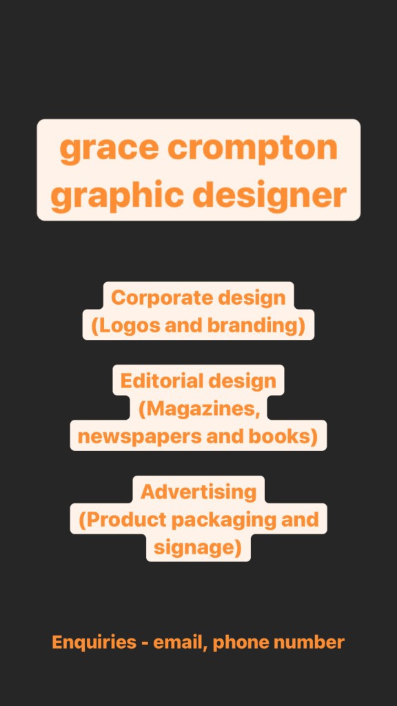
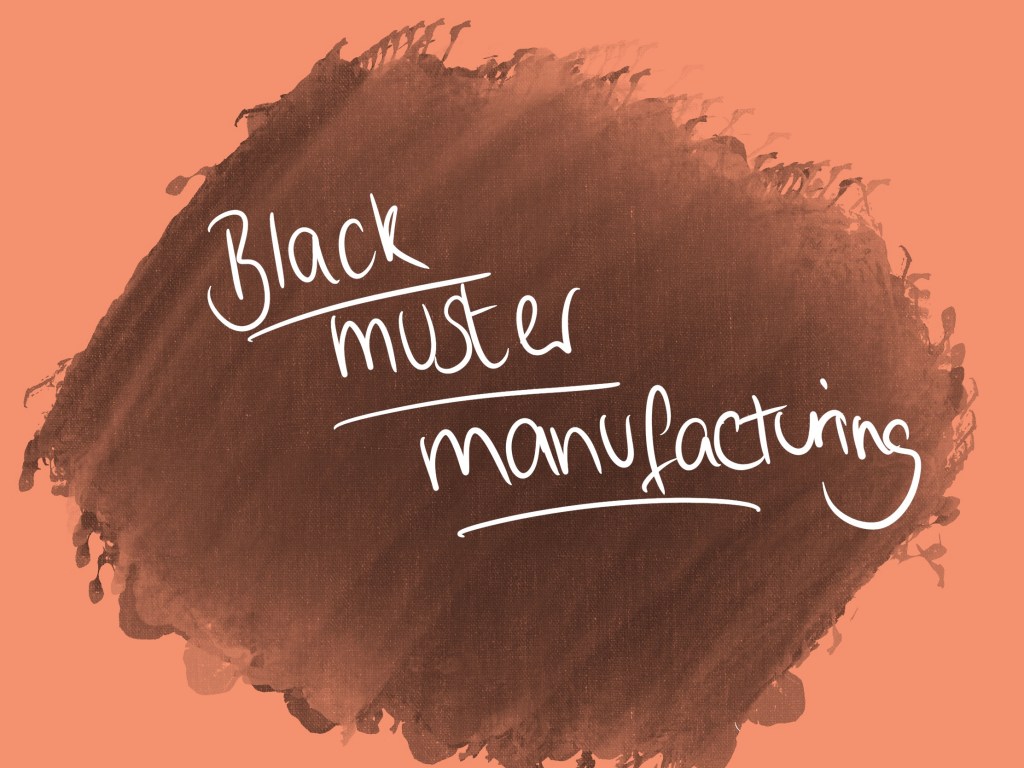
My second design I have used the basic features available in Instagram’s create mode. There are limited colours available for the background, this dark grey was the only solid colour available, and I believe a mixture of gradient colours would be too busy for an advertisement. I have contrasted the grey with an orange text making a readable clear design. Again, font variations are limited in the tool however; this looks to be a standard Arial style font, which is widely used in the graphic design world as a standard font. This tool in Instagram also allows me to add a block style background to the text making it stand out more. There is also options to add features such as a direct message box for the user to send a message through Instagram, also the added sticker/gif feature to create something more animated. The design does the job and was very quick and easy to create so for someone who is starting a small business for example this would be ideal as you can create a promotion yourself without paying a graphic designer.

Chapter 2 – Results

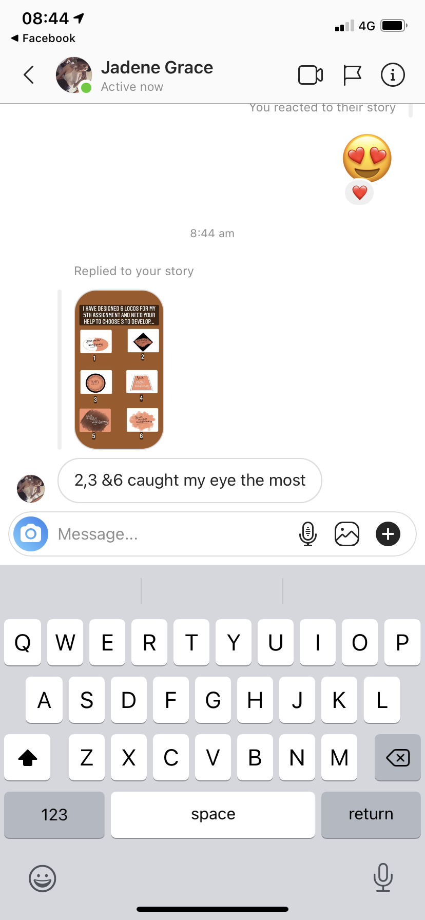
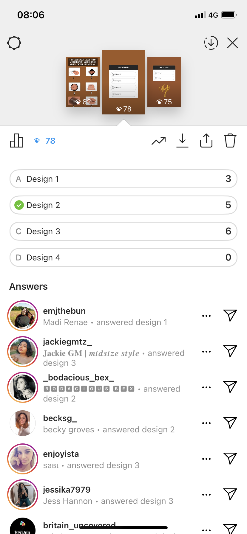
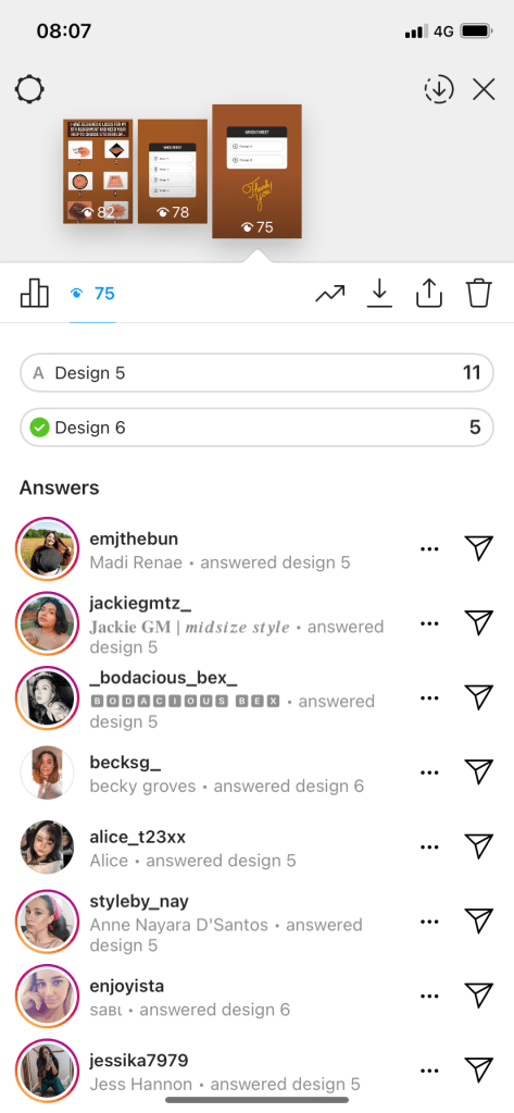
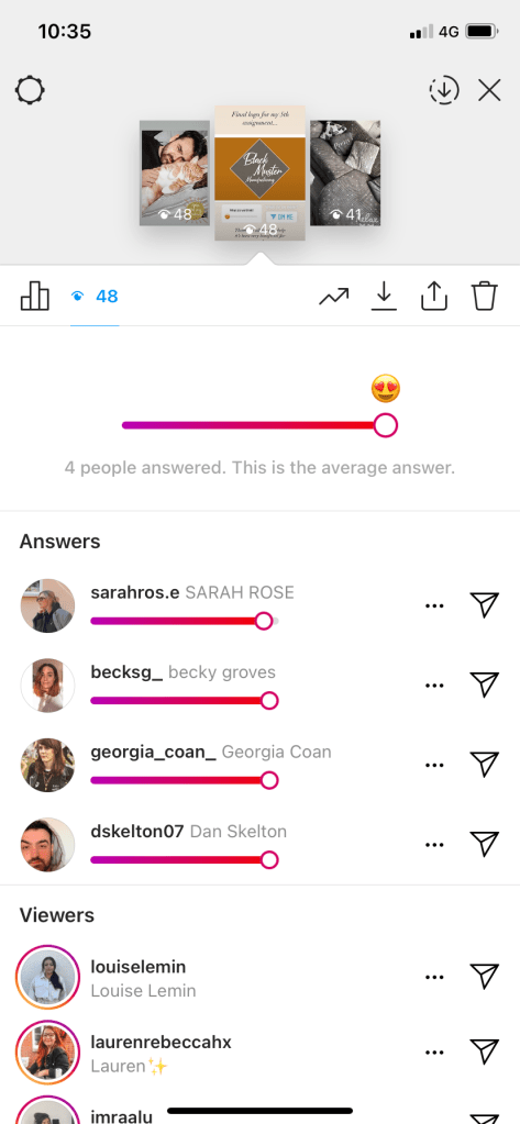
I asked my audience to simply view both designs and then vote as to which they prefer, the first or the second. The overwhelming majority voted for the first design created in Adobe Illustrator. I am assuming this is because the care and detail in the design is more than the design created in Instagram. I have created a pro’s and con’s list for both features to determine what would be best for engagement with an audience.

Instagram Create Mode

Pros

  • Easy to create
  • Free service
  • Ability to do paid promotion
  • Does the job

Cons

  • Not much available creatively
  • Limited to social media only

Adobe Illustrator / Graphic Designer

Pros

  • Good Quality Design
  • Can be altered and changed for various uses not just social media
  • More features available – fonts, colours etc.

Cons

  • More expensive to pay graphic designer or purchase adobe illustrator
Final Results

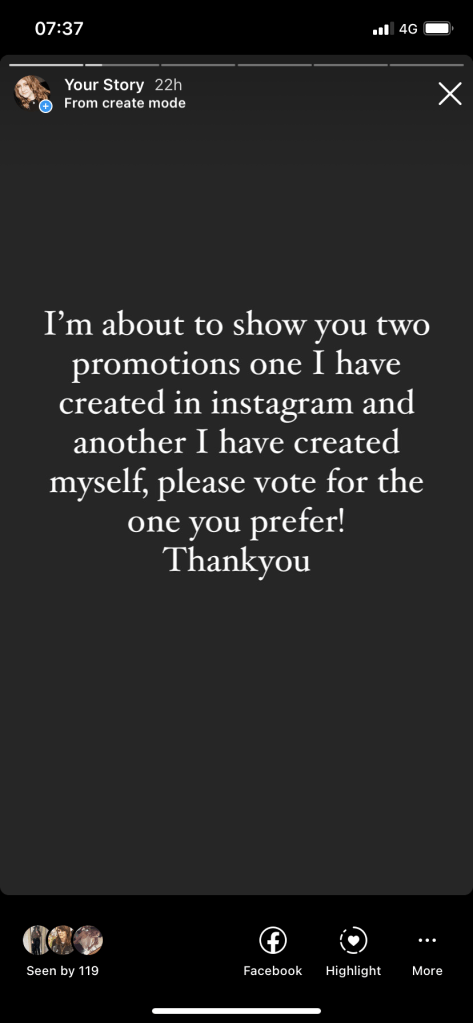
To add to my results I have asked my audience to expand on why they chose the first as their preferred design. Is there something specific or identical feedback from individuals that aligns with my own thoughts of the designs? Here is the feedback I received the consensus being that the first design looked more professional, cleaner and more visually pleasing.

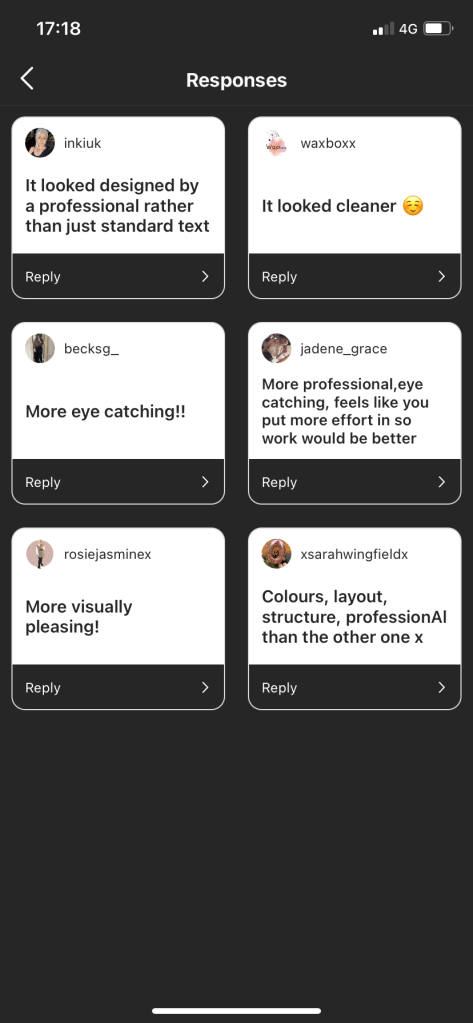
To which I do agree, as a graphic designer though my opinion is biased. I am bound to prefer the more professional thought out design but to know that others believe the same that the design is more eye catching and looks more professionally designed by someone who is technically not qualified is flattering and makes me believe I do have a potential career in this. However I do believe that due to the current circumstances and the impending recession companies will struggle to be able to afford a graphic designers fees and may have no choice but to use social media tools themselves to create promotions for their business. As a graphic designer it would be worth considering offering certain cheaper services for clients or even advice for them to create their own promotions such as text or placement. Easy tasks that will affect the look of their social media promotion.

Chapter 3 – Further Research

Having looked at what the user prefers from things I have designed it’s also worth looking at what other larger companies that use social media avidly to promote their business or company and the engagement they receive on said promotions. For example these instagram pages are usually run by an individual at head office posting adverts or photographs of products onto their feed, while also engaging with the public doing quiz’s, asking for opinions or posting about sales on their website including links to the various different items. Does a graphic designer have any impact on this? Can I make an accurate assumption that this probably is the work of a graphic designer by doing a deep analysis of the work featured. 

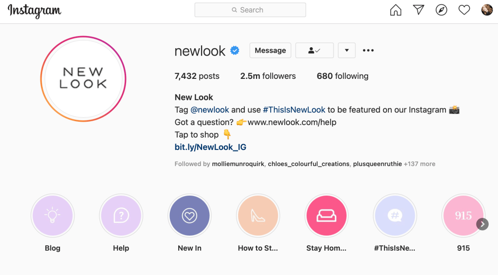
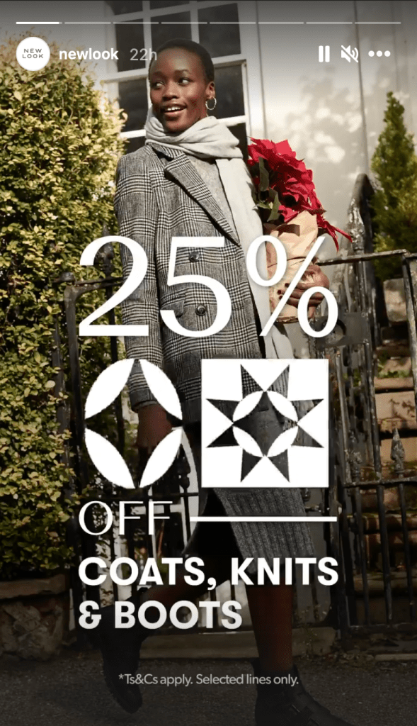
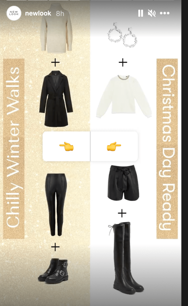
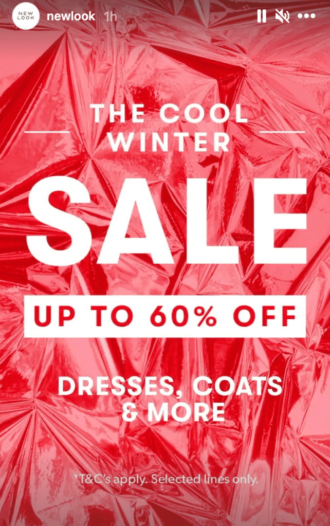
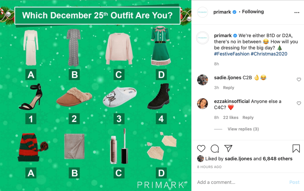
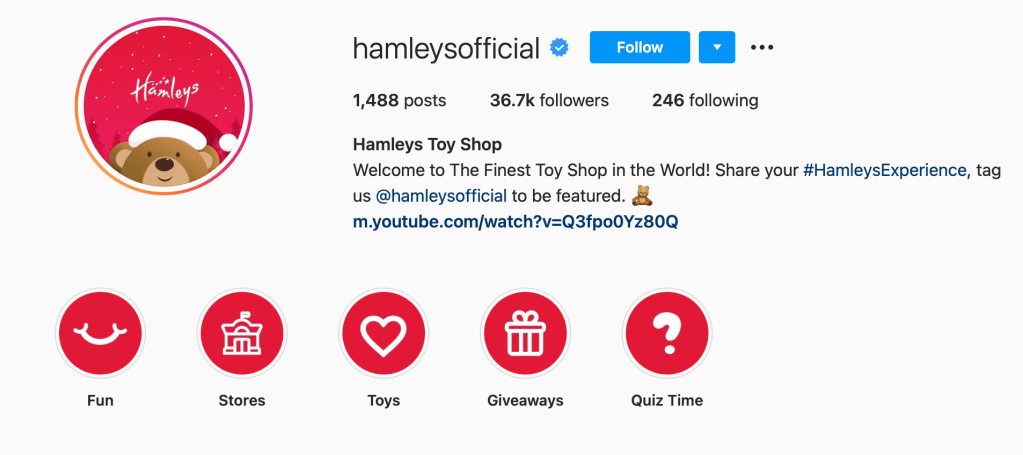
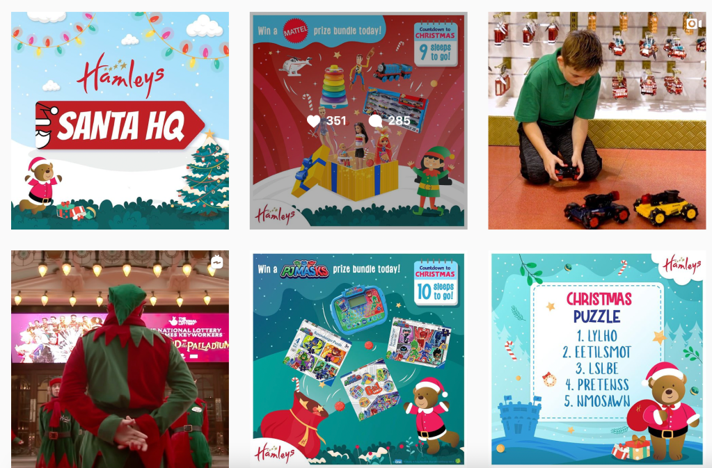
I’ve collected some screen shots of various business’ pages with work I think must have been created by a graphic designer. The colours, text and design are all specific to the companies branding. Using Pantones and fonts that align with the business’ image. In particular the Hamleys page is using a lot of Christmas styled images due to them promoting themselves as a high brand toy seller, the level on intricacy on many of their posts is too high quality to not be a graphic designers work. This also looks to be the same graphic designer or possibly a paid promotion that they are using multiple times on their page. As you can see the design features the same colour scheme and general illustration style hinting this has been done by the same person.

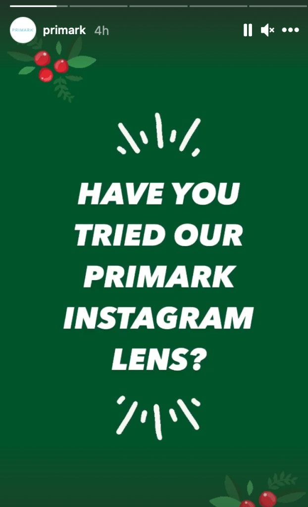
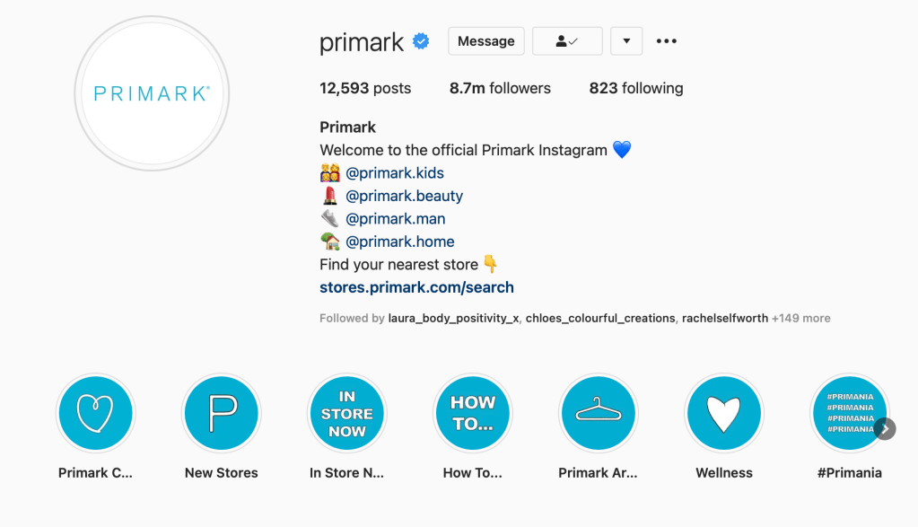
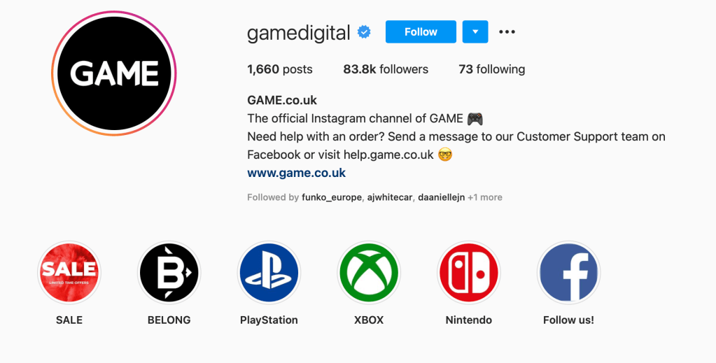
However as you can see the company ‘Game’ features a number of different other companies on their story feature such as xbox, playstation and Facebook. The company logos are obviously designed by a graphic designer for the company and then ‘Game’ will have had to get approval to use such logos on their page. But as they are a gaming company the usage of their page to promote xbox and playstation games and products is a given. This is the most popular store for gaming and therefore should be able to feature the branding for such companies. Although the usage of their logos/branding feels less individual for the company such as ‘Primark’ they have used their own colour scheme and style on their page specific to them but this is because they are only promoting themselves as a retailer. Rather than a seller of various products they sell their own brand of items. I decided to look further into this on other companies pages for those who sell other brands in their stores is this a similar pattern.

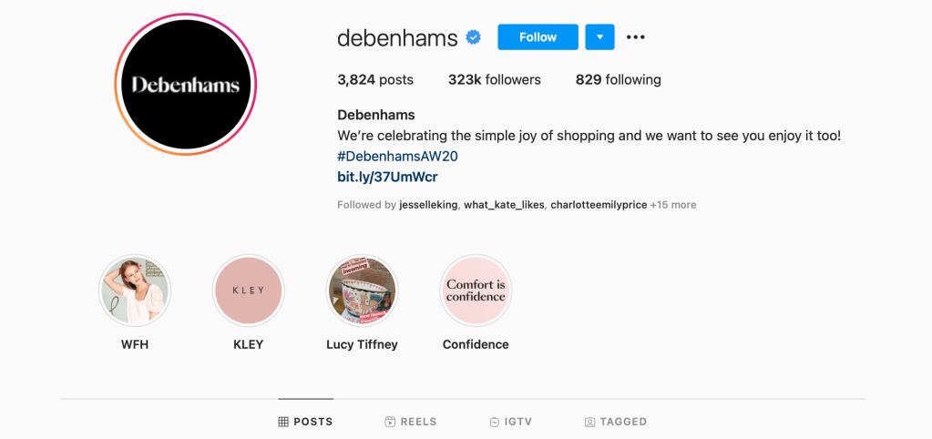
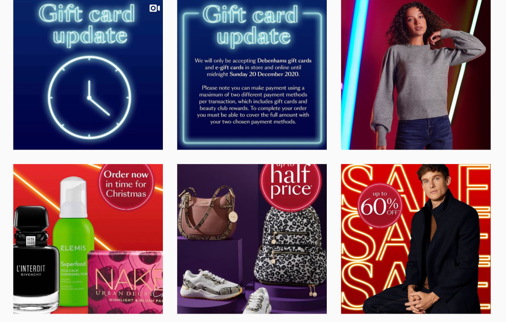
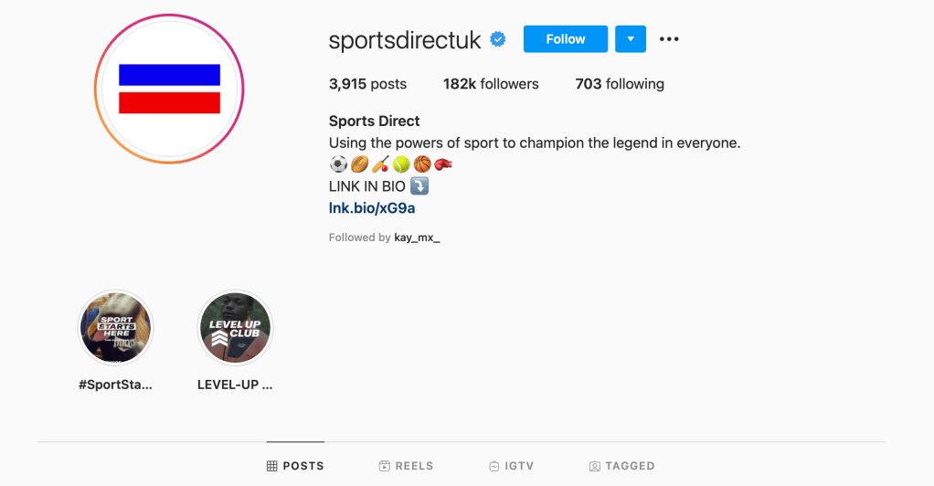
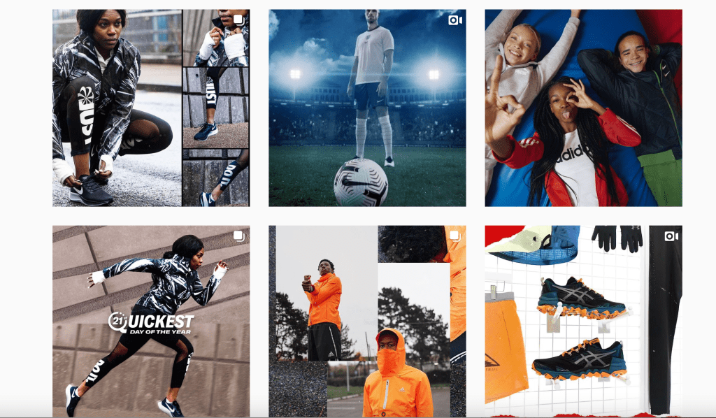
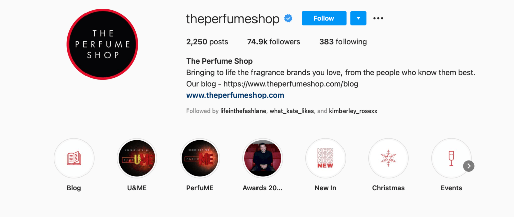
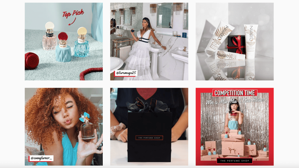
I looked at the retailers ‘Debenhams’, ‘Sports Direct’ and ‘The Perfume Shop’. I was surprised to find not a lot of brand usage considering these retailers sell on other brands. The products they sell are obviously featured but no reference to the brand logo or guidelines. For example the perfume shop sells many different brand perfumes and features them on their page is this because the selling of perfume is a niche market so when they purchase the rights to sell products on do they not have to feature the original brand? As a graphic designer I suppose it’s not my business to know but it is for creating brand guidelines for a company as depending on the retailer they might want to use certain Pantones or fonts to create a certain promotion for a brand.

Conclusion

In conclusion I believe that social media does impact a graphic designers thought process and what they design for certain companies and what these are used for. Such as my creation of a story differed to what could have been created by a social media operative for which there are many companies wanting someone to focus on their output on social media as it’s such a popular way to promote your brand/company or product. This therefore means a graphic designer must branch out further into the social media world to create professional, bold designs used for promotion on social media. There are many courses that feature designing for social media and this is definitely something universities and colleges should consider combining with graphic design or even business studies. In this day and age most companies want an individual to have multiple skill sets so having these would certainly be of benefit for someone starting a small business and can’t pay multiple salaries. That and it lessons the communications issues there could be surrounding speaking to a designer about what the brand wants and then having to speak again to the social media manager about what needs to be featured on the page for promotions. It’s something that I will definitely consider as a graphic designer, I may even study the use of social media aside of my graphic design and visual communications skills. I believe social media is such a useful tool for small businesses to create promotions but I also believe that graphic design should intricate together with social media in the future. Design companies are starting this process by introducing products such as Adobe Spark where you can very easily create instagram stories and posts. Similar to Adobe Illustrator you choose a background and add texts or images to feature but this you can do on the go on your mobile or tablet again very useful tool for a small business but this feature is exclusive to Adobe Creative Cloud. I think the use of social media on it’s own is definitely worth doing but if you can afford to you should pay a graphic designer to create something for your company for promotions on all platforms and graphic designers should be adding this feature to their skill set.

Assignment five – Client-led project

Finding a Client

After a good few weeks of promo and a fair few let downs, i was unable to find a client that needs some graphic design work doing. However i was recommended to try the good brief website that generates a fake brief for you to design, it’s good for starting out designers to develop a portfolio.

So this is the brief i was given by random generator.

The Brief

Company Name – Black Muster Manufacturing

Company Description – We are a fashion company that sells bespoke baby clothes. Our items are made with high-quality materials and are shipped directly to your home. Our target audience is parents. We want to convey a sense of fame, while at the same time being professional.

Job Description – You must create a logo using the information given in this brief. They would prefer a mascot logo that uses the color orange. The logo will be embroidered on uniforms. Take into account the company’s values and preferences, and make sure it will work for the planned use-cases.

Deadline – 3 Days.

Ideas

After analyzing the brief in full I have produced 6 rough sketch ideas of a logo using the specified orange colour use alongside keeping it professional.

As this brief is something I was given randomly I will ask the public to decide which ones to go forward with and produce into pre-press artwork.

Using social media platform Instagram is a good way to get the general view as I can post a voting system, see above. To get a general idea of what the public like. As you can see the results are design 2,3,5 and 6 are the overall winners. So I will develop the winner design 5 into final pre press artwork.

Final pre-press artwork

I started off by creating the basic shape outline with the burnt orange coloring and then adding the texturized black shape on top.

I think the black outline is a bit too prominent and makes the logo look too dark. Same with the texture effect on the square I will change this by changing the opacity.
I then had a play around with colour and fonts to choose this layout. I feel it looks professional with having a sense of fame with the font, it’s almost like a autograph.
Final Logo

Cost

I first had a look at the average cost for a logo design from graphic design company.

The average according to google is about $100 converted to pounds that would be £77.81 so about £80. However the AD’s on the google search claim a logo would be about £20. So for this assignment and how long this has taken me in terms of design and getting public opinion i would charge about £40 average.

Depending on how long it can take to get a confirmed design would depend on what a graphic designer would charge. If i needed to develop several designs further or do lots of amending i would therefore charge more. It’s something I need to consider if I want to make graphic design a career.

Reflection

For this I am going to use the public as my Guinea pigs, I have posted the final logo onto Instagram and asked for the opinion of my peers.

I didn’t get as much feedback this time not sure why but here are the results.

This assignment has been a challenging one it has however brought me an incite into what the world of freelance graphic design as a job would be like. Although I have worked in a company as a graphic designer i have no explored the avenue of freelance. This is definitely something I would like to consider as a career path certainly if I find myself at home more often and need a source of income. I loved being able to get opinions of the public for this assignment, I found it very beneficial as I wouldn’t have chosen the above design myself. I probably would have chose something a bit more traditional but that wasn’t what the client has asked for. They asked for something more professional and brought a sense of fame. This logo would work really well as a company logo the style is also able to change with the times of year for example. The burnt orange background could be changed to keep up to date with current trends. Keeping up to date is something I often do anyway but definitely in terms of graphic design as the client may have seen something online they would like replicated for their company. Logo design in particular isn’t something I have delved into much, I have as part of completing my degree and various small jobs that are work related. I enjoyed being able to design so many different looks with different shapes and styles, to appease the client i need to be able to broaden my horizon as well as keep the look as a traditional logo. Like the brief mentioned i would need to use this for company uniform, amongst business cards, web design and company marketing and advertising. A logo needs to be diverse in it’s use across all boards. It also needs to represent the company as a brand, this is important for the client/company to be able to establish themselves across their remit. For example if I mention a brand company like Coca-Cola you can visualize the logo in your head, from the font style to the recognizable colour scheme. As a graphic designer I need to be able to do the same for my client, creating them their own brand in the use of a logo in this circumstance. I believe I have handled the assignment in the best way, I would have preferred to work with a client properly but I have been able to get my work and skills out to the public through social media and have a few potential clients in the works. I will refer back to this assignment when producing artwork for clients to either show my process or look into pricing etc. It was interesting to look into the full process rather than just creating the work in my own vision, I was creating something for a client, although in this case an imaginary client, through goodbrief and the use of social media, I have created a logo for a company that I am very happy with and will use in my portfolio.

Exercise: Promote yourself

What do i offer as a graphic designer?

  • Poster, Leaflet, Business Card, Letterhead, Promotions Design
  • Logo Design
  • Illustration
  • Vectored Artwork

As a young graphic designer i am able to provide high quality, individual designs specifically tailored for your company.

Grace Crompton, Graphic Designer

I like to provide a range of artwork similar to what is featured in my portfolio, from logo designs to promotions to show a broad look at my skills as a graphic designer.

Business Card

First i created a simple dot pattern in a purple colour to display on either side. This gives the card a bit of colour while not being too overpowering
Then i added my name and title to the font of the card, i decided to go with Euclid Font as this was clear and professional looking.
Before then adding my contact information and a little tag line on the other side.

I love the look of this i will continue the colour scheme style and font in my PDF flyer.

PDF Flyer

The best way to promote yourself these days is through social media rather than create something to be printed and distributed. Social media is a much quicker format to promote.

So i have created the below banner/post in the iPhone size available on adobe illustrator.

Mobile size presets
I’ve added my signature dot effect to the post
Adding my font style keeping with the business card design.

I will use this as promotion for the upcoming assignment so i am able to get a client to work with.

Exercise: Create a portfolio

Having already had a portfolio with my work in for a number of years, this exercise is a good opportunity to look at work i have produced in this course and update it.

My Portfolio has always been on Dropbox as i find it the best way to send my work to others without filling up their inbox. So here i have gotten rid of the things i don’t think should feature anymore as my work has grown considerably better through doing this degree and my own personal work.

I’ve added work from my assignment 3 as i feel this work covered more areas in terms of designing logos and posters for companies.

While also adding in my favourite pieces from assignment 1 & 2.

I’ve then combined these into a compressed PDF document in case clients would like this sent to them or would prefer this format over a Dropbox link.

Exercise: Print variations

Research

Using the links from the brief I’ve done a bit of research, see below.

Collecting some samples of the most appealing work to me.

Steal Your Face Special Edition Art Print
Grateful Dead Santa Clara CA Art Print
Mudhoney  Girltrouble Art Print

Experiments

I love the look of the Grateful Dead band posters. Having already seen a lot of these as my dad was a huge fan. I’ve used a portrait of myself below and added different overlays to try and create a similar look to the above examples.

I started off by image tracing the photograph of myself just to get an idea of what the actual screen print would produce on its own without adding the other layers.
I then added the dot style from one of my research images overlaid onto the image.
I then added another image trace but completely black this time, similar to the cat image from my research. Using two different colours on top of one another to screen print the design.
Before then adding the frame style and triangle images like the grateful dead posters.

Final Image

Final Image

This exercise was really fun and imaginative, to look at the different styles of printing and create something for this style myself isn’t something i have done before. Having a small knowledge of print and the different variations i can see how designers need to consider the print aspect when they are creating and brainstorming ideas.

Exercise: Your pre-flight check

I first created my document in indesign A4 landscape marking the halfway point for folding and adding the 3 mm bleed.

Before then adding my full colour on the front and two spot colours on the inside making a note of the pantone colours used.

Then to add my images and text, making sure the images are also saved into a folder at 300dpi and adding the fonts i’ve used.

Finished Document inDesign
PDF with crop and bleed marks for printer
Folder with images, files and fonts.

I decided to use a recent trip to the zoo i had as it’s an outdoor area and zoos are now struggling after being shut for majority of the summer due to the coronavirus pandemic. I had to pay full price which i imagine would put a lot of people off going. Offering a voucher in the leaflet is a good idea to entice customers to visit and increase the zoo’s funding.

Having already had to deal with printers to some extent i know it’s better to include as much information as possible so the job can be booked in and started as soon as possible, as it’s infuriating to have to keep going back to the client asking for more details. A graphic designer should always be organised and have everything to hand and quickly respond to all demands in my opinion.

Exercise: Working for a client

To fully understand what the client wants there a various processes to go through, i started off by brainstorming the initial idea of exploring the enjoyment of reading.

I then looked at how the client wants to publicize the differences and benefits of a real bookshop over a virtual one.

In addition i’ve added a list of questions for my first meeting with the client, I like to establish as much information on this brief in the first meeting as possible so i can focus on the design aspect and completing the brief for the client as soon as possible.

To develop a schedule for this project i would need to know the deadline and how much hours of work are required. For example while im working full time and studying part time my only free hours to concentrate on this course are the weekends. So about 8 hours a week depending on my schedule and social plans. It’s important to have a balance of work and life. As the current pandemic makes meeting anyone in person particularly difficult what i could do for the client is arrange a Skype or google meeting to show my work so far and if the client is happy alongside any changes of plans or amendments. My creative process is generally quite quick once i have a brief i usually have an idea in mind already, i need to be able to slow the process down to make sure the client is satisfied and their vision achieved.

Exercise: Finding a client

Having already worked in various different sectors of graphic design including, education currently and art-working previously. I would say there are a fair few areas i would like to explore more of, see the list below.

I’ve always been interested in social media and fashion it’s very common to now to use social media to promote fashion brands. So to do this for a job would be the dream. For future assignment 5 I could contact some companies and see if I can create something for them to use for promotion.

Already working in education I could use this as an opportunity to create more visually stunning work for students to use.

Exercise: Open and closed briefs

Research

I thought it best to research the terms divergent and convergent thinking as to better understand these before reflecting on my results.

Divergent thinking is a thought process or method used to generate creative ideas by exploring many possible solutions. It typically occurs in a spontaneous, free-flowing, “non-linear” manner, such that many ideas are generated in an emergent cognitive fashion. Many possible solutions are explored in a short amount of time, and unexpected connections are drawn. Following divergent thinking, ideas and information are organized and structured using convergent thinking, which follows a particular set of logical steps to arrive at one solution, which in some cases is a “correct” solution. The psychologist J.P. Guilford first coined the terms convergent thinking and divergent thinking in 1956.

https://en.wikipedia.org/wiki/Divergent_thinking#:~:text=Divergent%20thinking%20is%20a%20thought,in%20an%20emergent%20cognitive%20fashion.

Convergent thinking is a term coined by Joy Paul Guilford as the opposite of divergent thinking. It generally means the ability to give the “correct” answer to standard questions that do not require significant creativity, for instance in most tasks in school and on standardized multiple-choice tests for intelligence.

https://en.wikipedia.org/wiki/Convergent_thinking#:~:text=Convergent%20thinking%20is%20a%20term,multiple%2Dchoice%20tests%20for%20intelligence.

Review

It’s quite clear from doing this exercise that depending on the notion of the brief as a graphic designer you need to be able to think like both a divergent and a convergent. In this case the client appears to know exactly what they want so be a convergent thinker and get the job done asap. However i feel it’s always worth asking the questions like a divergent thinker, is the client sure this is how they want to display the information, maybe give the client various options before they make a decision. It’s always worth speaking to the client and making sure they are clear and concise with their demands and what would be best for their needs.

Design a site like this with WordPress.com
Get started