
Research
Using the links from the brief I’ve done a bit of research, see below.
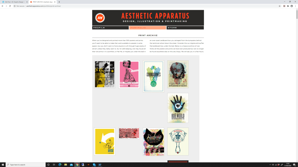

Collecting some samples of the most appealing work to me.


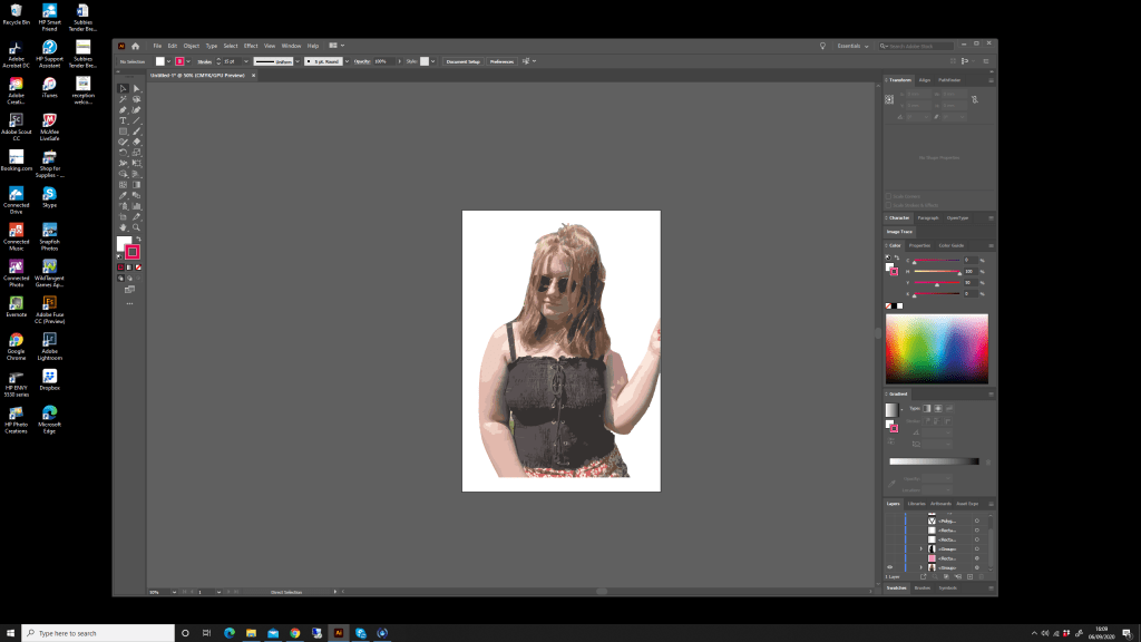
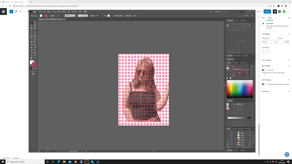
Experiments
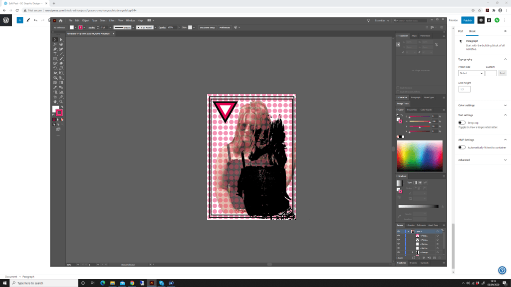
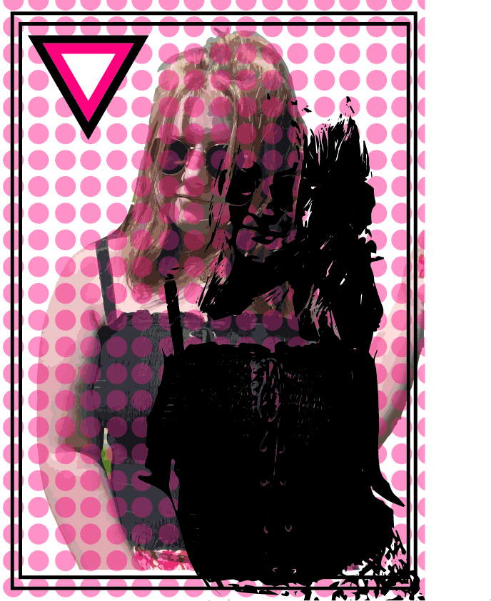
I love the look of the Grateful Dead band posters. Having already seen a lot of these as my dad was a huge fan. I’ve used a portrait of myself below and added different overlays to try and create a similar look to the above examples.
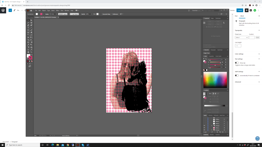
Final Image
This exercise was really fun and imaginative, to look at the different styles of printing and create something for this style myself isn’t something i have done before. Having a small knowledge of print and the different variations i can see how designers need to consider the print aspect when they are creating and brainstorming ideas.
