
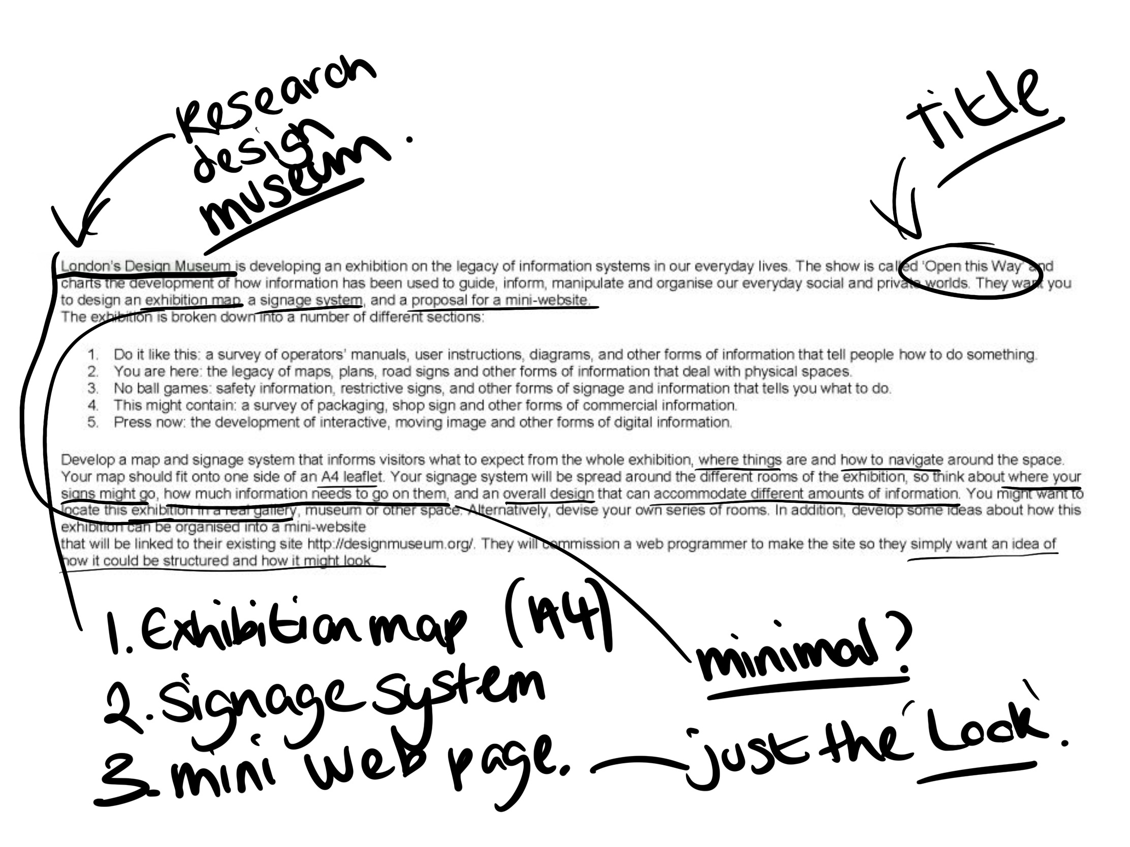
Brief
Research
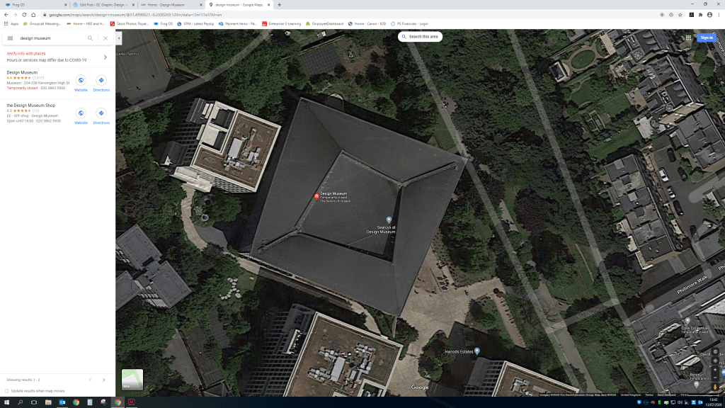
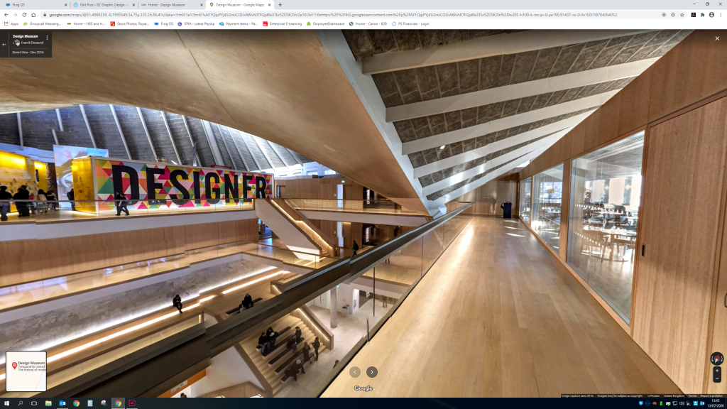
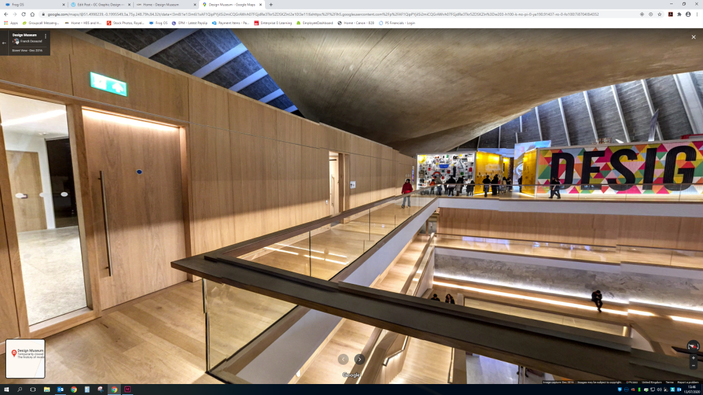
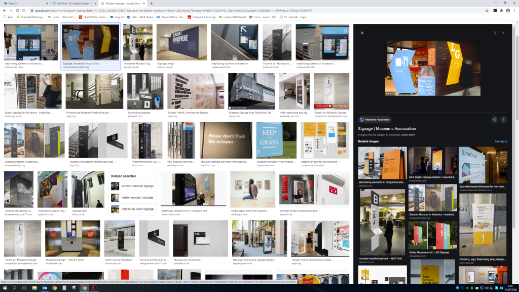
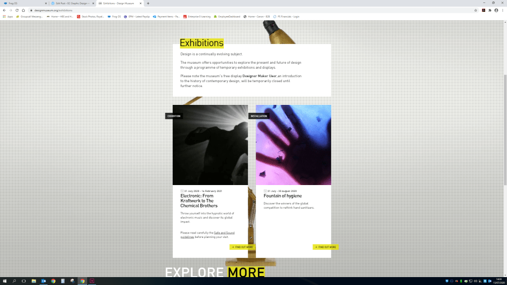
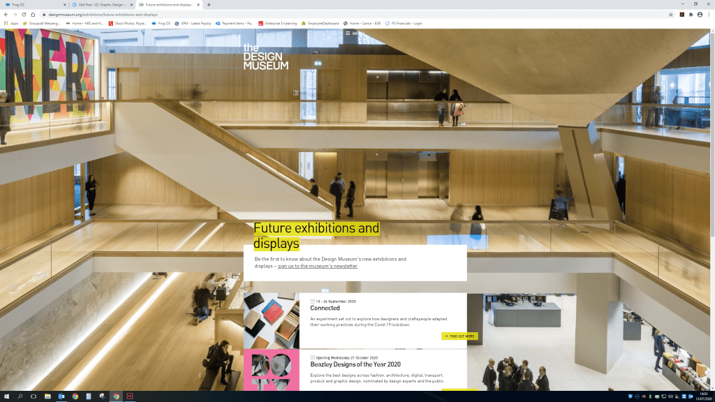
As the design museum is currently still closed while we are in a global pandemic of coronavirus unfortunately i cannot visit the museum and all it’s glory. So a google map view is the best i can do at the moment to develop ideas for the map layout.


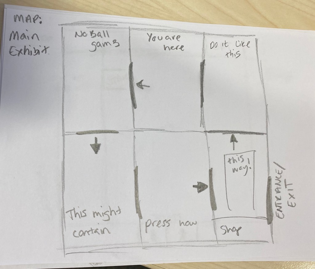
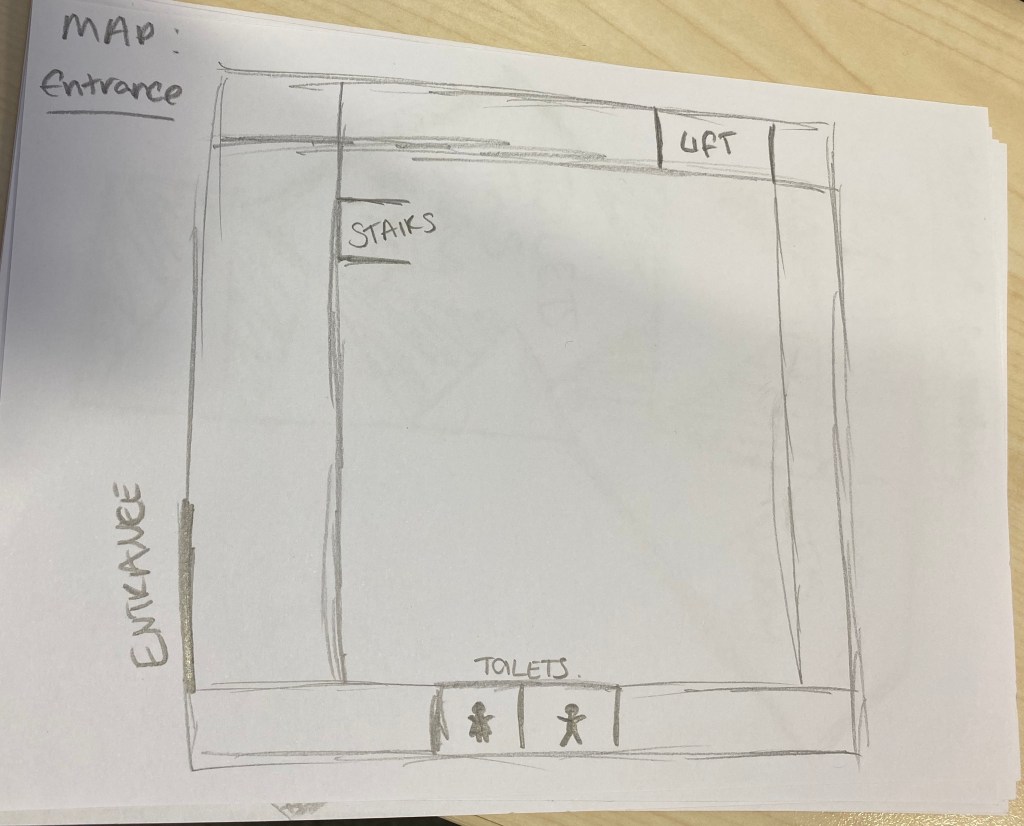
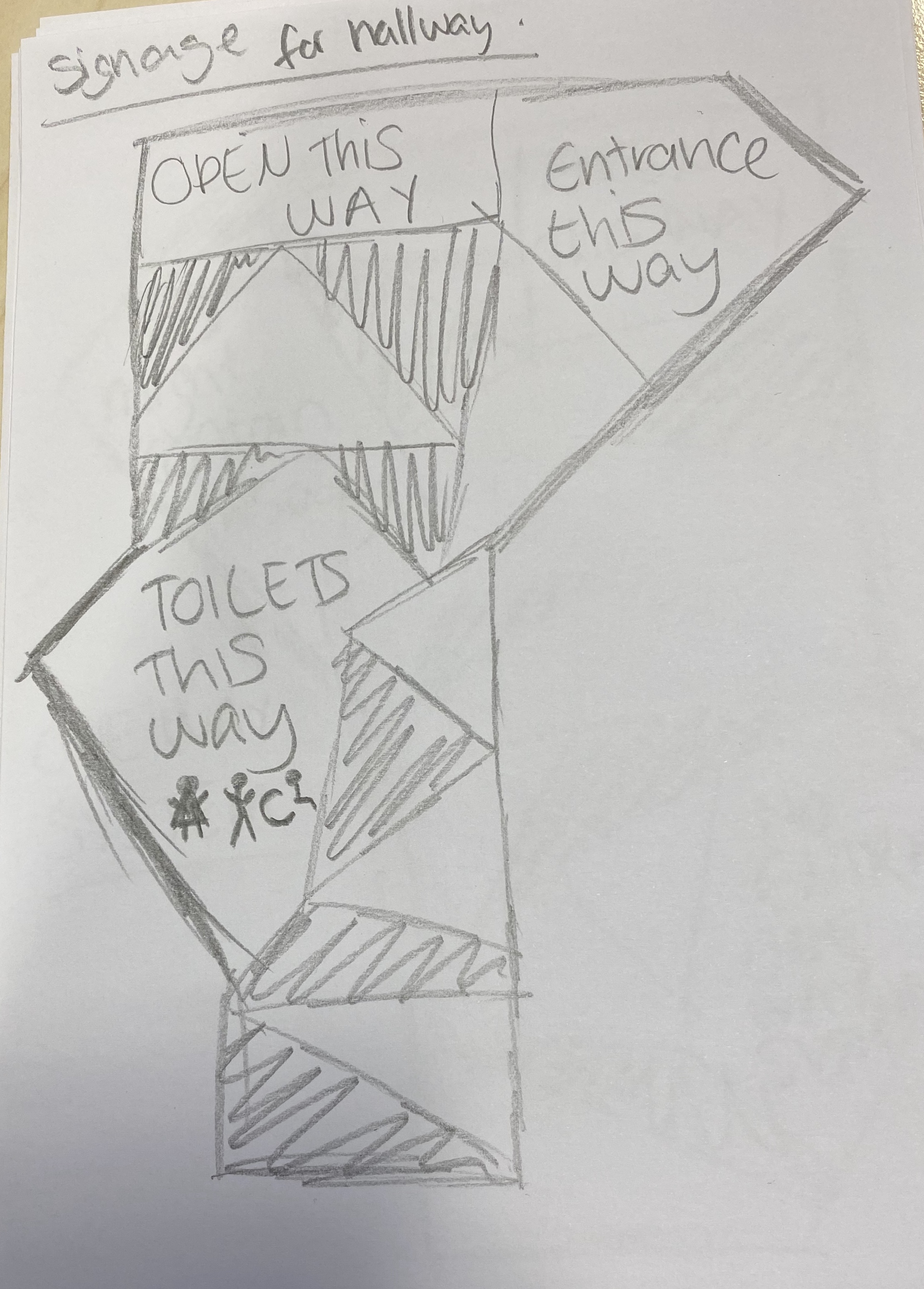
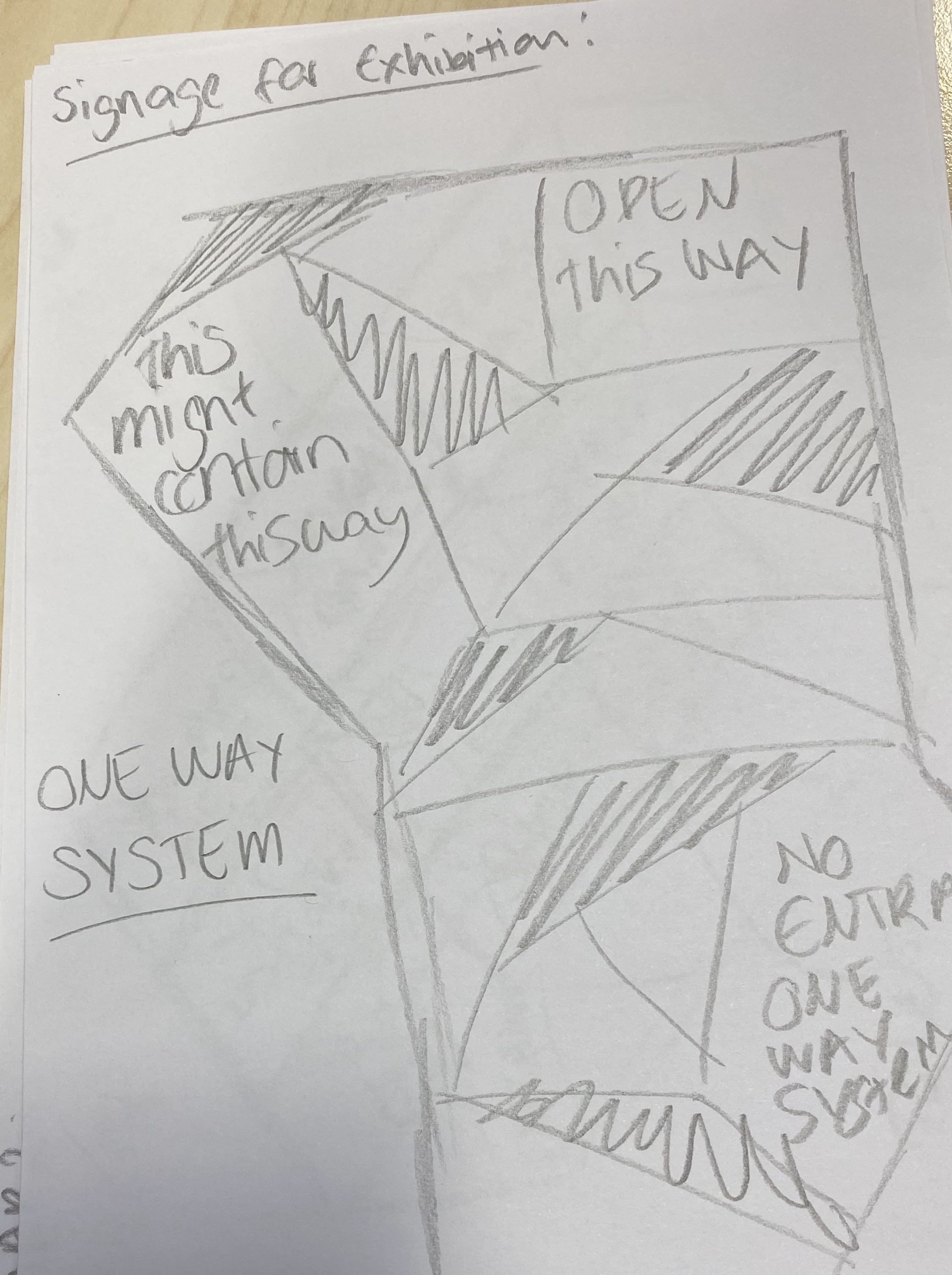
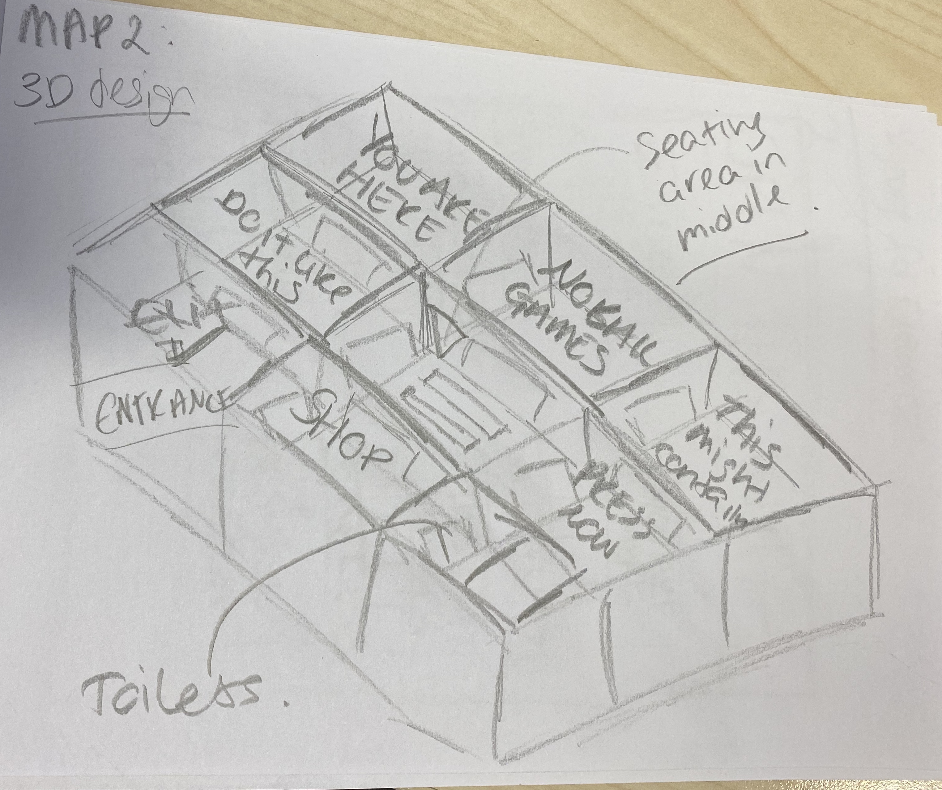
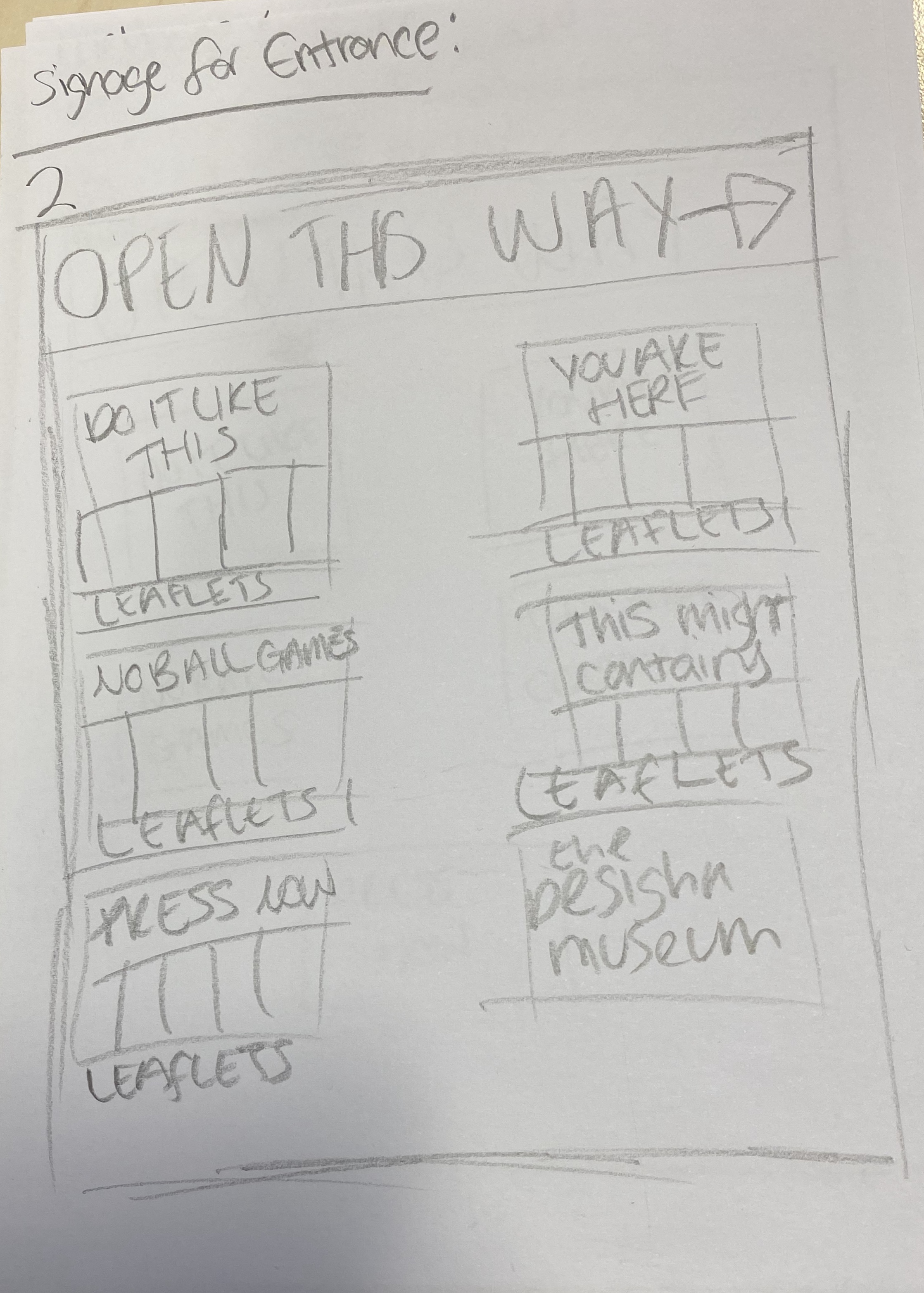
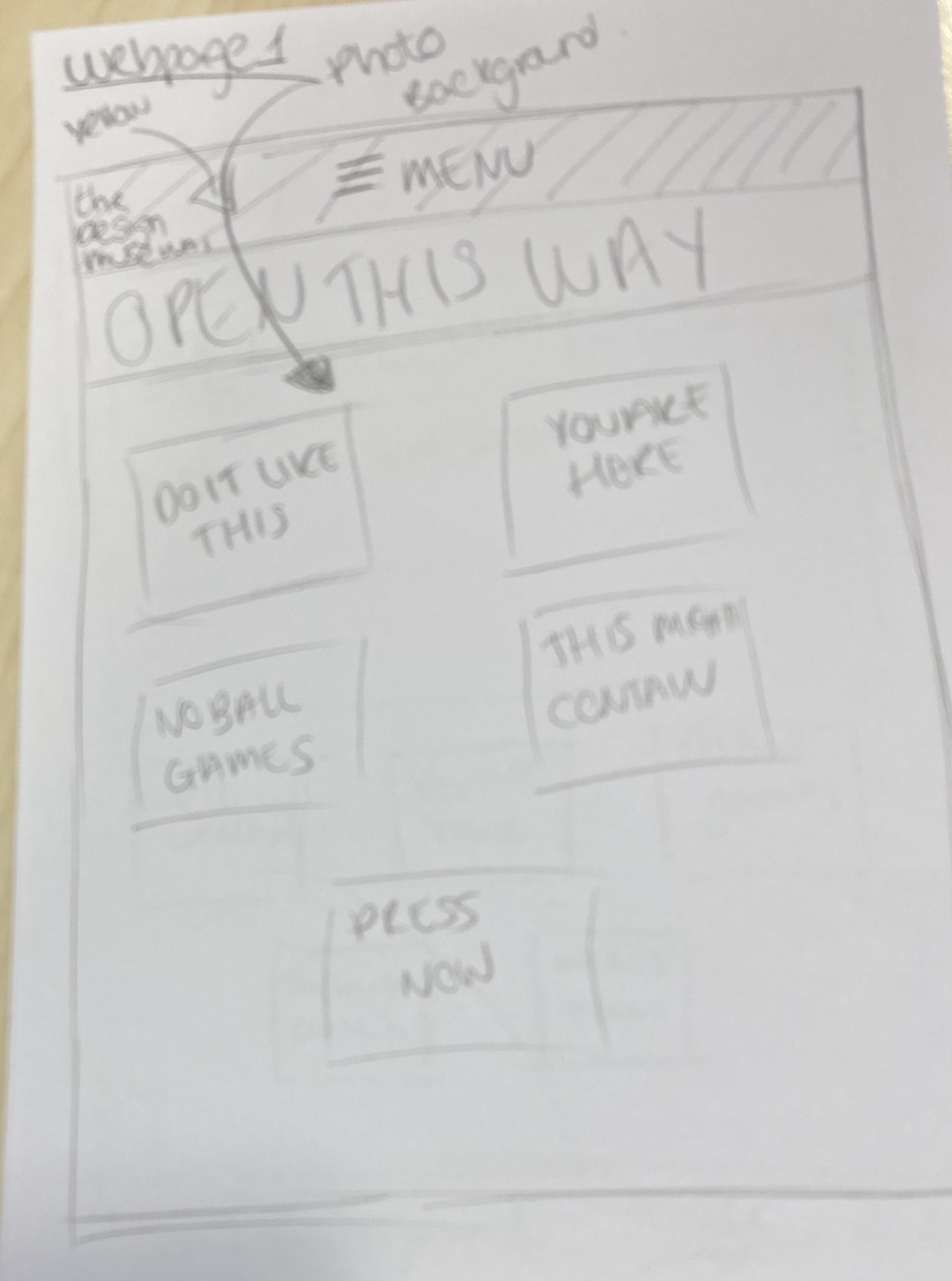
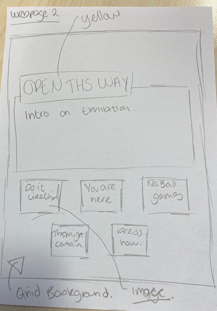
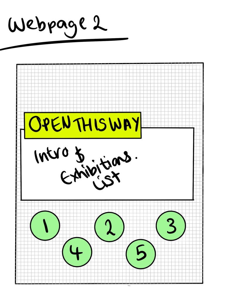
Sketches
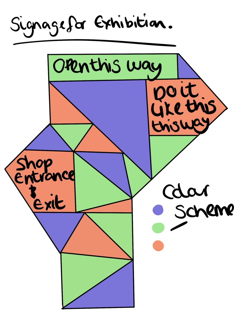
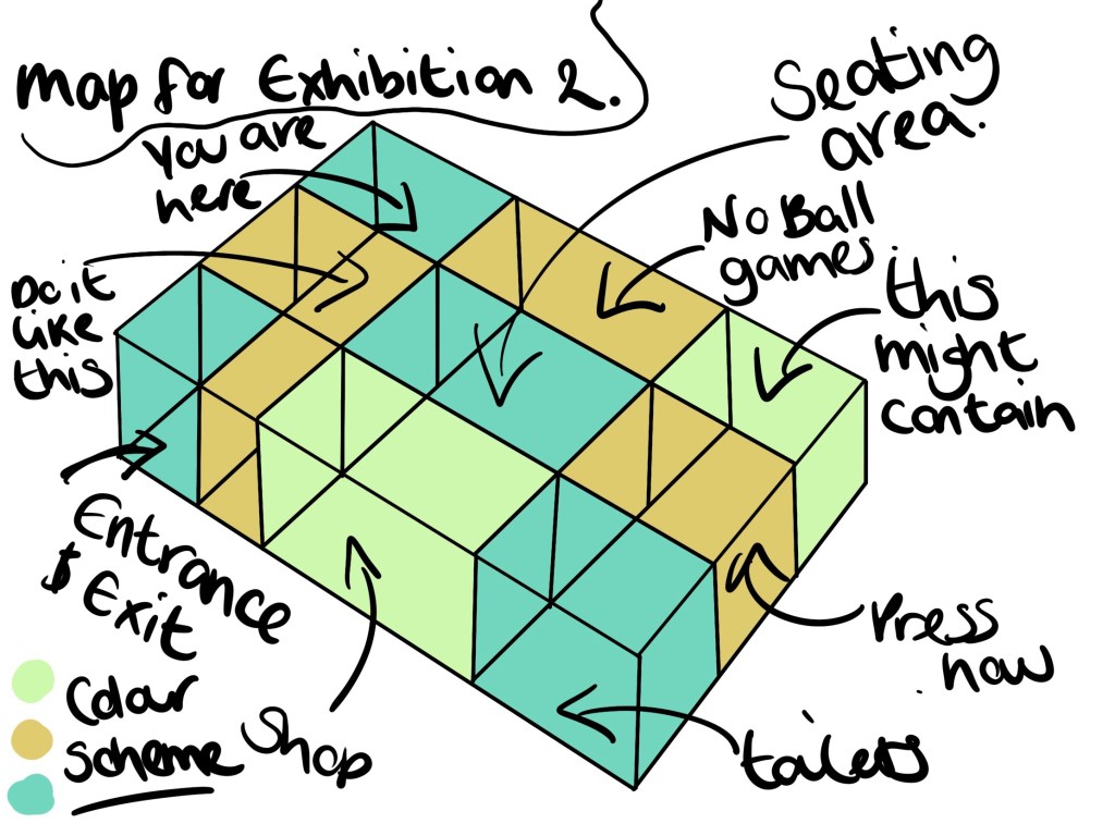
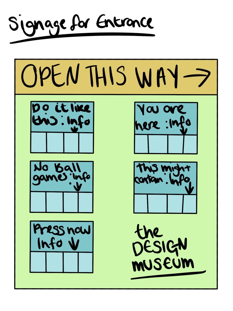
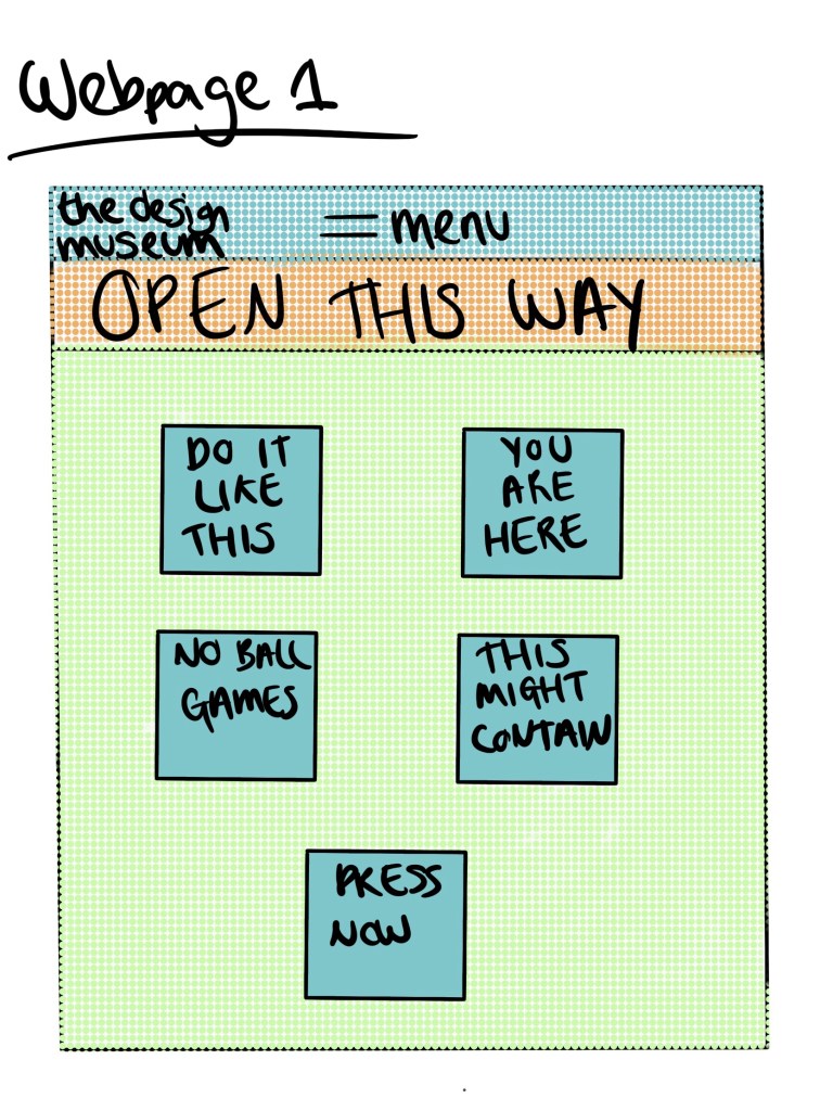
I did some basic sketches of map layouts, signage and webpage designs just to get a basic idea before choosing the design I want to develop further.
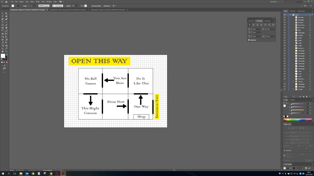
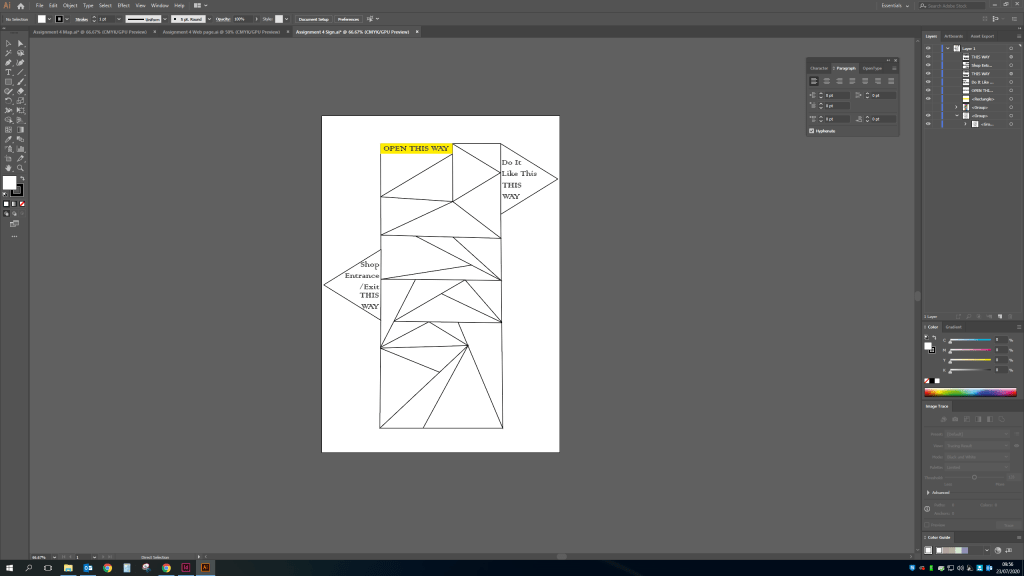
Developing ideas
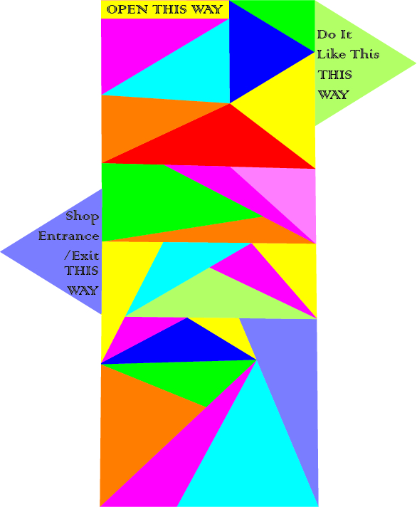
Final Piece

Review
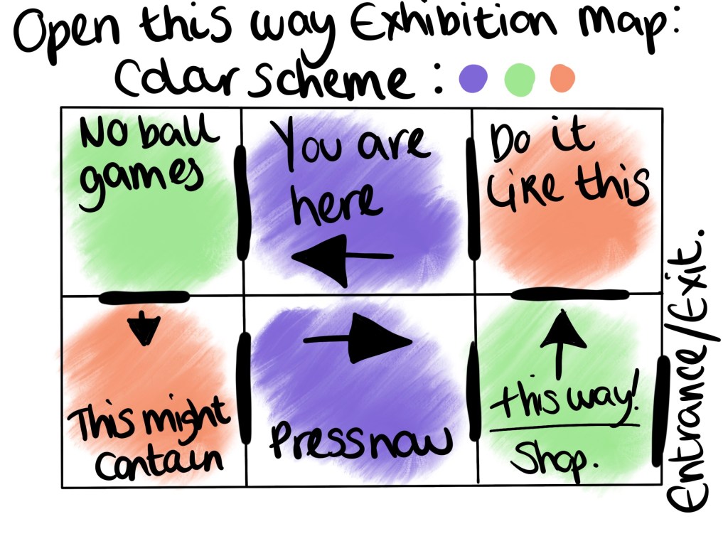
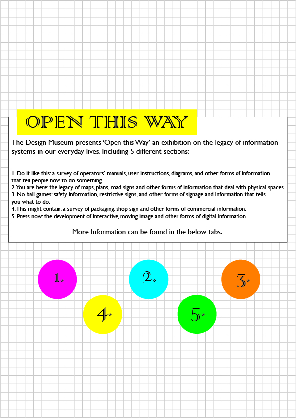
The overall look of the exhibition works really well, coinciding the colour scheme, font and general look together with the already put in place design taken from my research. Looking at the features i would probably add more information if i was to repeat the task as the information is very minimal but as i imagine this exhibit will not be free, its good to keep the mystery about the exhibit to encourage people to attend. I wanted to keep with a one way system for the map as i believe this is what would take place now due to current restrictions from the coronavirus global pandemic. I also feel it would add a level of structure to the exhibit which seems fitting given the nature and the title ‘Open this way’.
