
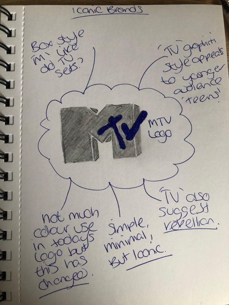
After a little google search of iconic brands and not wanting to use a logo i have already featured so far, i have chosen the MTV logo see below for my initial findings just from the image.
MTV
Year Company Founded: 1981
Year Logo Introduced: 1981
Logo Designer: Manhattan Design (Frank Olinsky, Patty Rogoff) (1981, 1981-2009), Popkern (2009)
Company Founders: Robert Warren Pittman, Warner Communications
First designed in 1981 by Manhattan Design, the MTV logo was the collaborative effort of Frank Olinsky and Patty Rogoff, overseen by original creative director, Fred Seibert. From the very beginning, the MTV logo has been constantly changing in color, patterns, and images, that filled the block “M” on which “tv” is scrolled. During the 1990s and 2000s, MTV opted for a simpler white logo, while maintaining the original design of a bold “M” and scrolled “tv.” A 2009 rebranding overseen by Popkern reintroduced the idea of filling the “M” with various images, with the “tv” becoming a non-disruptive white.
https://www.complex.com/life/2013/03/the-50-most-iconic-brand-logos-of-all-time/mtv
Here is the brand guidelines for MTV – http://www.logotypes101.com/guidelines/mtv.pdf
There doesn’t appear to be an official brand guidelines available to the public it looks like a web page has created the above PDF.
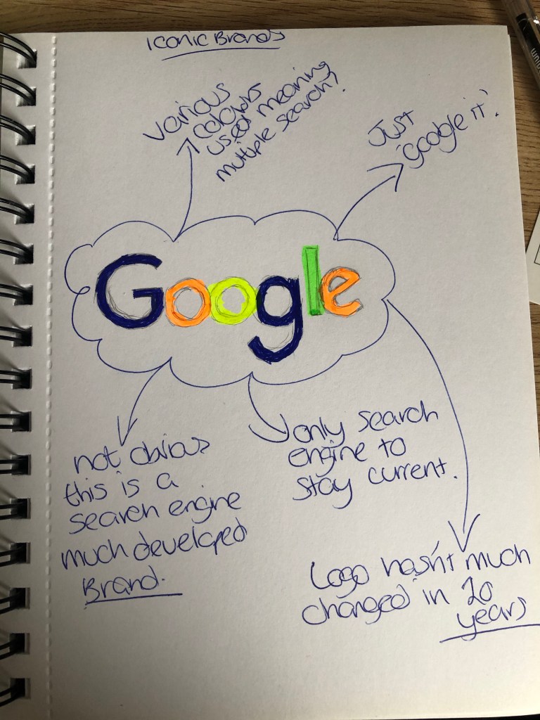
So after trying again i have used the google logo and come up with the below.
Year Company Founded: 1998
Year Logo Introduced: 1998
Logo Designer: Sergey Brin (1998, 1998), Ruth Kedar (1999, 2010)
Company Founders: Larry Page, Sergey Brin
The Google logo was first envisioned in 1988 by Sergey Brin, one of the the founders of the company, using the graphics program GIMP. It was an unpolished rendition of the now iconic logo, with an added exclamation mark meant to mimic the Yahoo! logo. Introduced in 1999, Ruth Kedar’s polished Google logo (with no exclamation mark) stayed in use by the company until 2010. Kedar’s logo gained instant recognizability over the 11 years it was in use, making it one of the most iconic logos of all time. On May 6, 2010, Google launched its latest, updated logo featuring a slightly more orange “O” with more subtle shadows, but the end result did not stray far from Ruth Kedar’s original design.
https://www.complex.com/life/2013/03/the-50-most-iconic-brand-logos-of-all-time/google
And here are the official brand guidelines for Google.
https://www.google.com/permissions/logos-trademarks/
The important parts to notice in any brand guidelines for a graphic designer is the do’s and don’ts for example changing the colour of the logo or modifying the text in any way most large iconic brands will not want their logo tampered with at all but some are more lenient than google. I wasn’t aware that google doesn’t offer sponsorship for events etc. But i suppose this is limited to certain charities. As a brand they don’t need to put their image out there as they have already established themselves over the last 20 years.
