
A local wildlife park wants you to develop a logo that supports the idea of a popular and fun family-centered experience, but also helps to make people more aware of the conservation work they do. The trustees of the park have recently visited Toronto and London Zoos to see how they balance the need to attract visitors and funding with a commitment to educating people about animal welfare and habitat issues.
Develop a logo that represents your chosen animal in an appealing way for a family
audience, but which also maintains its image and integrity as a wild animal. Record your
progress in your learning log.
For this exercise i have decided to use a tiger as my animal of choice purely because it’s my favourite and as they’re now an endangered species i feel it’s important to get that imagery out there. So i started off doing a few rough sketches of ideas i had following the brief. I wanted to represent the tiger and the conservation more than the fun family-centered experience as i feel this could easily be covered in the wording or slogan. Please see below the sketches.
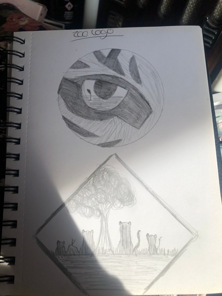
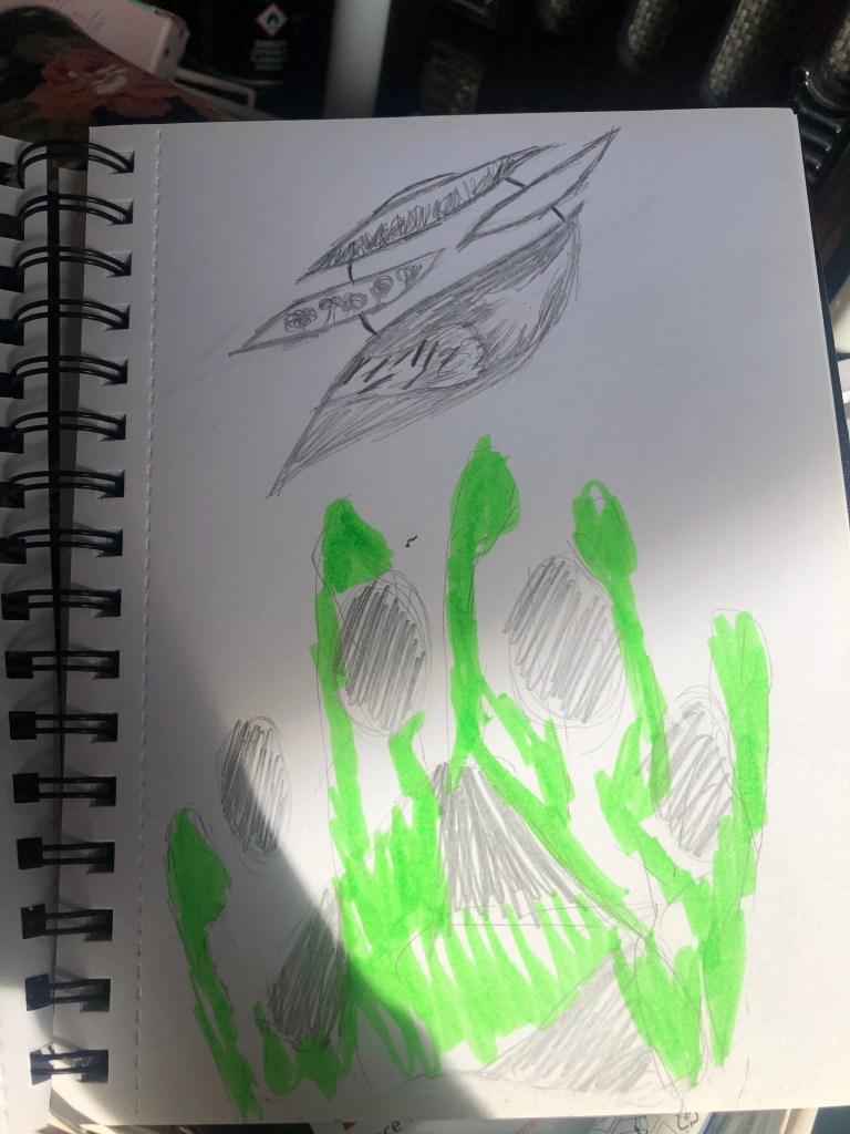
I then chose a few to develop on adobe illustrator. My strongest design, i believe, is the tiger eye with the imprint of a plant growing in a wasteland however this did change from being the hand and paw print design as it was something that sort of popped into my head as i was sketching the above circle/tiger stripes design. Please see below the finished versions in adobe illustrator.
I wasn’t keen on the hand and paw print design, it just didn’t have the same impact i wanted. The second family of tigers design does work quite well it appeals to my target audience of families and conveys the message of animals and conservation. I do however think the strongest is the tiger eye design, the look is striking and easy to recognize and see the detailing of the plant growing in the reflection of the tiger’s eye.
