
I started by doing 3 different sketch designs in my sketchbook adding a slight hint of colour for each before developing as a vector graphic for each design.
Aztec Gold
Looking at the name of the chocolate the obvious is to add a gold colouring and an aztec style building font but taking into consideration the description as ‘Exotic dark chocolate with buried fragments of honeycomb’ this makes the bar sound abit more classy and therefore more expensive to buy. I wanted to create a contrast of black and gold colours combined with aztec style font or added images with a classy style to it.
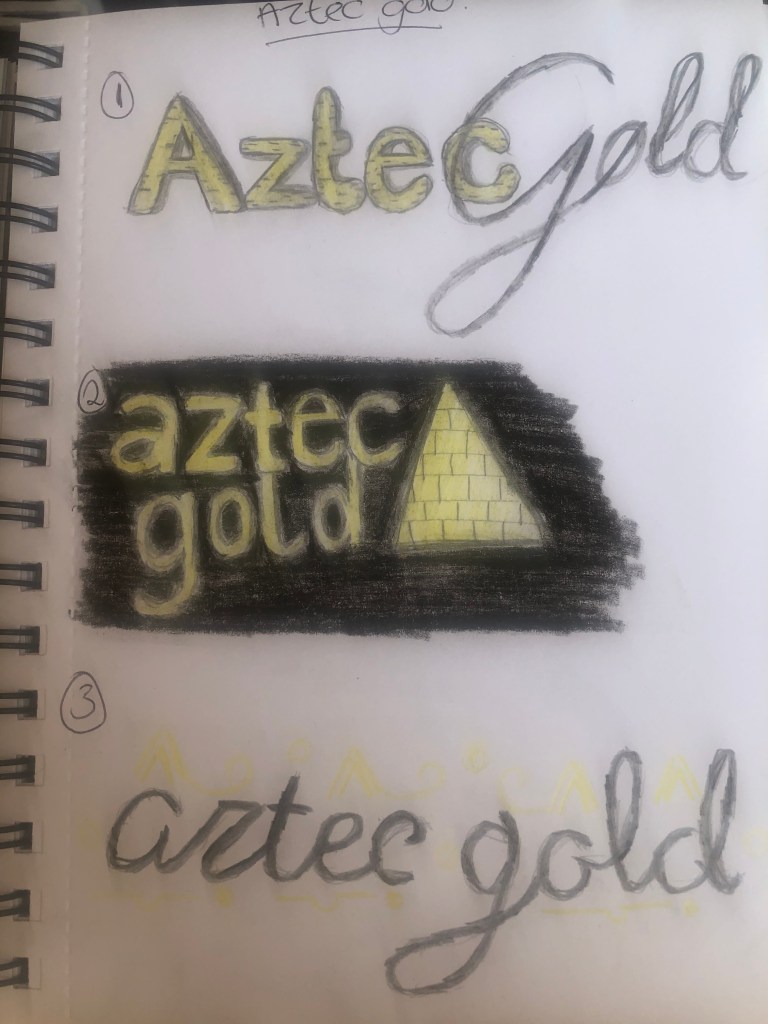
So the first design i used a standard sans serif style font for the word aztec and a more script style for the gold wording. Before then adding a block effect to the word Aztec creating a sense of depth to the logo. I also considered this as a type of brand for example if the company used the wording ‘aztec’ for another type of chocolate like white or milk etc. The second was more plain font with added imagery of a pyramid, thinking about how this could be packaged like in a pyramid style bar (Toblerone as an example) again adding the block effect to the pyramid alongside a black background and gold imagery and text. The third was more taken from googling aztec gold and the results were prominently the aztec gold coin featured in the popular film ‘pirates of the Caribbean’. So i used a script style font and added features from the coin, like hieroglyphics almost, this works really well around the text and could feature along the packaging of the bar.
High Tea Biscuits
Immediately associated this name with an already existing biscuit ‘Rich Tea’. So i need to make sure the design is different to this. I wanted to incorporate a classy, script or even older style font. High Tea is very much for upper class and the description for the biscuit even mentions ‘An altogether classier chocolate biscuit’ So i need to adhere to this.

The first design i wanted to incorporate a script classy font for High Tea and then a standard serif style for the Biscuits wording while also featuring a biscuit with melted chocolate on the front i think it looks quite nice and appealing especially if this was an actual photograph of the biscuit. The second i wanted a 1920’s sort of style to the logo/packaging featuring black and warm gold it certainly looks like an altogether classier logo the font is very simple yet elegant. The third i am less keen on i thought the idea of the text being on the biscuit as a sort of emblem style logo would work well but it doesn’t give off the elegant style im going for with this design.
Pow Milk Bar
I associate the word ‘pow’ from this like the ‘bang’ ‘kapow’ that features in the old batman tv show with a loud pop art shape and colour. So i wanted to create styles like this and more like vintage and retro and described ‘Retro chocolate for big kids’.
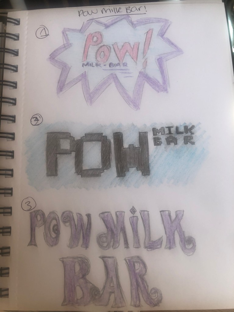
Firstly i made a decision to use purple and blue colours as these are not often used to associate as retro but are associated with chocolate particularly the purple for ‘dairy milk’. The first design i stuck to the pop art style featuring the POW as the main word and then the milk bar text below. It looks very appealing and certainly retro. The second i thought more about the wording ‘retro’ as a few months ago i went to a retro gaming weekend with pacman machines from the 80’s so i incorporated a pacman/gaming style square font which works really well and again could be used for other types of confectionery as i have moved the milk bar text to the side of the POW text and featured a small colourful pop art in the corner as an emblem for the brand. Taking the ‘retro’ style font i wanted an even older style from the 60’s as sort of a more plain design as the font speaks for itself however it doesn’t connect as well as the other two with the pop art style.
