
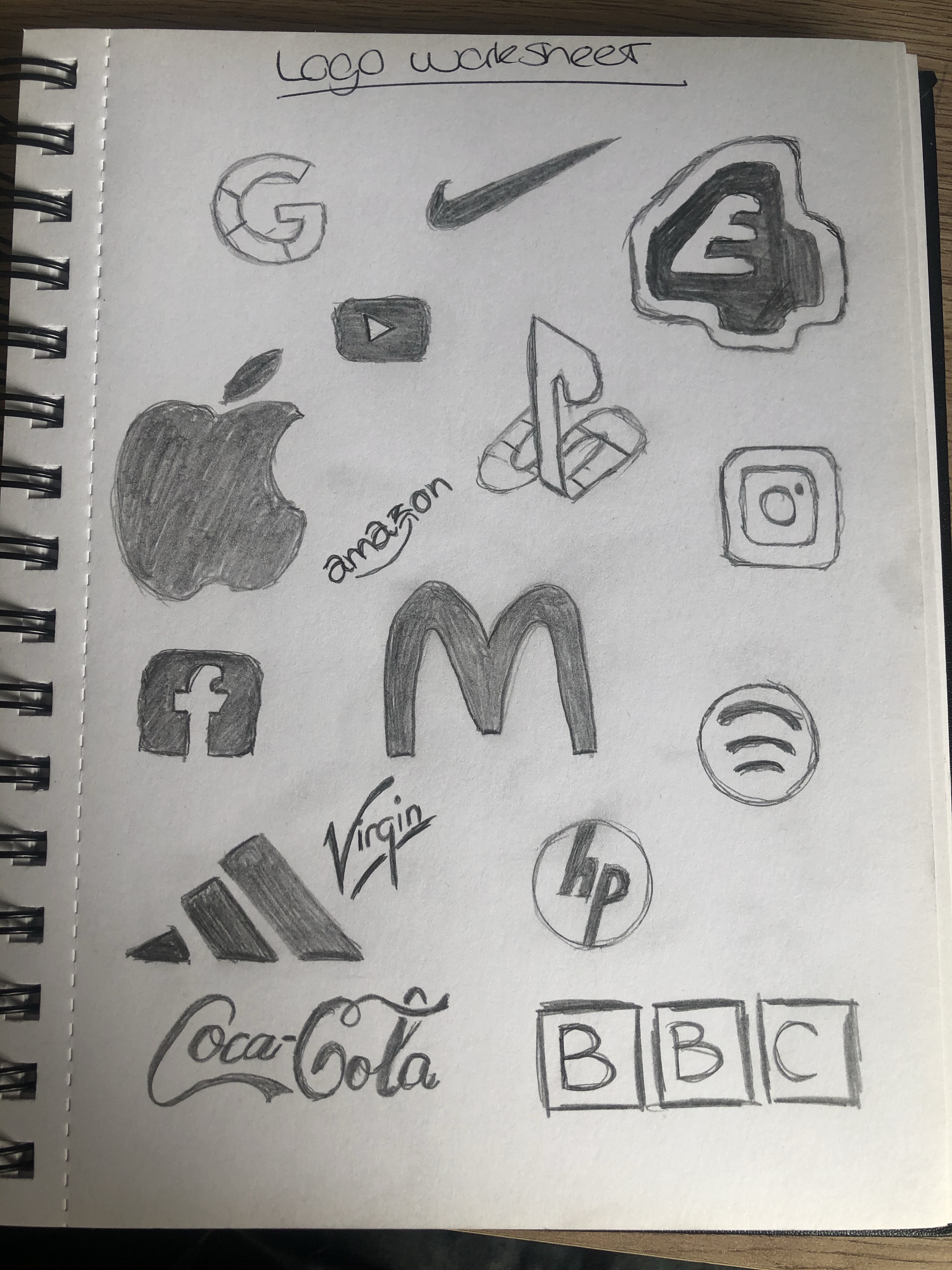
Starting in my sketchbook i drew as many logos as i could think of see below. The companies are quite varied from my social media emblems to food company logos and company names.
Using the varied designs i combined and used the different design aspects from each see below.
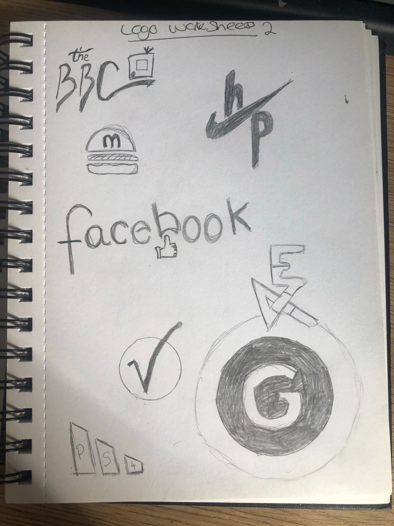
I’ve taken the font style from coca-cola and used a little TV type emblem like the Instagram logo for the top left BBC logo. The BBC has always used the same style of boxes and text since 1922. This works quite well keeping a sort of traditional style font with a modern twist.
Using the nikey tick and HP together is quite interesting, nike being a sporting company and HP computers. However as the symbol is just a tick it could mean anything, it certainly gives a positive look to HP. The same thing with the Adidas logo the three stripes could be used for anything so adding the PS4 text inside creates a little additional factor – i may add some original grey to this to make slightly more classical like the old console PS1 was grey.
I took the idea of the apple logo being an apple and mcdonalds being prominently a fast food burger institution i used the burger symbol and added a simple M to the forefront, i will develop this a bit further on illustrator to get the full effect, maybe add some colour?
For the Facebook logo i decided to use the same element from the amazon logo. The arrow pushes up into part of the text so i have used the ‘like’ symbol associated with Facebook to push into the text. This actually works really well i think still keeps the company essence of social media but adds in a bit of fun rather than it just being standard text.
I’ve used the circle emblem style with the virgin logo, using the V inside the circle making something simple and easy to associate with the company – especially if i had some red as this is their brand colour.
The E4 logo I’ve used the PlayStation style to join together both letters by adding some colour to this i think it could be quite an interesting look. Same could be said with the Google emblem the google logo is already very simple but adding a circular shape around like the 4 over the E just makes it slightly more striking but keeping a professional look.
