
To start this assignment off i thought about food… and then i got hungry, after consuming a healthy snack! I thought about how we consume food now with technology advancing everyday more and more of us only get our food through online means, ordering a takeaway, selecting food from a retailer and having it delivered etc. And i thought when was the last time i went outside for food? Well i went for afternoon tea at the Grand Royal in Hyde Park for my mum’s birthday. (Even the tickets were purchased online!) Afternoon tea used to be for a certain elite members of society but now it’s becoming more and more common and trendy even. Themed afternoon tea’s and bottomless prosecco afternoon tea are just some of the variations. So having taken some images of afternoon tea and particularly enjoying it i decided this is what my publication on food and drink would feature, running perfectly with mother’s day right around the corner.
Research
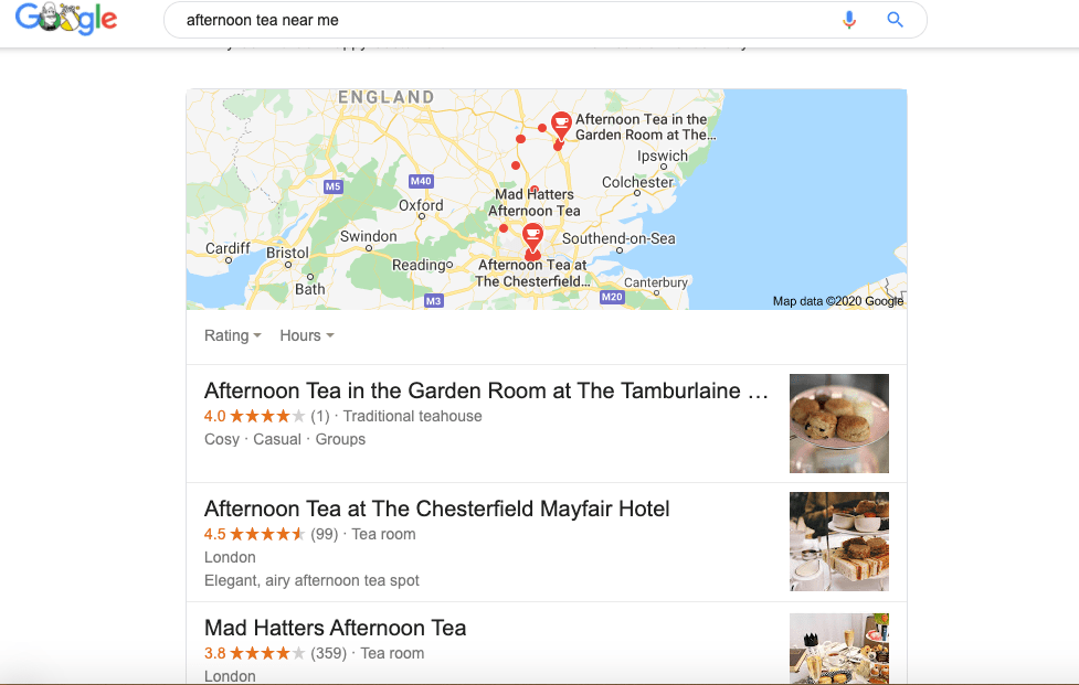
I started off by looking at afternoon tea available near me, and then looked at each website, what was available what does the imagery and type look like? what features have they included? i need to make sure that i am using similar effects to target the right audience.
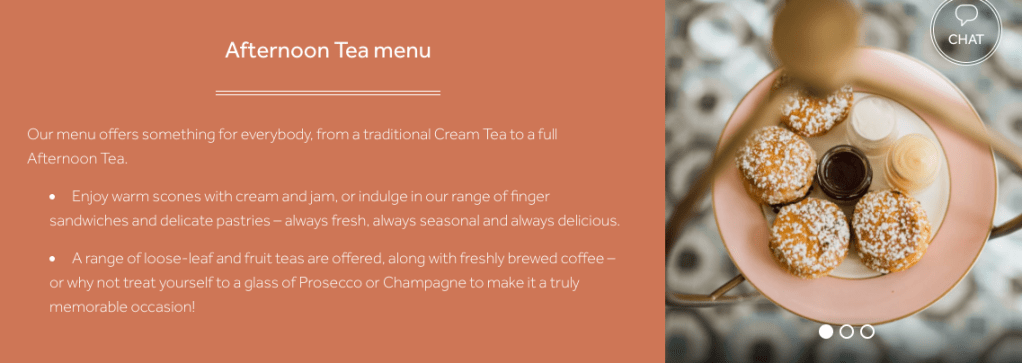
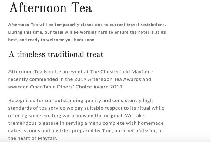
The images are crisp and clear focusing purely on the food, the text is clearly a sans font across a salmon colour background in white but still nice and easy to read. The use of language is very descriptive and minimal. Something i should bare in mind for my own!
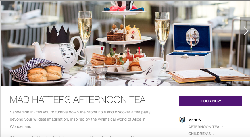
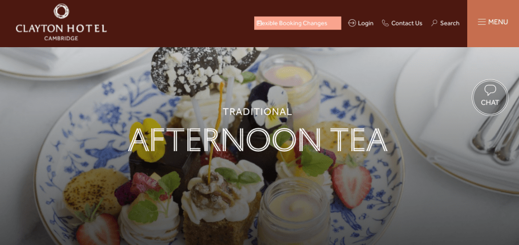
Considering the above is a ‘Mad Hatters’ afternoon tea the design on the website is not mad at all, not even a little bit creative, they have used a basic sans font with next to no colour or imagery. I want my design to be elegant but still have a ‘wow’ factor of colour.
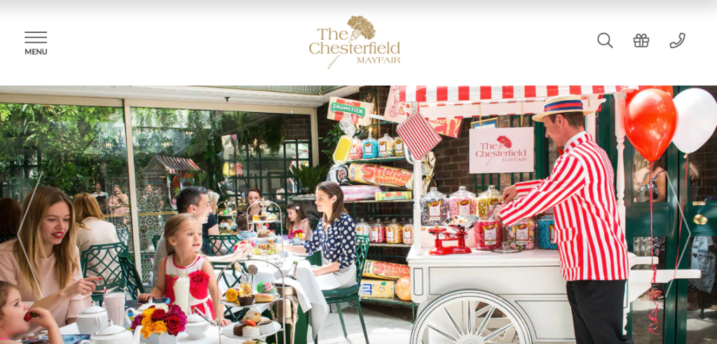
Love the use of bright red in this design, it’s so striking but still keeps a traditional aspect to it. Not so keen on the use of Serif and Sans serif fonts together, i feel it doesn’t keep a theme going well. I would understand this use if the font was not as visible in a paragraph or smaller font size but both are very readable, clear fonts.
Sketches
Now i have a rough idea i’ll use what i like from the above research to create my own front page design and other pages across the document with similar features.
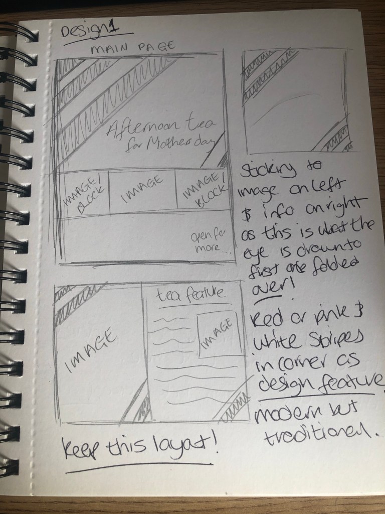
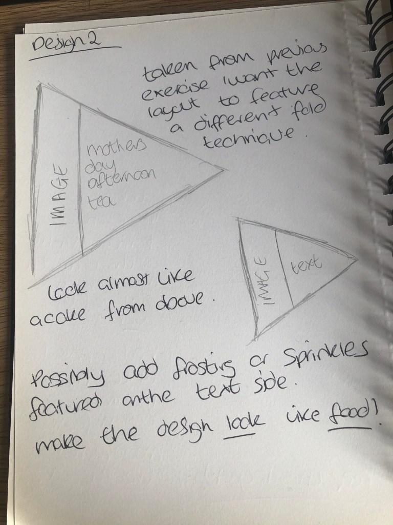
I did two designs in my sketch book, one keeping with a traditional style and page layout with text and images on separate sides along with design features in the corner of the document to continue through each page. Using a calligraphy style font for the title and a more readable sans serif style font. The second was more dynamic featuring an unusual page format in a triangle style to look like a slice of cake commonly featured at afternoon tea. To make the document look like food seemed a good way to attract attention and look appealing, along with featuring text and images. Probably the same font style as the first design as I feel this works best with the area of food and drink I am aiming to attract.
Final
For my final design i decided to go with a traditional layout as this is more likely to intrigue my target audience of mother’s and particularly the elderly. I’ve gone with a bright pink and white colour scheme which draws the eye with lovely large photo’s to keep attention as too much text can be a bit daunting especially reading small text. The photographs used are entirely my own. I’ve used Lorem ipsum text on every page other than the title to differentiate what will feature on the page along with images that match. This would have been easier if i had more stock photo’s to use. The type matches the colour scheme used and is still readable as a calligraphy/handwritten style. It gives the design a more personal touch and would still work well on the webpage side of things. As well as the design layout this would work really well featuring the bright stripes on the corner of each page and bold elegant images.
Review
I did really love my second idea of creating a document that is shaped like food however having worked in the print industry i know how difficult this would be to achieve. So the traditional route seemed better, maybe if i was actually producing something like this i would be able to find a company that would do exactly what the client would potentially want. The bright stripes and images work really well in this more traditional layout though, still engaging and modern.
