
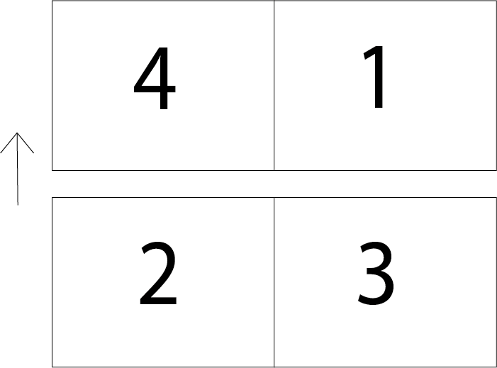
After doing a bit of research on artists book’s and fanzines, I feel fanzines are not as covered and these are more modernly used particularly by universities as they are more concentrated information rather than lots of information in a large book. Thinking about how a document normally folds I need to be more experimental so traditionally a document is folded from 4 sides see rough illustration below.
Given that most documents that are folded are generally square i’ve decided to use a different shape to make this pamphlet look different and more playful. I’m going to use the artists from this page below as i really loved the look of these zines, they’e so creative and brightly coloured.
https://www.format.com/magazine/galleries/art/11-cool-artist-zines
https://www.dazeddigital.com/artsandculture/article/17205/1/top-ten-zines
I’ve kept the pamphlet as basic as possible using American typewriter font to keep in style with modern print styles that are more vintage looking. I chose orange and red to keep interest bright and colourful is more eye catching especially to a younger audience which i want to attract at a university level. Most students will actually look online before they go and view something in a gallery. So i have included QR codes for the above webpages featuring the zines i have mentioned in the pamphlet so they can view the page themselves, a very modern approach to a printed document.
