
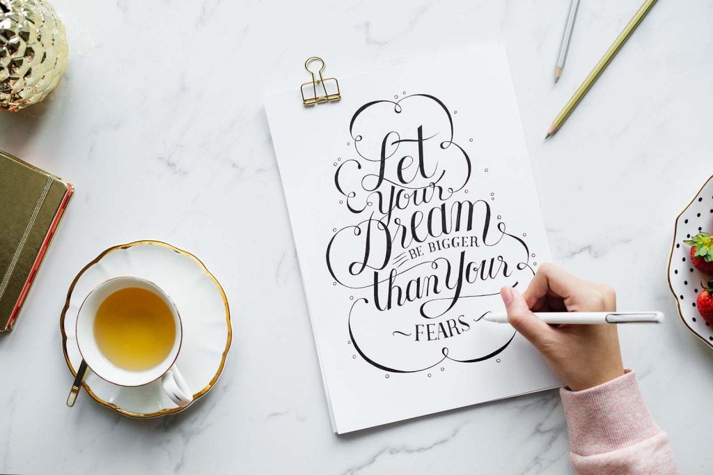
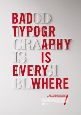
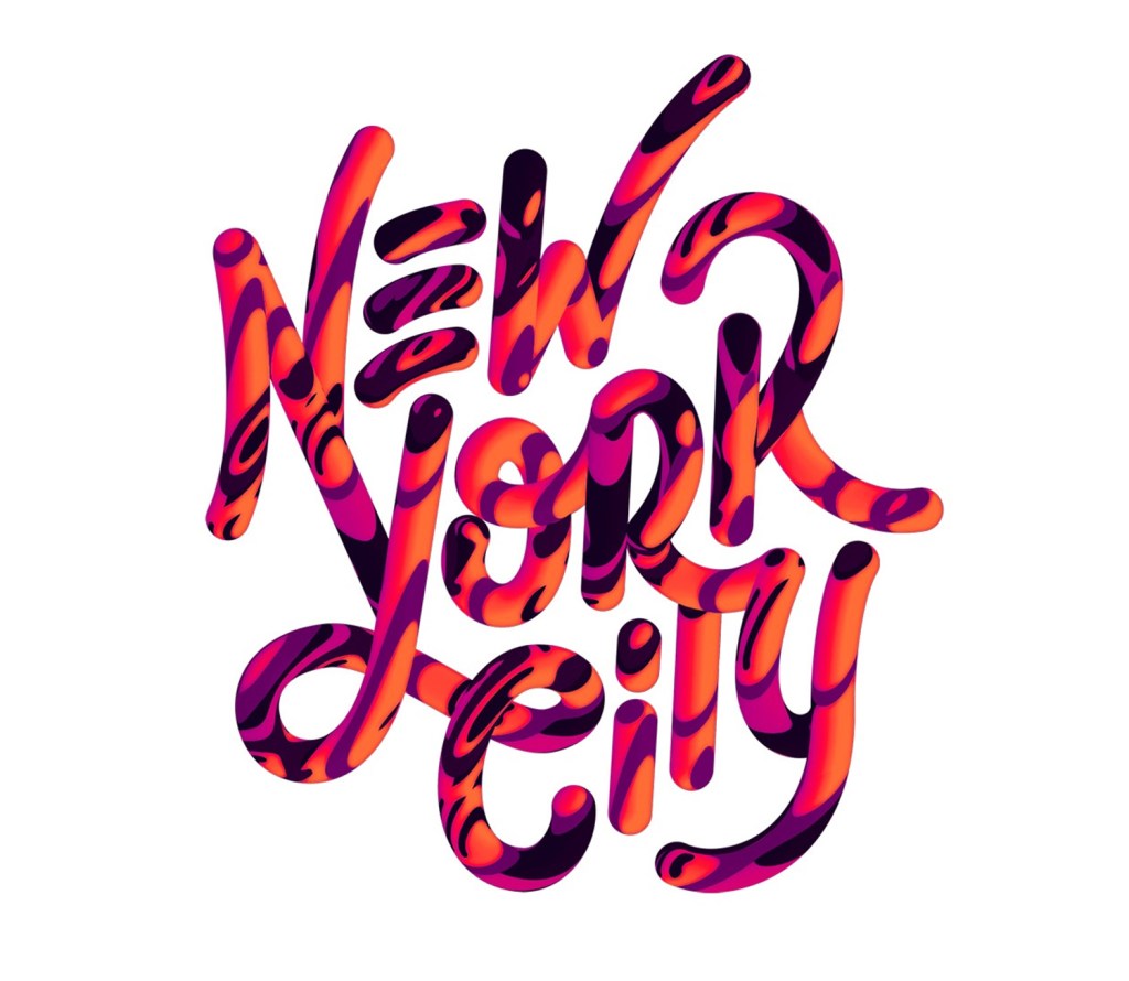
My general style of typography tends to lean towards the more creative and outstanding but i have worked on pieces for certain demographics which are more sensible and formal which have still been pieces i like the look of, like designing logos for a housing association in some of my previous work and then going onto designing poster displays for school projects. I’ve collected some images below of things that caught my eye leaning towards my style.

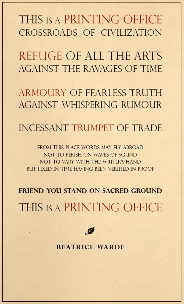
Generally Beatrice Warde’s approach to typography and typesetting is very formal, the lettering is evenly spaces correctly and clear white space in between paragraphs as per image above. I would say this is a good way to of typesetting for certain circumstances for example a business pamphlet etc. however the look is not very eye catching and is unlikely to entice certain individuals, like myself, i find it boring the lack of colour and fun display. But for someone older and more professional than myself would be fine with this.

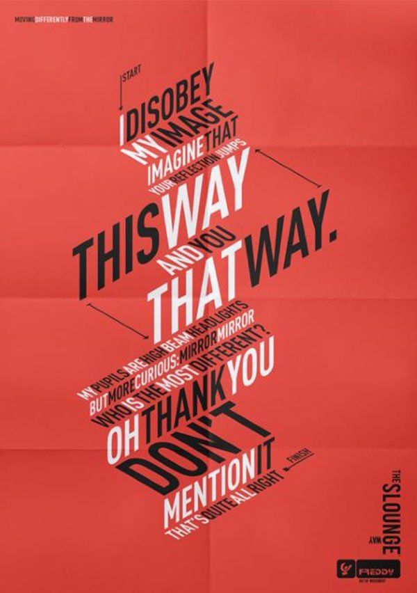
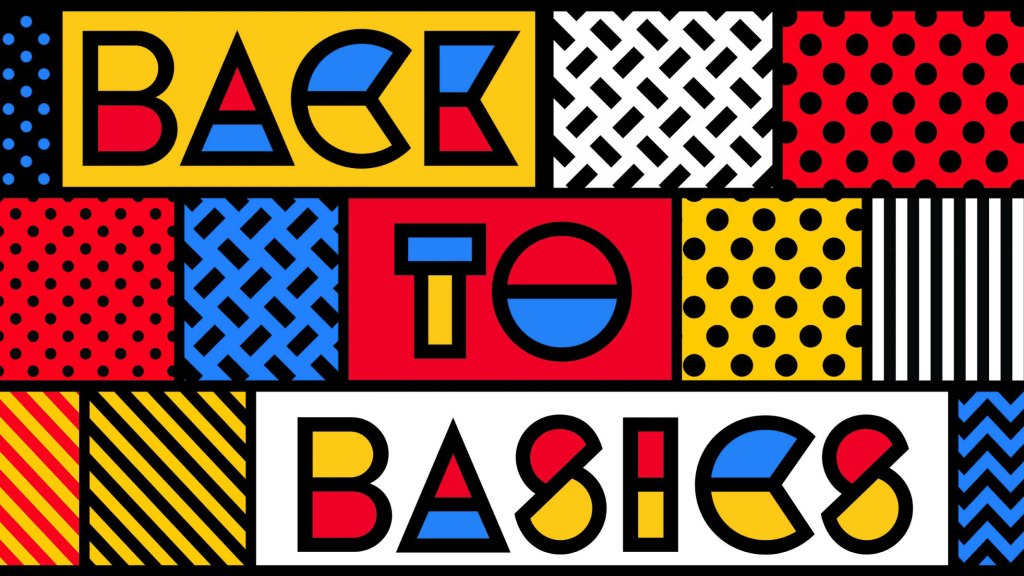
Whereas Jonathan Barnbrook’s approach is vastly different, this is bright, colourful, edgy and most importantly eye catching. The varied use of fonts and images works really well in the image above for a younger audience this is brilliant however you have the same issue in that this will not appeal to a certain demographic. I suppose with typography and typesetting there needs to be a certain balance between both of these styles depending on what the type of job is.
