
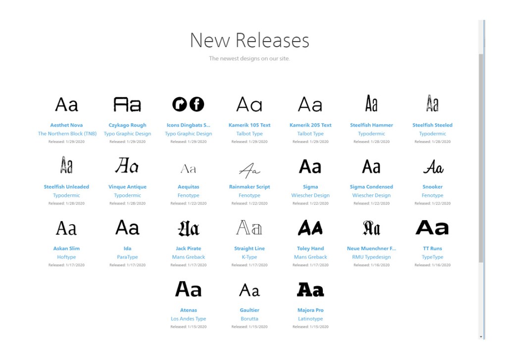
I researched on fonts.com for the newest fonts released see below. I noticed how similar these fonts are to fonts i already have available for example Kamerik 105 Text is very similar to century gothic a font i use a lot. The Icons Dingbats font really intrigued me i’ve never noticed a font that has other companies icons on as i imagine getting the legal permission for this would prove challenging. Different font styles used will depend on the occasion the font is being displayed for, as an example i would use Rainmaker Script to make a document look handwritten script but still readable as i find alot of the fonts i already have aren’t this clear.

Another font from this list i really liked the look of was Straight Line as it looks very neat and tidy but still adds and individuality to it with the white spacing inside the letters see below.

