
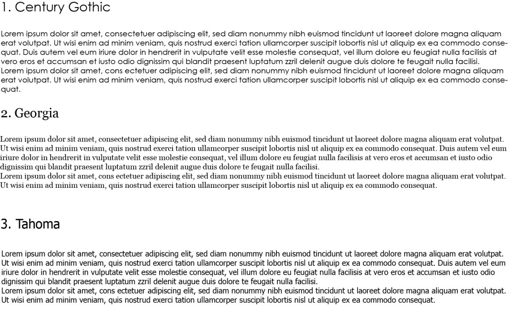
These are the three fonts i have chosen to research – Century Gothic, Georgia and Tahoma.
- Century Gothic is a sans-serif typeface in the geometric style, released by Monotype Imaging in 1991. It is strongly influenced by the font Futura, but with a larger x-height. Its design also derives from two other typefaces that were designed to compete with Futura. It is an exclusively digital typeface that has never been manufactured as metal type. Like many geometric sans-serifs, Century Gothic’s design has a single-story “a” and “g”, and an “M” with slanting sides resembling an upturned “W”. Century Gothic has a high x-height (tall lower-case characters). Its origins (see below) come from a design intended for large-print uses such as headings and signs, and so it has a reasonably purely geometric design closely based on the circle and square, with less variation in stroke width than fonts designed for small sizes tend to show, and a relatively slender design in its default weight. – Information taken from https://en.wikipedia.org/wiki/Century_Gothic
- Georgia is a serif typeface designed in 1993 by Matthew Carter and hinted by Tom Rickner for the Microsoft Corporation. It was intended as a serif typeface that would appear elegant but legible printed small or on low-resolution screens. The typeface is inspired by Scotch Roman designs of the 19th century and was based on designs for a print typeface in the same style Carter was working on when contacted by Microsoft; this would be released under the name Miller the following year. The typeface’s name referred to a tabloid headline claiming “Alien heads found in Georgia. – Information taken from https://en.wikipedia.org/wiki/Georgia_(typeface)
- Tahoma is a humanist sans-serif typeface that Matthew Carter designed for Microsoft Corporation. Microsoft first distributed it, along with Carter’s Verdana, as a standard font in the initial release of Windows 95. While similar to Verdana, Tahoma has a narrower body, smaller counters, much tighter letter spacing, and a more complete Unicode character set. Carter first designed Tahoma as a bitmap font, then “carefully wrapped” TrueType outlines around those bitmaps. Carter based the bold weight on a double pixel width, rendering it closer to a heavy or black weight. In contrast with some other sans-serif typefaces, including Arial, the uppercase “I” (eye) is distinguishable from lowercase “l” (ell), which is especially important in technical publications. Since 2010, Ascender Corporation has offered italic and small caps versions of Tahoma. Tahoma is often compared with Frutiger, another humanist sans-serif typeface. In an interview by Daniel Will-Harris, Carter acknowledged that Tahoma has some similarities with his earlier Bell Centennial typeface. The Tahoma typeface family was named after the Native American name for the stratovolcano Mount Rainier (Mount Tahoma), which is a prominent feature of the southern landscape around the Seattle metropolitan area. – Information taken from https://en.wikipedia.org/wiki/Tahoma_(typeface)
I’ve always loved using Century Gothic i find it such a clean, nice, easy font to use and will continue to do so now i know more about it. I would like to use Georgia instead of Times New Roman as i feel this is used practically everywhere for designers who want to use a serif style font. I never knew Tahoma was a Microsoft specific font i suppose I’ve never really thought of using it on my mac anyway so maybe when designing i can look at what works on both formats.
