London’s transport systems have benefited from the pioneering work of a number of graphic designers, for example Harry Beck’s London Underground map and Stanley Morrison’s typographic designs for the London Underground. There’s a long tradition of presenting culture on the Tube, through posters, poetry, mosaics, illustrations and other forms of visual culture. In addition, as an international city, London has for centuries been a melting pot for different cultures and identities; European, African and Asian communities have all established themselves and added something new to the city. For example, London has long been a centre for musical innovation that has developed in the underground clubs of the city before migrating to the mainstream, such as jazz and reggae.
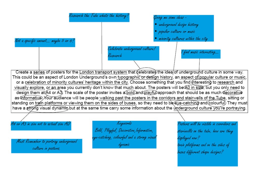
Research
First i wanted to briefly look at the history of the underground is there anything significant i should be aware of or i could use in my design?
The London Underground (also known simply as the Underground, or by its nickname the Tube) is a public rapid transit system serving Greater London, England and some parts of the adjacent counties of Buckinghamshire, Essex and Hertfordshire in the United Kingdom.
The Underground has its origins in the Metropolitan Railway, the world’s first underground passenger railway. Opened in January 1863, it is now part of the Circle, Hammersmith & City and Metropolitan lines; the first line to operate underground electric traction trains, the City & South London Railway in 1890, is now part of the Northern line. The network has expanded to 11 lines, and in 2017/18 carried 1.357 billion passengers, making it the world’s 11th busiest metro system. The 11 lines collectively handle up to 5 million passengers a day.
Taken from https://en.wikipedia.org/wiki/London_Underground
Early advertising posters used various letter fonts. Graphic posters first appeared in the 1890s, and it became possible to print colour images economically in the early 20th century. The Central London Railway used colour illustrations in their 1905 poster, and from 1908 the Underground Group, under Pick’s direction, used images of country scenes, shopping and major events on posters to encourage use of the tube. Pick found he was limited by the commercial artists the printers used, and so commissioned work from artists and designers such as Dora Batty, Edward McKnight Kauffer, the cartoonist George Morrow, Herry (Heather) Perry, Graham Sutherland, Charles Sharland and the sisters Anna and Doris Zinkeisen. According to Ruth Artmonsky, over 150 women artists were commissioned by Pick and latterly Christian Barman to design posters for London Underground, London Transport and London County Council Tramways. Art on the Underground was introduced in 1986 by Henry Fitzhugh to revive London Transport as a patron of the arts: the Underground commissioned six works a year, judged first on artistic merit. In that year Peter Lee, Celia Lyttleton and a poster by David Booth, Malcolm Fowler and Nancy Fowler were commissioned. Today commissions range from the pocket tube map cover to installations in a station.
Taken from https://en.wikipedia.org/wiki/London_Underground
It was really interesting to read about the underground history, especially the graphic posters section above. I never would have thought that 150 women artists work was commissioned for the underground, maybe this is something i could pay homage to in one of my designs?
London and UK has always been a highly populated continent. Even way back in the trading times our roots have always been multi-cultural. This mixing of Punk and Reggae cultures gave birth to well known bands like the specials in the late 70’s through to the 80’s. Throughout the English underground music culture a beautiful exchange of music was being heard in London and the UK.
Taken from https://virtuousmovement.co.uk/history-of-londons-underground-music-scene/
Ideas
After doing some initial research i decided to venture into London for a bit of inspiration after all how could i possibly know what to look into without having a look at what is already present. With modern technology vastly adapting everyday and especially now we’ve entered another decade i noticed that on the escalators in the underground used to show posters at the side, now its a TV screen showing multiple posters for various events. Thinking about this i feel i need to design something that will incorporate well being on a screen rather than a print out.
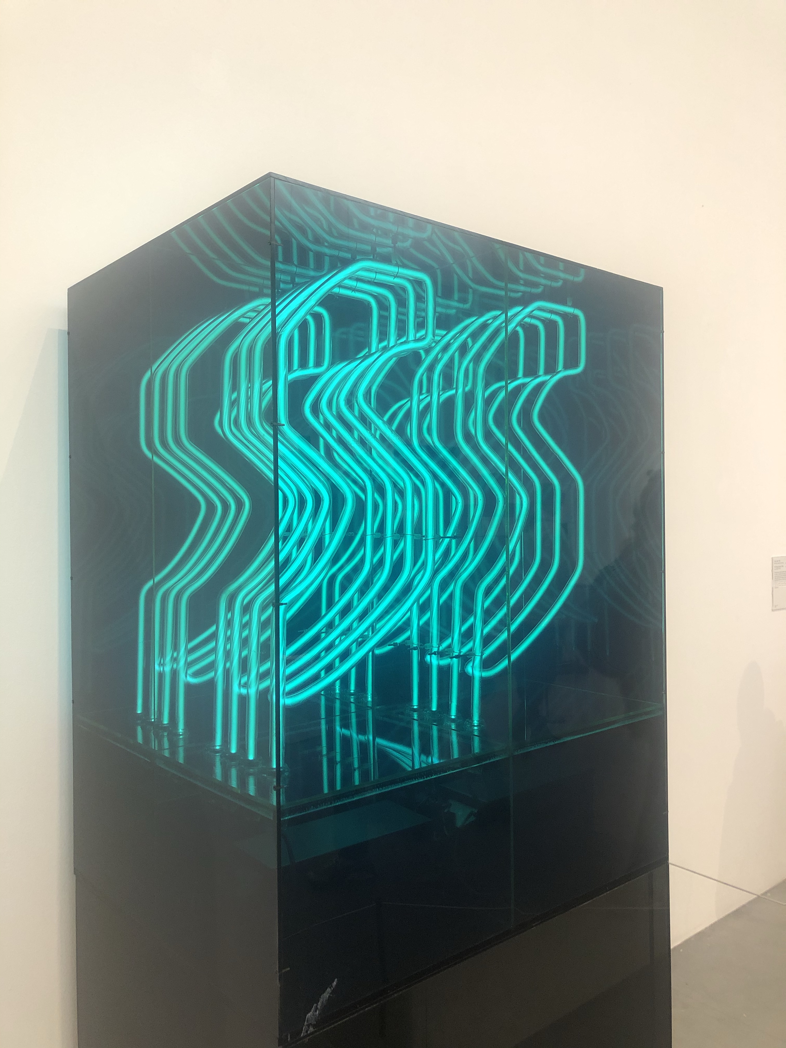

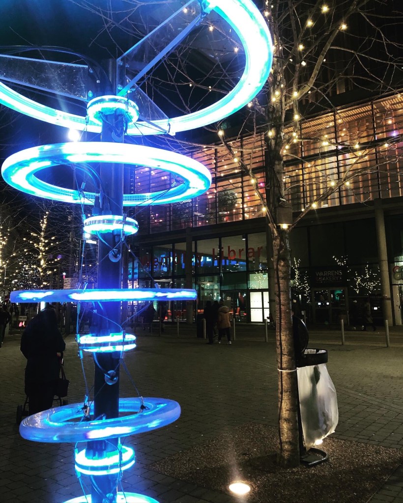
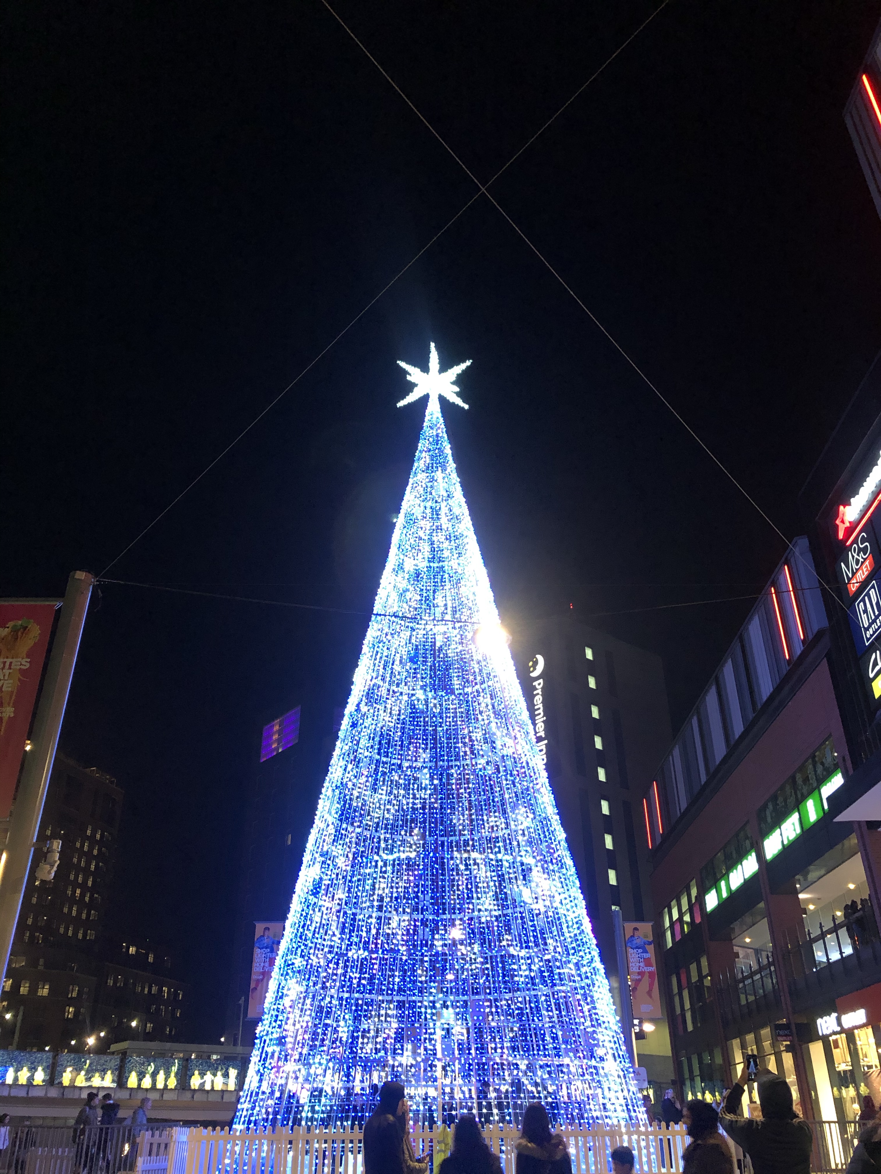
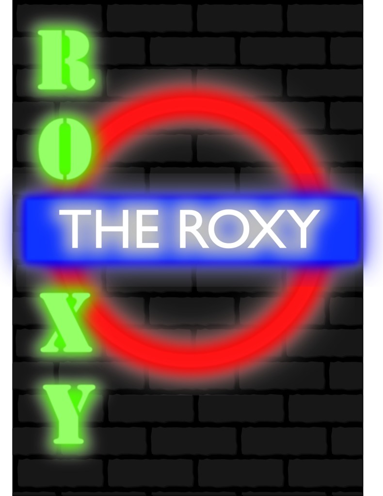
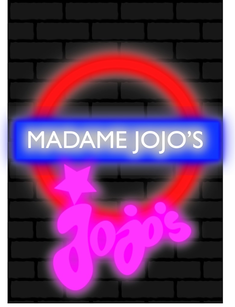
As i went to London just for Christmas, of course all the amazing lights were up around the city so I’ve had the idea of incorporating this into my design making a light effect to look like some of the old club branding.
I want to look more closely at London’s underground music/club scene specifically in the 1980’s. My mum was part of the London underground punk scene in the 80’s and talks about all the clubs she went to it’s something that is still present in parts of London today. therefore still relevant.
Final Posters
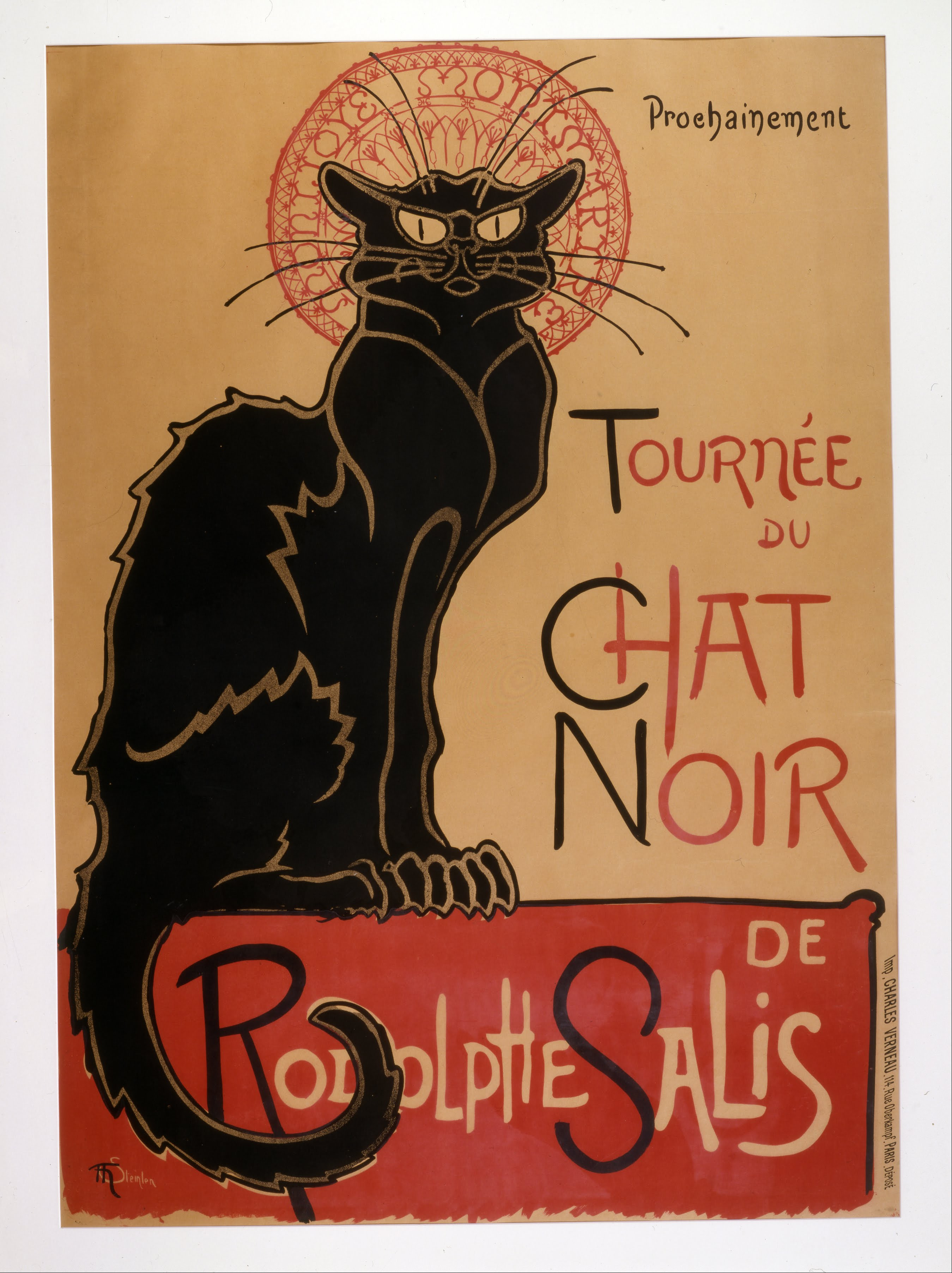
1.The Bad Cat Club – After hours of searching i have found no trace of the bad cat club my parents visited in the 80’s, the only information i have is the logo which was based on Le chat noir from Paris. See below image I’ve done a basic drawing of the cat and added it to my poster that’s the idea i want to go with incorporating their branding into my own posters as sort of a promotion for London’s underground club scene.
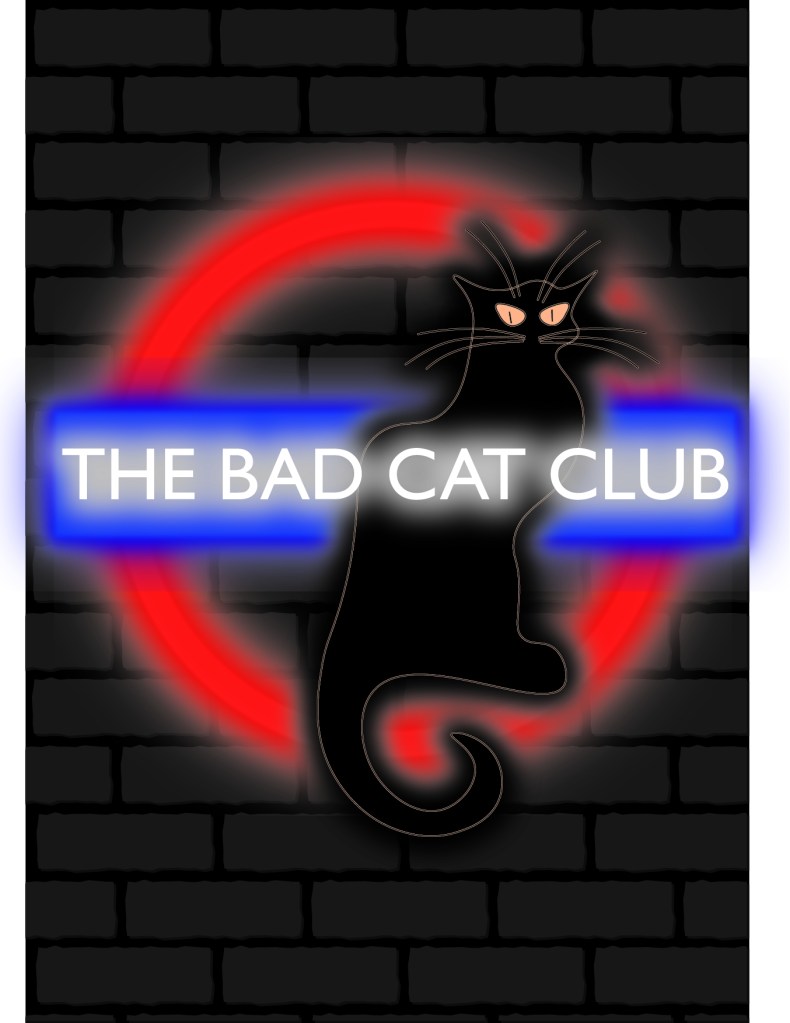
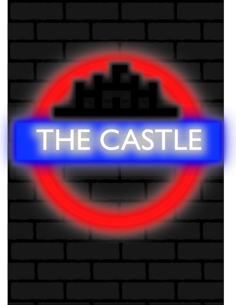
2. The Castle – There’s been a pub at the site since 1792. Situated on the corner of Goodman’s Stile & 44 Commercial Road, it was originally called the Dover Castle. The pub was owned at one time by Frank Maloney, the British boxing manager and promoter who managed Lennox Lewis to the undisputed heavyweight championship of the world. It is rumoured there was a ring on the top floor where boxers used to train daily. It’s fair to say the walls of The Castle have seen it all.
http://www.thecastlelondon.com/about

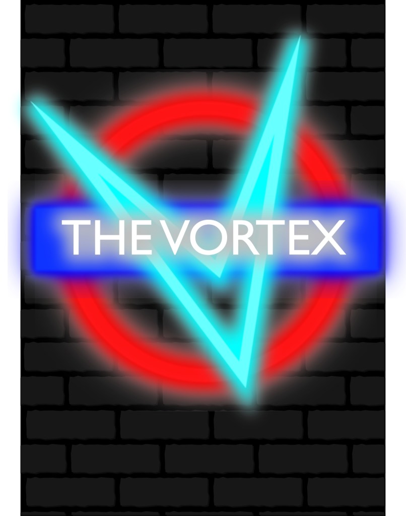
3. Vortex – The Vortex Jazz Club is one of the UK’s premier jazz venues, programming almost 400 performances a year in an intimate space. We were winner of the Live Jazz Award category at the 2013 Parliamentary Jazz Awards.As a volunteer-led jazz club in North London, Dalston, we have been given the accolade of being one of the world’s best, and have even been singled out by the prestigious Downbeat magazine as one the top 150 jazz venues in the world.
http://www.vortexjazz.co.uk/about-us/
![Vortex Jazz Club [Logo]](https://i0.wp.com/www.vortexjazz.co.uk/wp-content/themes/vortex2016/images/vortex_blue.png)
4. The Roxy – The Roxy was a fashionable nightclub located at 41–43 Neal Street in London’s Covent Garden, known for hosting the flowering British punk music scene in its infancy.
https://en.wikipedia.org/wiki/The_Roxy_(Covent_Garden)
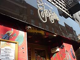
5. Madame JoJo’s – There has been a nightclub on this spot in Brewer Street since at least the early 1950s, when Soho was London’s most famous red-light district, populated by the sleazy, scar-faced underworld gang leaders who had thrived in the post-war era. It is believed the club acquired the famous name of Madame Jojo’s some time in the 1960s. In that decade it was bought by Paul Raymond, who can be said to have preserved much of Soho as we know it today, simply by buying most of it and leaving it alone, so that it remains largely untouched by the brutality of modern re-development.
http://wikimapia.org/11666117/Madame-Jojo-s
6. Underworld – Over the years The Underworld has become the heart of the alternative music scene in England. Little is promoted about the history of the venue, although it dates back to the opening of pub above The Worlds End. The venue is itself owned by Glendola Leisure.
https://www.theunderworldcamden.co.uk/about/


Evaluation
Overall this assignment has stretched my imagination making me connect ideas to research and looking at the brief in great detail to come up with something with a strong visual dynamic. All the posters keep within the theme of bold, playful, and decorative eye-catching and colourful. Although i haven’t included much information on the posters it would be nice to include some information but as i was creating i thought London is such a busy city, the underground being constantly filled with people no matter the time or day, people often don’t stop long enough to read hordes of information on a poster even when going up an escalator it’s hard to read the posters, you are more drawn to the imagery used than anything. The bright light effect was quite easy to achieve once i knew how, i researched how to make a neon light effect on YouTube and followed the instructions. I think the effect works really well it’s bright and modern, the brick effect background gives an edgy look and adds a bit more substance rather than a plain black background. All the while still promoting London’s underground culture with various clubs from the ages.
