Here is a series of short exercises to help you start creatively exploring what you can do with visual dynamics. 1. Choose a typeface and zoom into some of the letterforms to pick up on the detail of the lines, dots, curves, stems, bowls and serifs that make up the letters. You can do this by scanning your selection at a higher resolution, blowing it up on a photocopier or working with vectors on Illustrator. 2. Using a square format to frame your selections, develop a grid of designs that makes the most of the visual dynamics you’ve found. Think about how you use scale, cropping or framing. 3. Repeat the exercise, but this time exploring the dynamic of using different colour or tonal combinations.
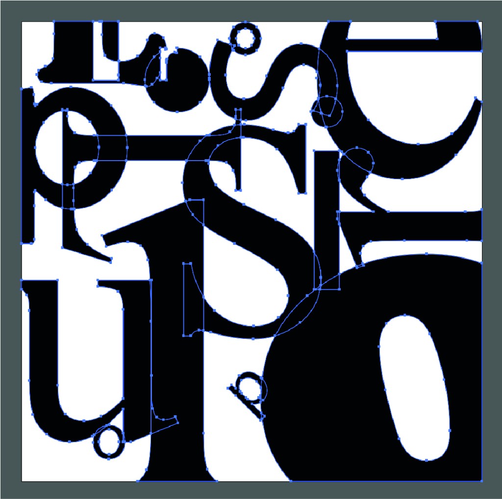
I started this exercise of with illustrator using a square page with 4 different randomly selected fonts before then vectoring each sets so I could see the different outlines on each font, specifically the difference between sans serif and serif style fonts how much more detail is in sans serif styles to get the right curvature compared to serif styles which are more traditional simple line style.
See below the same image now manipulated with the use of different colours. You can see how this hugely effects the visual layout of the image. I love how this turned out it looks so interesting and isn’t overly obvious I’ve only used different type styles ad sizes to achieve.